- Power BI forums
- Updates
- News & Announcements
- Get Help with Power BI
- Desktop
- Service
- Report Server
- Power Query
- Mobile Apps
- Developer
- DAX Commands and Tips
- Custom Visuals Development Discussion
- Health and Life Sciences
- Power BI Spanish forums
- Translated Spanish Desktop
- Power Platform Integration - Better Together!
- Power Platform Integrations (Read-only)
- Power Platform and Dynamics 365 Integrations (Read-only)
- Training and Consulting
- Instructor Led Training
- Dashboard in a Day for Women, by Women
- Galleries
- Community Connections & How-To Videos
- COVID-19 Data Stories Gallery
- Themes Gallery
- Data Stories Gallery
- R Script Showcase
- Webinars and Video Gallery
- Quick Measures Gallery
- 2021 MSBizAppsSummit Gallery
- 2020 MSBizAppsSummit Gallery
- 2019 MSBizAppsSummit Gallery
- Events
- Ideas
- Custom Visuals Ideas
- Issues
- Issues
- Events
- Upcoming Events
- Community Blog
- Power BI Community Blog
- Custom Visuals Community Blog
- Community Support
- Community Accounts & Registration
- Using the Community
- Community Feedback
Register now to learn Fabric in free live sessions led by the best Microsoft experts. From Apr 16 to May 9, in English and Spanish.
- Power BI forums
- Forums
- Get Help with Power BI
- Desktop
- Formatting Bars in a Clustered Chart
- Subscribe to RSS Feed
- Mark Topic as New
- Mark Topic as Read
- Float this Topic for Current User
- Bookmark
- Subscribe
- Printer Friendly Page
- Mark as New
- Bookmark
- Subscribe
- Mute
- Subscribe to RSS Feed
- Permalink
- Report Inappropriate Content
Formatting Bars in a Clustered Chart
Hi all,
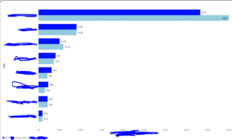
I'm a total Power BI noob, so wanted to know if something was possible. I have this bar chart pictured:
The royal blue bars represented a target financial amount, light blue is actual financial amount. I wanted to add something that indicates the following:
Actual >= 95% of target, some green-colored visual indicator.
80%=<Actual<95% of target, yellow-colored visual indicator.
Actual < 80% of target, red-colored indicator.
Would anyone happen to know the best way to go about doing this? Any help is appreciated.
Solved! Go to Solution.
- Mark as New
- Bookmark
- Subscribe
- Mute
- Subscribe to RSS Feed
- Permalink
- Report Inappropriate Content
Hi @donovan_smith44 ,
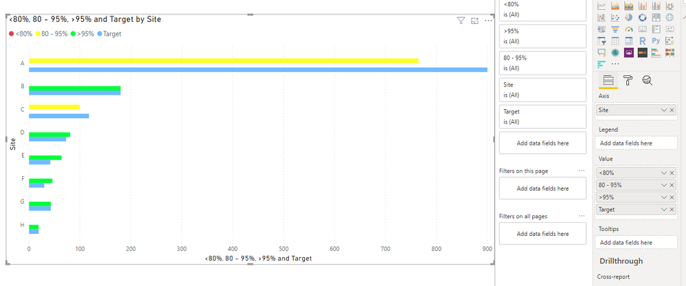
We can also archieve your requirement in a build in clustered bar chart with trick. Create two measures as actually or amount, adjust the formula based on your own data model.
Actually = CALCULATE(SUM('Table'[Value]),FILTER('Table',[Type]="2019"))
Target = CALCULATE(SUM('Table'[Value]),FILTER('Table',[Type]="Other"))
Then we create three more measures, put them and target into the value field of visual.
<80% = IF([Actually]<0.8*[Target],[Actually],BLANK())
80 - 95% = IF([Actually]<0.95*[Target] && [Actually]>=0.8*[Target] ,[Actually],BLANK())
>95% = IF([Actually]>=0.95*[Target],[Actually],BLANK())
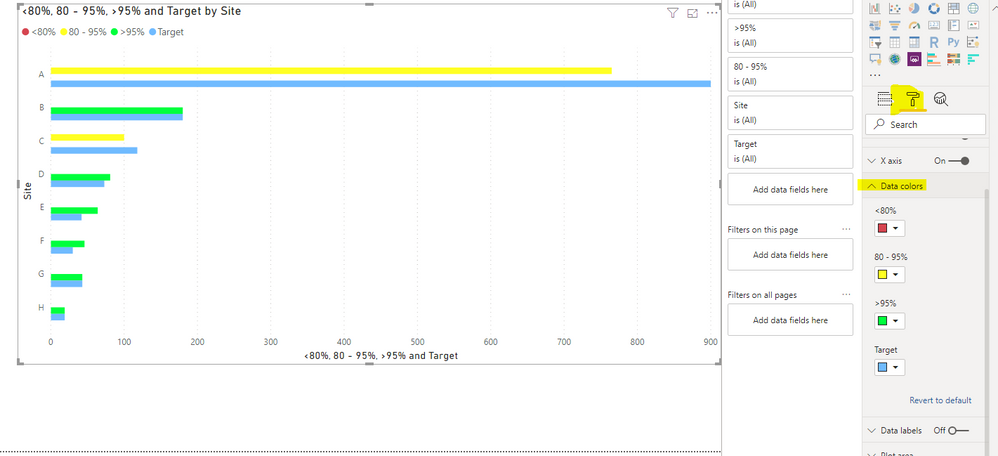
You can also change the name of these measure.
Then we can change the color of data for each measure
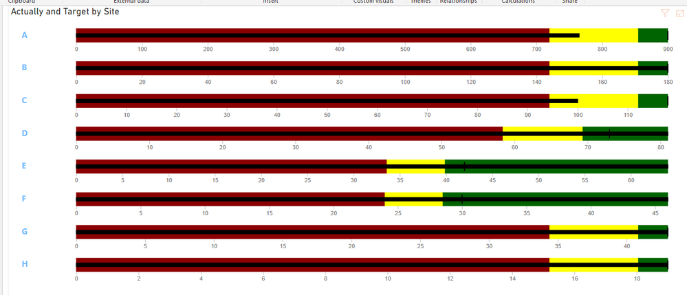
We also provided a usage of bullet chart in the page 2 of sample pbix file.
BTW, pbix as attached.
Best regards,
Community Support Team _ Dong Li
If this post helps, then please consider Accept it as the solution to help the other members find it more quickly.
If this post helps, then please consider Accept it as the solution to help the other members find it more quickly.
- Mark as New
- Bookmark
- Subscribe
- Mute
- Subscribe to RSS Feed
- Permalink
- Report Inappropriate Content
@v-lid-msft This is great. Do you know how to create a bullet chart with the green shading to the left, yellow in the middle, and red to the right? That would seem to make sense in some contexts where the more something is consumed, the more it moves in to the red area.
- Mark as New
- Bookmark
- Subscribe
- Mute
- Subscribe to RSS Feed
- Permalink
- Report Inappropriate Content
Hi @bchager6 ,
We can change the colors in the setting as following picuture.
BTW, pbix as attached.
Best regards,
Community Support Team _ Dong Li
If this post helps, then please consider Accept it as the solution to help the other members find it more quickly.
If this post helps, then please consider Accept it as the solution to help the other members find it more quickly.
- Mark as New
- Bookmark
- Subscribe
- Mute
- Subscribe to RSS Feed
- Permalink
- Report Inappropriate Content
Thank you. This is great. Will try.
- Mark as New
- Bookmark
- Subscribe
- Mute
- Subscribe to RSS Feed
- Permalink
- Report Inappropriate Content
I recommend researching the conditional formatting options available with tables, matrices and bullet charts. Especially bullet charts.
- Mark as New
- Bookmark
- Subscribe
- Mute
- Subscribe to RSS Feed
- Permalink
- Report Inappropriate Content
Thank you. Bullet charts are something I haven't tried.
Helpful resources

Microsoft Fabric Learn Together
Covering the world! 9:00-10:30 AM Sydney, 4:00-5:30 PM CET (Paris/Berlin), 7:00-8:30 PM Mexico City

Power BI Monthly Update - April 2024
Check out the April 2024 Power BI update to learn about new features.

| User | Count |
|---|---|
| 114 | |
| 99 | |
| 83 | |
| 70 | |
| 60 |
| User | Count |
|---|---|
| 150 | |
| 115 | |
| 104 | |
| 89 | |
| 65 |


