- Power BI forums
- Updates
- News & Announcements
- Get Help with Power BI
- Desktop
- Service
- Report Server
- Power Query
- Mobile Apps
- Developer
- DAX Commands and Tips
- Custom Visuals Development Discussion
- Health and Life Sciences
- Power BI Spanish forums
- Translated Spanish Desktop
- Power Platform Integration - Better Together!
- Power Platform Integrations (Read-only)
- Power Platform and Dynamics 365 Integrations (Read-only)
- Training and Consulting
- Instructor Led Training
- Dashboard in a Day for Women, by Women
- Galleries
- Community Connections & How-To Videos
- COVID-19 Data Stories Gallery
- Themes Gallery
- Data Stories Gallery
- R Script Showcase
- Webinars and Video Gallery
- Quick Measures Gallery
- 2021 MSBizAppsSummit Gallery
- 2020 MSBizAppsSummit Gallery
- 2019 MSBizAppsSummit Gallery
- Events
- Ideas
- Custom Visuals Ideas
- Issues
- Issues
- Events
- Upcoming Events
- Community Blog
- Power BI Community Blog
- Custom Visuals Community Blog
- Community Support
- Community Accounts & Registration
- Using the Community
- Community Feedback
Register now to learn Fabric in free live sessions led by the best Microsoft experts. From Apr 16 to May 9, in English and Spanish.
- Power BI forums
- Forums
- Get Help with Power BI
- Desktop
- Format each Column Series of a Matrix
- Subscribe to RSS Feed
- Mark Topic as New
- Mark Topic as Read
- Float this Topic for Current User
- Bookmark
- Subscribe
- Printer Friendly Page
- Mark as New
- Bookmark
- Subscribe
- Mute
- Subscribe to RSS Feed
- Permalink
- Report Inappropriate Content
Format each Column Series of a Matrix
I have a matrix visual that plots the count by 4 different column series like shown below:
__|____1___|___2____|____3___|___4___|
A | 23 | 23 | 43 | 23 |
B | 23 | 23 | 43 | 23 |
C | 23 | 23 | 43 | 23 |
Is there a way to format the matrix so that ALL of column 1 is ALWAYS highlighted in green, column 2 in yellow, and column 3 and 4 in red. The coloring would never change!
Solved! Go to Solution.
- Mark as New
- Bookmark
- Subscribe
- Mute
- Subscribe to RSS Feed
- Permalink
- Report Inappropriate Content
Hi @Javerbuch,
For your scenario, why not pivot your column Age Bucket (4 Options)? If you pivot the column that should be easier to set the background of the value like I have mentioned for the first reply.
If you want to pivot the column, you could click Column1 and select Pivot column with value likw below in Query Editor. Then you could create the martrix and set the value background as I first reply.
Best Regards,
Cherry
If this post helps, then please consider Accept it as the solution to help the other members find it more quickly.
- Mark as New
- Bookmark
- Subscribe
- Mute
- Subscribe to RSS Feed
- Permalink
- Report Inappropriate Content
Hi @Javerbuch,
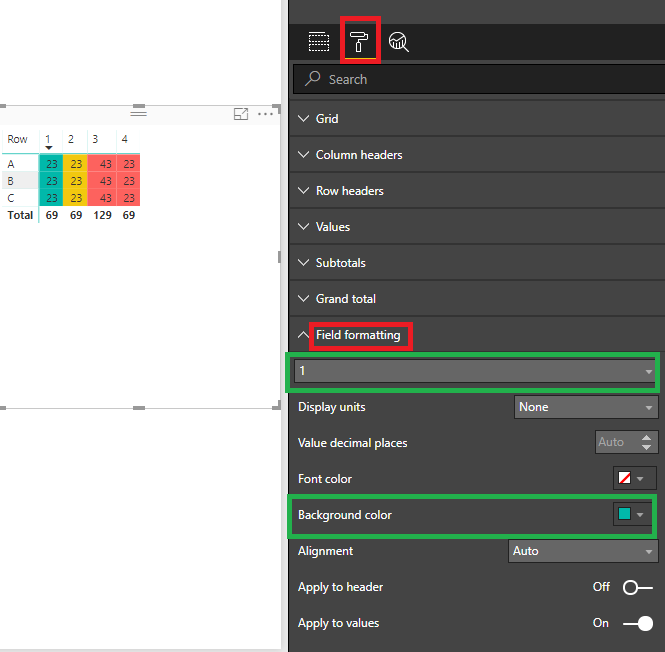
By my test, you could use the feature Field formatting under format pane like below.
You could select the Field and set the background color.
Hope this can help you! More details you could refer to the attachment.
Best Regards,
Cherry
If this post helps, then please consider Accept it as the solution to help the other members find it more quickly.
- Mark as New
- Bookmark
- Subscribe
- Mute
- Subscribe to RSS Feed
- Permalink
- Report Inappropriate Content
Thank you for the response. It is my fault that I did not say this before, but there is a column series that buckets out each amount. So unlike in your example where there are 4 different columns, I want to be able to format it based on the value in the column series. Is it possible to do it that way, or is my only option to create a "summarization" table that lists the values in seperate columns? I can not seem to post a photo so I will try and show you below what my visualization pane looks like.
Rows
Names
Columns
Age Bucket (4 Options)
Values
Quantity
Dollar Value
What I am aiming for is the first age bucket being green, the second being yellow, and the others being red.
- Mark as New
- Bookmark
- Subscribe
- Mute
- Subscribe to RSS Feed
- Permalink
- Report Inappropriate Content
Hi @Javerbuch,
For your scenario, why not pivot your column Age Bucket (4 Options)? If you pivot the column that should be easier to set the background of the value like I have mentioned for the first reply.
If you want to pivot the column, you could click Column1 and select Pivot column with value likw below in Query Editor. Then you could create the martrix and set the value background as I first reply.
Best Regards,
Cherry
If this post helps, then please consider Accept it as the solution to help the other members find it more quickly.
Helpful resources

Microsoft Fabric Learn Together
Covering the world! 9:00-10:30 AM Sydney, 4:00-5:30 PM CET (Paris/Berlin), 7:00-8:30 PM Mexico City

Power BI Monthly Update - April 2024
Check out the April 2024 Power BI update to learn about new features.

| User | Count |
|---|---|
| 111 | |
| 100 | |
| 80 | |
| 64 | |
| 58 |
| User | Count |
|---|---|
| 148 | |
| 111 | |
| 93 | |
| 84 | |
| 66 |


