- Power BI forums
- Updates
- News & Announcements
- Get Help with Power BI
- Desktop
- Service
- Report Server
- Power Query
- Mobile Apps
- Developer
- DAX Commands and Tips
- Custom Visuals Development Discussion
- Health and Life Sciences
- Power BI Spanish forums
- Translated Spanish Desktop
- Power Platform Integration - Better Together!
- Power Platform Integrations (Read-only)
- Power Platform and Dynamics 365 Integrations (Read-only)
- Training and Consulting
- Instructor Led Training
- Dashboard in a Day for Women, by Women
- Galleries
- Community Connections & How-To Videos
- COVID-19 Data Stories Gallery
- Themes Gallery
- Data Stories Gallery
- R Script Showcase
- Webinars and Video Gallery
- Quick Measures Gallery
- 2021 MSBizAppsSummit Gallery
- 2020 MSBizAppsSummit Gallery
- 2019 MSBizAppsSummit Gallery
- Events
- Ideas
- Custom Visuals Ideas
- Issues
- Issues
- Events
- Upcoming Events
- Community Blog
- Power BI Community Blog
- Custom Visuals Community Blog
- Community Support
- Community Accounts & Registration
- Using the Community
- Community Feedback
Register now to learn Fabric in free live sessions led by the best Microsoft experts. From Apr 16 to May 9, in English and Spanish.
- Power BI forums
- Forums
- Get Help with Power BI
- Desktop
- Re: Format bar chart bar's to the left
- Subscribe to RSS Feed
- Mark Topic as New
- Mark Topic as Read
- Float this Topic for Current User
- Bookmark
- Subscribe
- Printer Friendly Page
- Mark as New
- Bookmark
- Subscribe
- Mute
- Subscribe to RSS Feed
- Permalink
- Report Inappropriate Content
Format bar chart bar's to the left
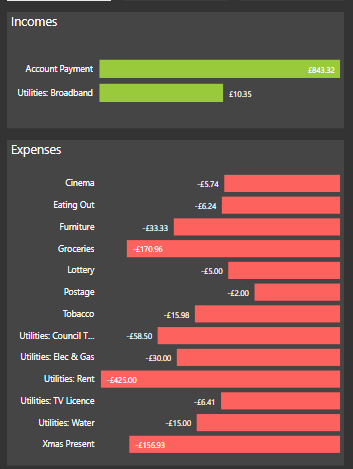
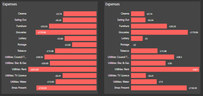
I have two bar charts, I want the bottom one to be formatted, so that the bars start on the left, like the top bar chart is.
I understand why it starts from the right, because those figures are all negative, but I need it to be from the right like the top bar graph, but with the figures staying as negative.
It currently looks like this:
Does anyone know how I can do this?
I should also mention that the labels need to stay on the left.
Solved! Go to Solution.
- Mark as New
- Bookmark
- Subscribe
- Mute
- Subscribe to RSS Feed
- Permalink
- Report Inappropriate Content
@Anonymous
ahhh... those pesky pence causing a nuisance...😊
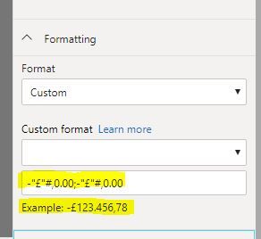
Try typing in: -"£"#,0.00;-"£"#,0.00
(the thousands and decimal seperators shown in the example value in my case correspond to the spanish definition (my pc local settings) so just ignore them; it should render as "," for thousands and "." for decimals for you - in other words, respecting your local settings.
Did I answer your question? Mark my post as a solution!
In doing so, you are also helping me. Thank you!
Proud to be a Super User!
Paul on Linkedin.
- Mark as New
- Bookmark
- Subscribe
- Mute
- Subscribe to RSS Feed
- Permalink
- Report Inappropriate Content
@Anonymous
One method is:
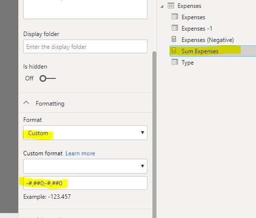
1) make your measure into positive values (measure *-1)
2) go into the modeling pane, select the measure, go to the format option, choose custom in the dropdown, and format the values to display negative values:
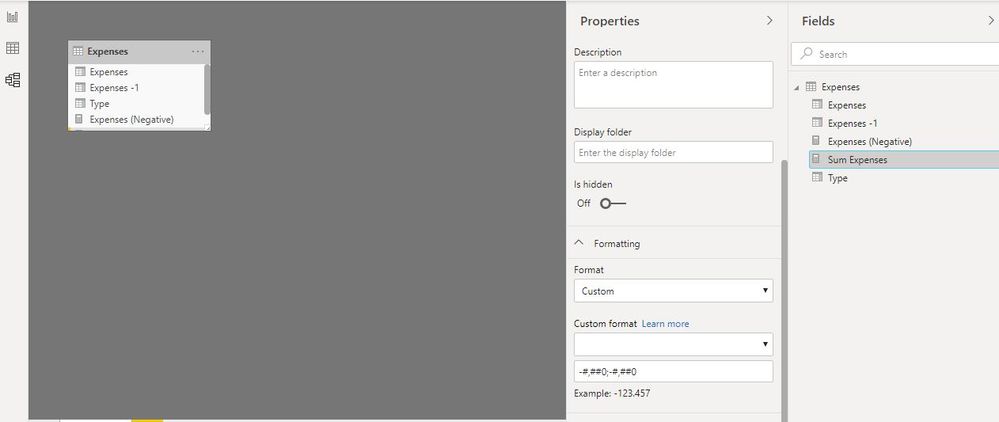
Format values to display negative values:
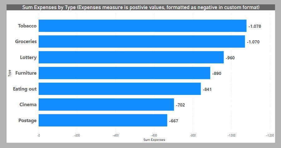
and you can now create your bar chart:
Just beware that the measure format remains wherever you use this measure!
Did I answer your question? Mark my post as a solution!
In doing so, you are also helping me. Thank you!
Proud to be a Super User!
Paul on Linkedin.
- Mark as New
- Bookmark
- Subscribe
- Mute
- Subscribe to RSS Feed
- Permalink
- Report Inappropriate Content
Were almost there, the right graph is the new one:
I changed the format to: -£#,##.##;-£#,##.##
But as you can see in the image, when the sum doesn't have any pence at the end, it just shows £15 instead of £15.00, any idea how I sort that?
- Mark as New
- Bookmark
- Subscribe
- Mute
- Subscribe to RSS Feed
- Permalink
- Report Inappropriate Content
@Anonymous
ahhh... those pesky pence causing a nuisance...😊
Try typing in: -"£"#,0.00;-"£"#,0.00
(the thousands and decimal seperators shown in the example value in my case correspond to the spanish definition (my pc local settings) so just ignore them; it should render as "," for thousands and "." for decimals for you - in other words, respecting your local settings.
Did I answer your question? Mark my post as a solution!
In doing so, you are also helping me. Thank you!
Proud to be a Super User!
Paul on Linkedin.
- Mark as New
- Bookmark
- Subscribe
- Mute
- Subscribe to RSS Feed
- Permalink
- Report Inappropriate Content
Were almost there, the right graph is the new one:
I changed the format to: -£#,##.##;-£#,##.##
But as you can see in the image, when the sum doesn't have any pence at the end, it just shows £15 instead of £15.00, any idea how I sort that?
- Mark as New
- Bookmark
- Subscribe
- Mute
- Subscribe to RSS Feed
- Permalink
- Report Inappropriate Content
Have you considered using a function like ABS() in a query to change all the numbers to positive ones. The label says "Expenses" and you could keep the red color.
I'm a personal Power Bi Trainer I learn something every time I answer a question
The Golden Rules for Power BI
- Use a Calendar table. A custom Date tables is preferable to using the automatic date/time handling capabilities of Power BI. https://www.youtube.com/watch?v=FxiAYGbCfAQ
- Build your data model as a Star Schema. Creating a star schema in Power BI is the best practice to improve performance and more importantly, to ensure accurate results! https://www.youtube.com/watch?v=1Kilya6aUQw
- Use a small set up sample data when developing. When building your measures and calculated columns always use a small amount of sample data so that it will be easier to confirm that you are getting the right numbers.
- Store all your intermediate calculations in VARs when you’re writing measures. You can return these intermediate VARs instead of your final result to check on your steps along the way.
Did this post answer your question? Mark it as a solution so others can find it!
Help when you know. Ask when you don't!
Join the conversation at We Talk BI find out more about me at Slow BI
- Mark as New
- Bookmark
- Subscribe
- Mute
- Subscribe to RSS Feed
- Permalink
- Report Inappropriate Content
I condsidered this, but for other items on the page, they need to be shown as negatives, so ABS isnt the right solution for me on this.
- Mark as New
- Bookmark
- Subscribe
- Mute
- Subscribe to RSS Feed
- Permalink
- Report Inappropriate Content
you can use 2 columns, one that shows positive, one that shows negative... then insert the positive column only for this graphic.
Did this post answer your question? Mark it as a solution so others can find it!
Help when you know. Ask when you don't!
Join the conversation at We Talk BI find out more about me at Slow BI
- Mark as New
- Bookmark
- Subscribe
- Mute
- Subscribe to RSS Feed
- Permalink
- Report Inappropriate Content
Im not sure what you mean sorry?
- Mark as New
- Bookmark
- Subscribe
- Mute
- Subscribe to RSS Feed
- Permalink
- Report Inappropriate Content
you can have the same number in the table in 2 columns, one with minus, one plus
each graphic on the report has its own list of columns it displays. where you need to display the minus numbers, use the column with the minus version of the number
Did this post answer your question? Mark it as a solution so others can find it!
Help when you know. Ask when you don't!
Join the conversation at We Talk BI find out more about me at Slow BI
Helpful resources

Microsoft Fabric Learn Together
Covering the world! 9:00-10:30 AM Sydney, 4:00-5:30 PM CET (Paris/Berlin), 7:00-8:30 PM Mexico City

Power BI Monthly Update - April 2024
Check out the April 2024 Power BI update to learn about new features.

| User | Count |
|---|---|
| 113 | |
| 99 | |
| 80 | |
| 70 | |
| 59 |
| User | Count |
|---|---|
| 149 | |
| 114 | |
| 107 | |
| 89 | |
| 67 |
