- Power BI forums
- Updates
- News & Announcements
- Get Help with Power BI
- Desktop
- Service
- Report Server
- Power Query
- Mobile Apps
- Developer
- DAX Commands and Tips
- Custom Visuals Development Discussion
- Health and Life Sciences
- Power BI Spanish forums
- Translated Spanish Desktop
- Power Platform Integration - Better Together!
- Power Platform Integrations (Read-only)
- Power Platform and Dynamics 365 Integrations (Read-only)
- Training and Consulting
- Instructor Led Training
- Dashboard in a Day for Women, by Women
- Galleries
- Community Connections & How-To Videos
- COVID-19 Data Stories Gallery
- Themes Gallery
- Data Stories Gallery
- R Script Showcase
- Webinars and Video Gallery
- Quick Measures Gallery
- 2021 MSBizAppsSummit Gallery
- 2020 MSBizAppsSummit Gallery
- 2019 MSBizAppsSummit Gallery
- Events
- Ideas
- Custom Visuals Ideas
- Issues
- Issues
- Events
- Upcoming Events
- Community Blog
- Power BI Community Blog
- Custom Visuals Community Blog
- Community Support
- Community Accounts & Registration
- Using the Community
- Community Feedback
Register now to learn Fabric in free live sessions led by the best Microsoft experts. From Apr 16 to May 9, in English and Spanish.
- Power BI forums
- Forums
- Get Help with Power BI
- Desktop
- Re: Force Single Y axis on combination charts
- Subscribe to RSS Feed
- Mark Topic as New
- Mark Topic as Read
- Float this Topic for Current User
- Bookmark
- Subscribe
- Printer Friendly Page
- Mark as New
- Bookmark
- Subscribe
- Mute
- Subscribe to RSS Feed
- Permalink
- Report Inappropriate Content
Force Single Y axis on combination charts
I have a bar/line combo chart. I want to force the visual to ONLY use a single Y axis. Can I force this behavior?
Right now when I hide the second axis, it doesn’t change the chart. For example, I will have a line value of -1 M and a bar value of 100K. In this scenario two axes are used. I choose to not display the second axis and the line doesn’t change relative to the bar. So now I have a y axis that goes to 150K or so and a -1M line value that appears to be within that range. This is very confusing. So I have to display both axes for the visual to make sense.
- Mark as New
- Bookmark
- Subscribe
- Mute
- Subscribe to RSS Feed
- Permalink
- Report Inappropriate Content
I have found a solution. However it is rather complicated!
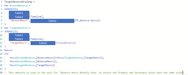
I have used the custom formula for the maximum on each of the axies.
I created a measure which calculated the maximum value for bar and line values and then prints the higher value therefore alsways printing the highest number shown on the graph:
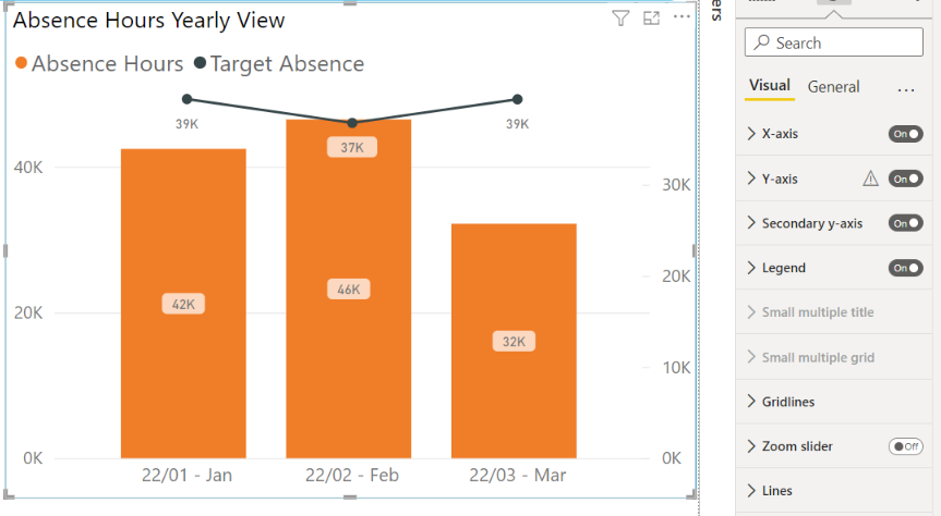
Then I call this in the formula section on both Primary and Secondary axies. As you can see below, this has worked for me...
- Mark as New
- Bookmark
- Subscribe
- Mute
- Subscribe to RSS Feed
- Permalink
- Report Inappropriate Content
Hi, I have same issue but this is on version Feb 22 and they don't seem to have this option.
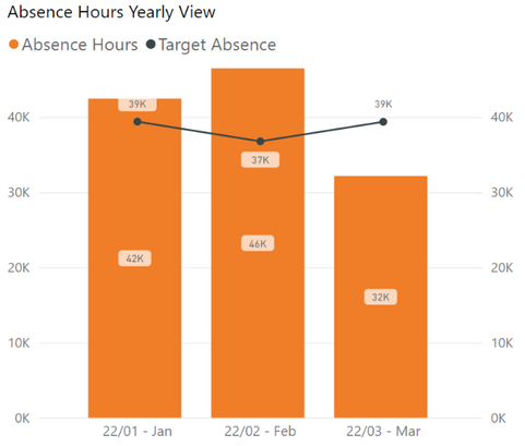
This is my graph and as you can see it would be better represented if it used one axis for both fields.
The only thing I could find is the on/off function for the secondary axis and all this does is hide it - this is USELESS!
Is there a way of forcing them to both use the same axis or ensure that both Primary and Secondary axies will always have the same scaling?
- Mark as New
- Bookmark
- Subscribe
- Mute
- Subscribe to RSS Feed
- Permalink
- Report Inappropriate Content
For people still facing this problem i have found a solution !
1. Under "Y Axis" in format pane , you will see an option "Show Secondary". It will be defaultly in "Off" position even though a secondary axis is visible.
2. Here is the important part, switch the "Show Secondary' switch to "On"position and back to "Off" position. This will trigger the power bi visual to remove the secondary axis.
Power BI team should work on automatically switching the "Show secondary" switch to "On" position when a secondary axis is shown. But we manually switching it On/Off is triggering the required actions.
Hope this helps! Mark this as solution to help others.
Thanks,
Hanson
- Mark as New
- Bookmark
- Subscribe
- Mute
- Subscribe to RSS Feed
- Permalink
- Report Inappropriate Content
Thanks, Hanson. That worked perfectly for me. I've been using MS tools long enough - I should have thought of this!
- Mark as New
- Bookmark
- Subscribe
- Mute
- Subscribe to RSS Feed
- Permalink
- Report Inappropriate Content
Exact same problem. Plus, it is also a problem that it is unpredictable. On the desktop version, when I use "column series" for the bar part, and use the individuals series for the lines, the chart always shares one Y axis. The same report, once uploaded on the service, unpredictably show one or two axis depending on the selection, and it is not clear the criteria followed.
- Mark as New
- Bookmark
- Subscribe
- Mute
- Subscribe to RSS Feed
- Permalink
- Report Inappropriate Content
For people still facing this problem i have found a solution !
1. Under "Y Axis" in format pane , you will see an option "Show Secondary". It will be defaultly in "Off" position even though a secondary axis is visible.
2. Here is the important part, switch the "Show Secondary' switch to "On"position and back to "Off" position. This will trigger the power bi visual to remove the secondary axis.
Power BI team should work on automatically switching the "Show secondary" switch to "On" position when a secondary axis is shown. But we manually switching it On/Off is triggering the required actions.
Hope this helps! Mark this as solution to help others.
Thanks,
Hanson
- Mark as New
- Bookmark
- Subscribe
- Mute
- Subscribe to RSS Feed
- Permalink
- Report Inappropriate Content
awesome! thanks. I will give it a try! At the moment I had to add "ghost" bars to the max values of the data from both axis to "trick" the invisible secondary axis to be on the same range as the primary. I'll confirm if it works.
- Mark as New
- Bookmark
- Subscribe
- Mute
- Subscribe to RSS Feed
- Permalink
- Report Inappropriate Content
I am running into similar issue, in fact, this has got much worse with Zoom Slider.
The Zoom slider only zooms into the bars leaving behind the line plot at it's original position, making it look very weird.
No matter what I try, the line curve just doesn't use the same primary axis of bars, even though in my case the numbers for line curve are nearly of similar order than of bars.
Can anyone suggest how to enforce same Y-axis to be used by line curve as bars in Clustered Column Chart?
Turning off Secondary Axis does not help
I cannot fix min-max because there are many slicers and depending on which slicer one may choose, the numbers will change (still of similar order for line curve with bars/columns)
- Mark as New
- Bookmark
- Subscribe
- Mute
- Subscribe to RSS Feed
- Permalink
- Report Inappropriate Content
I just came across this question. it's quite old, but still not answered...
i found a sollution. What I did is:
1. Enabled secondary axis
2. checked alligne 0s setting
3. changed the range of my secondary axis to the min and max value of the primary y axis.
4. disabled secondary axis.
After these steps the problem was solved.
hope it helps someone
- Mark as New
- Bookmark
- Subscribe
- Mute
- Subscribe to RSS Feed
- Permalink
- Report Inappropriate Content
Hi,
I'd like to bring this topic back to life because mentioned solution with aligning zeroes and axis range to min and max values of first axis by hand will work when You have just one thing to show. In my case though it is more tricky: I'm presenting measurements of different substances which have different units of measure on bars (one can be in mililiters, other in micrometers or something else; axis for one can span to thousands of units, for other tenth part of unit), line is used to present some limit value (like industry standard) to identify which samples exceeds this standard.
So I need a way to adjust axis for line and bar chart to sale scale every time someone pick a substance.
- Mark as New
- Bookmark
- Subscribe
- Mute
- Subscribe to RSS Feed
- Permalink
- Report Inappropriate Content
I have the same problem, even if I use slicers the filter the report.
Is there a solution to set the primary and the secondary y axis to display the same range? Even when I use slicers and the range changes.
Thank you.
Helpful resources

Microsoft Fabric Learn Together
Covering the world! 9:00-10:30 AM Sydney, 4:00-5:30 PM CET (Paris/Berlin), 7:00-8:30 PM Mexico City

Power BI Monthly Update - April 2024
Check out the April 2024 Power BI update to learn about new features.

| User | Count |
|---|---|
| 111 | |
| 100 | |
| 80 | |
| 64 | |
| 58 |
| User | Count |
|---|---|
| 146 | |
| 110 | |
| 93 | |
| 84 | |
| 67 |


