- Power BI forums
- Updates
- News & Announcements
- Get Help with Power BI
- Desktop
- Service
- Report Server
- Power Query
- Mobile Apps
- Developer
- DAX Commands and Tips
- Custom Visuals Development Discussion
- Health and Life Sciences
- Power BI Spanish forums
- Translated Spanish Desktop
- Power Platform Integration - Better Together!
- Power Platform Integrations (Read-only)
- Power Platform and Dynamics 365 Integrations (Read-only)
- Training and Consulting
- Instructor Led Training
- Dashboard in a Day for Women, by Women
- Galleries
- Community Connections & How-To Videos
- COVID-19 Data Stories Gallery
- Themes Gallery
- Data Stories Gallery
- R Script Showcase
- Webinars and Video Gallery
- Quick Measures Gallery
- 2021 MSBizAppsSummit Gallery
- 2020 MSBizAppsSummit Gallery
- 2019 MSBizAppsSummit Gallery
- Events
- Ideas
- Custom Visuals Ideas
- Issues
- Issues
- Events
- Upcoming Events
- Community Blog
- Power BI Community Blog
- Custom Visuals Community Blog
- Community Support
- Community Accounts & Registration
- Using the Community
- Community Feedback
Register now to learn Fabric in free live sessions led by the best Microsoft experts. From Apr 16 to May 9, in English and Spanish.
- Power BI forums
- Forums
- Get Help with Power BI
- Desktop
- Focus on a time period selected by clicking the 2 ...
- Subscribe to RSS Feed
- Mark Topic as New
- Mark Topic as Read
- Float this Topic for Current User
- Bookmark
- Subscribe
- Printer Friendly Page
- Mark as New
- Bookmark
- Subscribe
- Mute
- Subscribe to RSS Feed
- Permalink
- Report Inappropriate Content
Focus on a time period selected by clicking the 2 endpoints
Hi,
Is it possible to "zoom" in between a specific period of time in a line chart?
For example.: data is between 2019.01.01 - 2019.12.31.
I would like to click on 2019.05.15 and 2019.05.25 on a chart and it'll just filter out those dates that are between them.
Thank you,
Gabor
- Mark as New
- Bookmark
- Subscribe
- Mute
- Subscribe to RSS Feed
- Permalink
- Report Inappropriate Content
Hi @Gaborfromungarn,
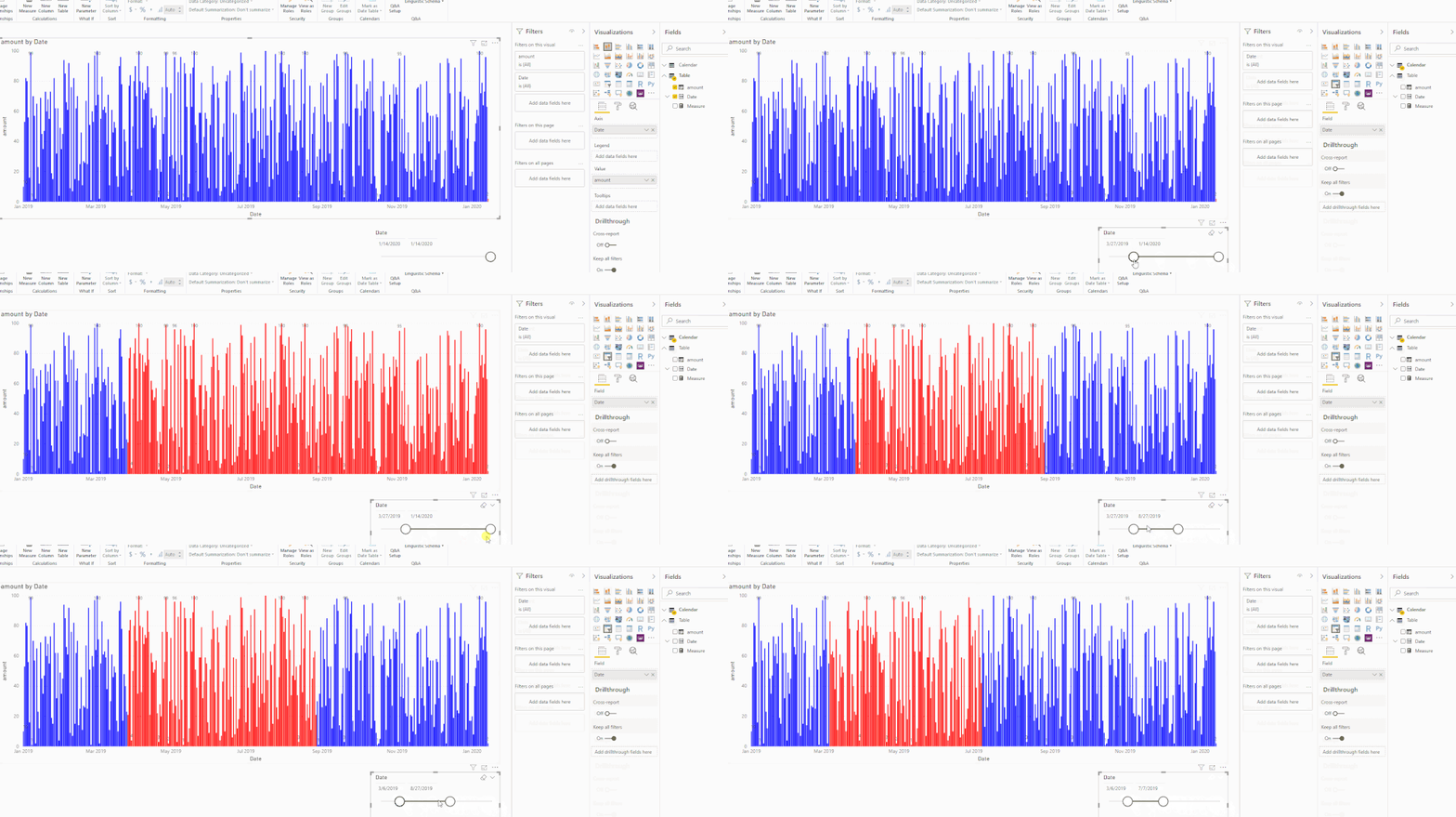
Based on my test, it is impossible to achieve focus or highlight effect on line chart, you can use other type charts(column, bar charts) to achieve your requirement.
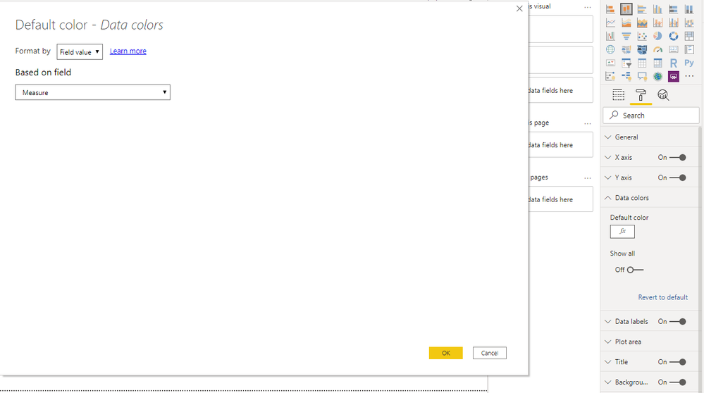
I'd like to suggest you create a new calendar table without relationship to original table records(use new calendar date as source slicer), then you can write a measure to compare selected date range and current table date and return conditional colors and enable conditional formatting on 'data color'.
Measure =
IF ( MAX ( 'Table'[Date] ) IN ALLSELECTED ( 'Calendar'[Date] ), "red", "blue" )
Result:
Regards,
Xiaoxin Sheng
If this post helps, please consider accept as solution to help other members find it more quickly.
- Mark as New
- Bookmark
- Subscribe
- Mute
- Subscribe to RSS Feed
- Permalink
- Report Inappropriate Content
Hi @Gaborfromungarn ,
As far as I know, the basic line chart don't have this filter function.
I'm not sure whether you know the basic "slicer" visualization of DATE type has this function.
You can try to create a slicer, then put your date column into it.
Then you can choose the type of slice to "BETWEEN" by clicking the "DOWN" button on the right top of the slicer.
Hope that can solve your problem.
Aiolos Zhao
Did I answer your question? Mark my post as a solution!
Proud to be a Super User!
- Mark as New
- Bookmark
- Subscribe
- Mute
- Subscribe to RSS Feed
- Permalink
- Report Inappropriate Content
Hi,
I understand that the slicer could solve the technical part of filtering,
however I might need an alternative chart that can solve this issue.
Are there any chart types that I can use?
Thank you,
Gabor
Helpful resources

Microsoft Fabric Learn Together
Covering the world! 9:00-10:30 AM Sydney, 4:00-5:30 PM CET (Paris/Berlin), 7:00-8:30 PM Mexico City

Power BI Monthly Update - April 2024
Check out the April 2024 Power BI update to learn about new features.

| User | Count |
|---|---|
| 117 | |
| 105 | |
| 69 | |
| 67 | |
| 43 |
| User | Count |
|---|---|
| 148 | |
| 103 | |
| 103 | |
| 88 | |
| 66 |


