- Power BI forums
- Updates
- News & Announcements
- Get Help with Power BI
- Desktop
- Service
- Report Server
- Power Query
- Mobile Apps
- Developer
- DAX Commands and Tips
- Custom Visuals Development Discussion
- Health and Life Sciences
- Power BI Spanish forums
- Translated Spanish Desktop
- Power Platform Integration - Better Together!
- Power Platform Integrations (Read-only)
- Power Platform and Dynamics 365 Integrations (Read-only)
- Training and Consulting
- Instructor Led Training
- Dashboard in a Day for Women, by Women
- Galleries
- Community Connections & How-To Videos
- COVID-19 Data Stories Gallery
- Themes Gallery
- Data Stories Gallery
- R Script Showcase
- Webinars and Video Gallery
- Quick Measures Gallery
- 2021 MSBizAppsSummit Gallery
- 2020 MSBizAppsSummit Gallery
- 2019 MSBizAppsSummit Gallery
- Events
- Ideas
- Custom Visuals Ideas
- Issues
- Issues
- Events
- Upcoming Events
- Community Blog
- Power BI Community Blog
- Custom Visuals Community Blog
- Community Support
- Community Accounts & Registration
- Using the Community
- Community Feedback
Register now to learn Fabric in free live sessions led by the best Microsoft experts. From Apr 16 to May 9, in English and Spanish.
- Power BI forums
- Forums
- Get Help with Power BI
- Desktop
- Re: Flexible line chart x-axis
- Subscribe to RSS Feed
- Mark Topic as New
- Mark Topic as Read
- Float this Topic for Current User
- Bookmark
- Subscribe
- Printer Friendly Page
- Mark as New
- Bookmark
- Subscribe
- Mute
- Subscribe to RSS Feed
- Permalink
- Report Inappropriate Content
Flexible line chart x-axis
What I am trying to do is provide a supervisor with one chart that compares Revenue YTD. Two lines should be plottedl 2015 and 2016.
I have the measures and I can plot this chart without issue. My challenge is making the x-axis behave as requested
By default the x axis should be listed based on days however they would like to have two sets of filters available to him; Months and Quarters.
Therefore:
Years
When a year is selected the x-axis would show months but the lines would be plotted based on days.
I can get this to work as a standalone chart.
Quarters
When a quarter is selected the x-axis narrows to that selected 90 day period but the label on the x-axis shows Months (even though it is calcualted on days).
I can get this to work fine as an individual chart.
Correction. I cannot actually get this to work, it was working only when I used a single year and had date as the x-axis. Power BI automatically converted the dates to months to make the chart more readable however I cannot use a 'date' column as it create a continuous line rather than two lines on-top of each other.
Months
If a month is selected it narrows to those 28-31 days selected. The x-axis woudl then show labels for individual dates.
Again, I can build this chart as stand-alone chart. My question is whether it is possible to build a single flexible chart where the axis switches based on the filter so that it meets both requested behaviours.
The alternative is obviously to have multiple charts but curious as to whether the above can be achieved.
- Mark as New
- Bookmark
- Subscribe
- Mute
- Subscribe to RSS Feed
- Permalink
- Report Inappropriate Content
@maracles - Can you drag your Year, Month and Day columns into a hierarchy in the X-Axis and use drilldown? Well, I guess that won't work on a line chart, you'd have to go with Column chart. OK, correction, you could possibly use the combined column/line chart and just not have a value for Column, only for Line.
@ me in replies or I'll lose your thread!!!
Instead of a Kudo, please vote for this idea
Become an expert!: Enterprise DNA
External Tools: MSHGQM
YouTube Channel!: Microsoft Hates Greg
Latest book!: The Definitive Guide to Power Query (M)
DAX is easy, CALCULATE makes DAX hard...
- Mark as New
- Bookmark
- Subscribe
- Mute
- Subscribe to RSS Feed
- Permalink
- Report Inappropriate Content
I was hoping for something like this which is how I would do it in Excel, howeve Power BI doesn't appear to allow that functionality. I can only add one dimension to the x-axis, I cannot layer them.
If I allow PowerBI to implement its own heirachy which is what happens when you try to use the 'date' dimension it simply makes a continuous line.
Everything works if I use Day of Year, but this just isn't friendly enough to interpret apparently. I'm looking for an alternative.
- Mark as New
- Bookmark
- Subscribe
- Mute
- Subscribe to RSS Feed
- Permalink
- Report Inappropriate Content
@maracles - Try the combined Column and Line chart, that allows you to have your own hierarchy and it works for a line graphic, just don't put anything in your Column area.
@ me in replies or I'll lose your thread!!!
Instead of a Kudo, please vote for this idea
Become an expert!: Enterprise DNA
External Tools: MSHGQM
YouTube Channel!: Microsoft Hates Greg
Latest book!: The Definitive Guide to Power Query (M)
DAX is easy, CALCULATE makes DAX hard...
- Mark as New
- Bookmark
- Subscribe
- Mute
- Subscribe to RSS Feed
- Permalink
- Report Inappropriate Content
@maracles @Greg_Deckler Even if this is the expertise of @SqlJason and probably have a better solution this is what I came up.
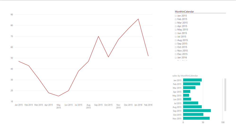
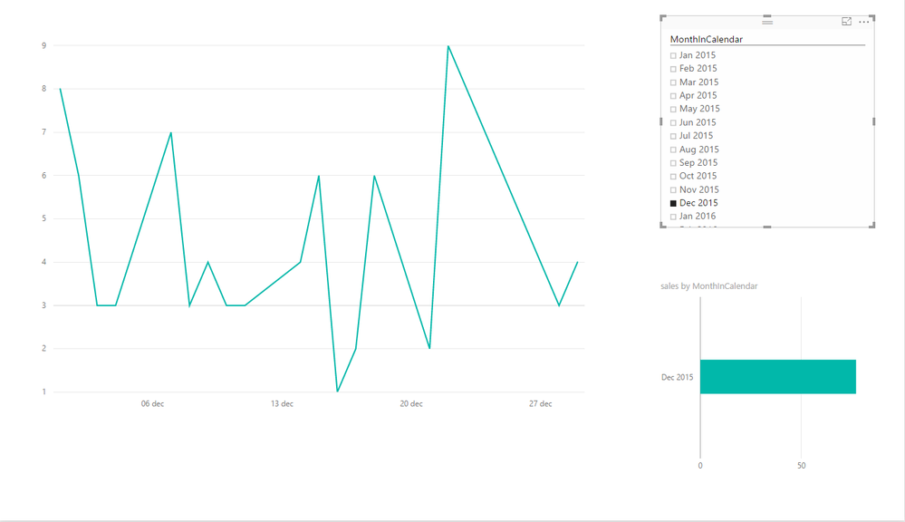
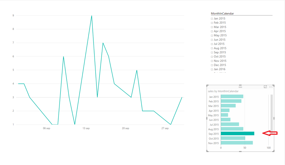
@maracles You are right on needing two charts the one over the other. When you select a single month the days chart will show and if there are multiple ( meaning no filter or more selected than one ) the other visual with show up.
Let's start.
Assumimng you are using a calendar/date table as dimension.
Assuming that the measure you display called [Sales]
Create one line chart and add months ( I use MonthInCalendar column i.e "Jan 2015" ) in axis..
Create second line chart and add days ( I use Datekey column ) in axis.. ( or copy the first one so you have the same formating & size )
Remove titles.
In the first chart ( months ) add the following measure
Axis Months =

VAR AllMonths =
CALCULATE (
DISTINCTCOUNT ( 'Calendar'[MonthInCalendar] );
ALLSELECTED ( 'Calendar' )
)

VAR Months =
DISTINCTCOUNT ( 'Calendar'[MonthInCalendar] )

RETURN
IF ( Months <> AllMonths; [Sales] )
Variable Months always return 1 since the current filter context is one month due to months in axis.
Variable Allmonths returns the number of months in calendar table ignoring the current filter context months in axis ) BUT not any other filter we select outside the graph..( not preciesly - from more details check ALLSELCTED() http://www.sqlbi.com/articles/understanding-allselected/
Result if we don't select one month in a slicer or other chart our line will be visible...If we select one then the chart shows nothing...Cool
Now in the second chart (days ) add the following
Axis Days=

VAR AllMonths =
CALCULATE (
DISTINCTCOUNT ( 'Calendar'[MonthInCalendar] );
ALLSELECTED ( 'Calendar' )
)

VAR Months =
DISTINCTCOUNT ( 'Calendar'[MonthInCalendar] )

RETURN
IF ( Months = AllMonths; [Sales] )
The same as the previous but know the line is visible only if we have a month selected in slicer or other chart. (due to the Moths = Allmonths)
Now put one into other so it looks like one. Depending what you select in months one of them will be visible ,mimic the change in axis.
(red months in axis - green days in axis )
Plus : You can change color in one graph or other attributes the change in axis is more visible
Minus: when you hoove over with the mouse tooltip only appears for the chart the Z-Score in the front and when this is blank hoovering over blurs the chart.
Hope this can work for you..
P.S. I did enjoy trying to fing the workaround
- Mark as New
- Bookmark
- Subscribe
- Mute
- Subscribe to RSS Feed
- Permalink
- Report Inappropriate Content
Thanks Konstantinos for taking the time to look into this. I was actually hoping to have both years plotted on a single chart rather than one split, I am however going to explore your suggestions as it may be another way of achieveing what we are looking for. Before I can try out your method I am actualy having a different line chart related issue that I am about to post about. Will update this post once I have tested it though.
Helpful resources

Microsoft Fabric Learn Together
Covering the world! 9:00-10:30 AM Sydney, 4:00-5:30 PM CET (Paris/Berlin), 7:00-8:30 PM Mexico City

Power BI Monthly Update - April 2024
Check out the April 2024 Power BI update to learn about new features.

| User | Count |
|---|---|
| 111 | |
| 97 | |
| 80 | |
| 69 | |
| 59 |
| User | Count |
|---|---|
| 150 | |
| 119 | |
| 104 | |
| 87 | |
| 67 |


