- Power BI forums
- Updates
- News & Announcements
- Get Help with Power BI
- Desktop
- Service
- Report Server
- Power Query
- Mobile Apps
- Developer
- DAX Commands and Tips
- Custom Visuals Development Discussion
- Health and Life Sciences
- Power BI Spanish forums
- Translated Spanish Desktop
- Power Platform Integration - Better Together!
- Power Platform Integrations (Read-only)
- Power Platform and Dynamics 365 Integrations (Read-only)
- Training and Consulting
- Instructor Led Training
- Dashboard in a Day for Women, by Women
- Galleries
- Community Connections & How-To Videos
- COVID-19 Data Stories Gallery
- Themes Gallery
- Data Stories Gallery
- R Script Showcase
- Webinars and Video Gallery
- Quick Measures Gallery
- 2021 MSBizAppsSummit Gallery
- 2020 MSBizAppsSummit Gallery
- 2019 MSBizAppsSummit Gallery
- Events
- Ideas
- Custom Visuals Ideas
- Issues
- Issues
- Events
- Upcoming Events
- Community Blog
- Power BI Community Blog
- Custom Visuals Community Blog
- Community Support
- Community Accounts & Registration
- Using the Community
- Community Feedback
Register now to learn Fabric in free live sessions led by the best Microsoft experts. From Apr 16 to May 9, in English and Spanish.
- Power BI forums
- Forums
- Get Help with Power BI
- Desktop
- Re: Flag or highlight row across several columns i...
- Subscribe to RSS Feed
- Mark Topic as New
- Mark Topic as Read
- Float this Topic for Current User
- Bookmark
- Subscribe
- Printer Friendly Page
- Mark as New
- Bookmark
- Subscribe
- Mute
- Subscribe to RSS Feed
- Permalink
- Report Inappropriate Content
Flag or highlight row across several columns in table based on value condition
Hello,
I have the following table and i want to flag or highlight the entire row if the number of Sold items are 90% or more of Stock items. I used a calculated column for the Difference column in a table visualization. Any help is much appreciated!
| Week number | Stock | Sold | Difference |
| 1 | 121 | 89 | 32 |
| 2 | 212 | 200 | 12 |
| 3 | 142 | 105 | 37 |
| 4 | 846 | 845 | 1 |
| 5 | 552 | 500 | 52 |
| 6 | 231 | 31 | 200 |
| 7 | 514 | 51 | 463 |
| 8 | 874 | 551 | 323 |
| 9 | 548 | 84 | 464 |
| 10 | 152 | 54 | 98 |
| 11 | 516 | 156 | 360 |
| 12 | 614 | 614 | 0 |
Solved! Go to Solution.
- Mark as New
- Bookmark
- Subscribe
- Mute
- Subscribe to RSS Feed
- Permalink
- Report Inappropriate Content
Create a measure to use for the conditional formatting along the lines of:
flag =
VAR _Threshold = DIVIDE(SUM(Table[Sold]), SUM(Table[Stock]))
RETURN
IF(_Threshold >= 0.9, "Red")
Select each field and add the conditional formatting using the option of "Field value" and selecting the [flag] measure
You will need to use the measure for the conditional formatting for each column and in the table visual
Did I answer your question? Mark my post as a solution!
In doing so, you are also helping me. Thank you!
Proud to be a Super User!
Paul on Linkedin.
- Mark as New
- Bookmark
- Subscribe
- Mute
- Subscribe to RSS Feed
- Permalink
- Report Inappropriate Content
@PaulDBrown Thanks for your reply! It works. But as an improvement, could you please advise how to make it work as follows for the "Difference" column, based on the following rules:
1. If the number of Sold items are less than 50% of Stock items, then green icon.
2. If the number of Sold items is at least 50% but less than 90% of Stock items, then yellow icon.
3. If the number of Sold items is 90% or greater than Stock items, then red icon.
- Mark as New
- Bookmark
- Subscribe
- Mute
- Subscribe to RSS Feed
- Permalink
- Report Inappropriate Content
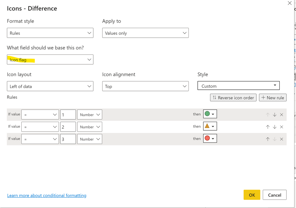
Use this measure with the conditional formatting for icons:
Icon flag =
VAR _Threshold =
    DIVIDE ( SUM ( 'Table'[Sold] ), SUM ( 'Table'[Stock] ) )
RETURN
    SWITCH ( TRUE (),
_Threshold < 0.5, 1,
_Threshold < 0.9, 2,
3 )
Use it for the Difference field
Did I answer your question? Mark my post as a solution!
In doing so, you are also helping me. Thank you!
Proud to be a Super User!
Paul on Linkedin.
Helpful resources

Microsoft Fabric Learn Together
Covering the world! 9:00-10:30 AM Sydney, 4:00-5:30 PM CET (Paris/Berlin), 7:00-8:30 PM Mexico City

Power BI Monthly Update - April 2024
Check out the April 2024 Power BI update to learn about new features.

| User | Count |
|---|---|
| 107 | |
| 99 | |
| 78 | |
| 64 | |
| 58 |
| User | Count |
|---|---|
| 148 | |
| 111 | |
| 94 | |
| 84 | |
| 67 |


