- Power BI forums
- Updates
- News & Announcements
- Get Help with Power BI
- Desktop
- Service
- Report Server
- Power Query
- Mobile Apps
- Developer
- DAX Commands and Tips
- Custom Visuals Development Discussion
- Health and Life Sciences
- Power BI Spanish forums
- Translated Spanish Desktop
- Power Platform Integration - Better Together!
- Power Platform Integrations (Read-only)
- Power Platform and Dynamics 365 Integrations (Read-only)
- Training and Consulting
- Instructor Led Training
- Dashboard in a Day for Women, by Women
- Galleries
- Community Connections & How-To Videos
- COVID-19 Data Stories Gallery
- Themes Gallery
- Data Stories Gallery
- R Script Showcase
- Webinars and Video Gallery
- Quick Measures Gallery
- 2021 MSBizAppsSummit Gallery
- 2020 MSBizAppsSummit Gallery
- 2019 MSBizAppsSummit Gallery
- Events
- Ideas
- Custom Visuals Ideas
- Issues
- Issues
- Events
- Upcoming Events
- Community Blog
- Power BI Community Blog
- Custom Visuals Community Blog
- Community Support
- Community Accounts & Registration
- Using the Community
- Community Feedback
Register now to learn Fabric in free live sessions led by the best Microsoft experts. From Apr 16 to May 9, in English and Spanish.
- Power BI forums
- Forums
- Get Help with Power BI
- Desktop
- Re: Find Percentage of project completion (section...
- Subscribe to RSS Feed
- Mark Topic as New
- Mark Topic as Read
- Float this Topic for Current User
- Bookmark
- Subscribe
- Printer Friendly Page
- Mark as New
- Bookmark
- Subscribe
- Mute
- Subscribe to RSS Feed
- Permalink
- Report Inappropriate Content
Find Percentage of project completion (section) by using Today() and Start date in advanced card viz
Hi Everyone,
I've been scouring power bi forums and I dont think I've found the answer I need- apologies if something like this has already been answered,
I'm creating a project dashabord that consists of tasks, end date and start date. Its all data that I'm pulling from Excel and have made a formula for it in Excel:
IF(D2>TODAY(),"0%",IF(E2<TODAY(),"100%",(TODAY()-D2)/G2))
(Above is a condensed list of all the project tasks)
What I'd like to do is use a circle card (or if there is another visual I can use) to show the section complete -column F.
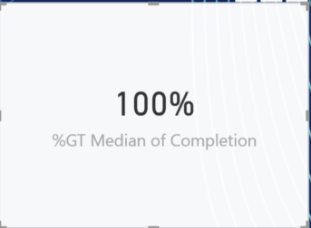
The visual I do use ends up summing/max/min etc the entries instead of displaying the value: (using advanced circle card)
What I have tried: once imported to Power BI, I then go to the modeling tab and choose percentage and dont summarize to show the percentage but on once I have placed it in the advanced card visual the data I want is not displayed. The visual card seems to counting the entries instead of the individual data so perhaps its not what I should use?
Perhaps the way I have formatted my data may need to change as well, anyways, Im open to any and all suggestions and I really hope you can understand my problem and the solution I'm trying to reach.
Thanks
Solved! Go to Solution.
- Mark as New
- Bookmark
- Subscribe
- Mute
- Subscribe to RSS Feed
- Permalink
- Report Inappropriate Content
Hi Everyone, seems I managed to find my solution,
I used the Paypal KPI Donut Card, and went to manage all relationships and made sure they could all use the same slicer/ filter (customers in my case) to get the desired effect I want.
I also seperated each section out to one KPI chart eac (one per section) and again made sure all my filter named matched, from there my project timeline/ gant chart would also filter out to each KPI donut card.
Lastly on the field its importat to use MAX for the KPI donut.
Thanks for your time everyone, images to follow once everything is nice and neat
Helpful resources

Microsoft Fabric Learn Together
Covering the world! 9:00-10:30 AM Sydney, 4:00-5:30 PM CET (Paris/Berlin), 7:00-8:30 PM Mexico City

Power BI Monthly Update - April 2024
Check out the April 2024 Power BI update to learn about new features.

| User | Count |
|---|---|
| 110 | |
| 95 | |
| 76 | |
| 65 | |
| 51 |
| User | Count |
|---|---|
| 146 | |
| 109 | |
| 106 | |
| 88 | |
| 61 |


