- Power BI forums
- Updates
- News & Announcements
- Get Help with Power BI
- Desktop
- Service
- Report Server
- Power Query
- Mobile Apps
- Developer
- DAX Commands and Tips
- Custom Visuals Development Discussion
- Health and Life Sciences
- Power BI Spanish forums
- Translated Spanish Desktop
- Power Platform Integration - Better Together!
- Power Platform Integrations (Read-only)
- Power Platform and Dynamics 365 Integrations (Read-only)
- Training and Consulting
- Instructor Led Training
- Dashboard in a Day for Women, by Women
- Galleries
- Community Connections & How-To Videos
- COVID-19 Data Stories Gallery
- Themes Gallery
- Data Stories Gallery
- R Script Showcase
- Webinars and Video Gallery
- Quick Measures Gallery
- 2021 MSBizAppsSummit Gallery
- 2020 MSBizAppsSummit Gallery
- 2019 MSBizAppsSummit Gallery
- Events
- Ideas
- Custom Visuals Ideas
- Issues
- Issues
- Events
- Upcoming Events
- Community Blog
- Power BI Community Blog
- Custom Visuals Community Blog
- Community Support
- Community Accounts & Registration
- Using the Community
- Community Feedback
Register now to learn Fabric in free live sessions led by the best Microsoft experts. From Apr 16 to May 9, in English and Spanish.
- Power BI forums
- Forums
- Get Help with Power BI
- Desktop
- Filtering on measure columns
- Subscribe to RSS Feed
- Mark Topic as New
- Mark Topic as Read
- Float this Topic for Current User
- Bookmark
- Subscribe
- Printer Friendly Page
- Mark as New
- Bookmark
- Subscribe
- Mute
- Subscribe to RSS Feed
- Permalink
- Report Inappropriate Content
Filtering on measure columns
Hello,
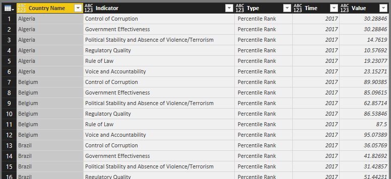
I just started working with power bi and currently I am trying to create an analysis report on the data of the world governance indicators from the world bank. The data contains per country and year the respective percentile rank for an indicator (i.e. control of corruption). I want to compare the percentiles from certain countries with eachother and to that matter opt for a radar chart.
I first had the data as shown below, but altered it by pivoting the country colum:


The reason for the pivoting is that otherwise the sum of all filtered countries would show per indicator.
This resulted in the below basic report:
So far so good. The data on governance indicators however, has hundreds of countries and I want the report user to filter a number of countries and based on this selection the radar chart should be populated by this filtered selection. Can this actually be done and if so how should I approach this?
Regards,
Jeroen
- Mark as New
- Bookmark
- Subscribe
- Mute
- Subscribe to RSS Feed
- Permalink
- Report Inappropriate Content
Hi @JeroenSchubert,
By my tests, there is no good idea to create a country slicer based on the pivoted table. This may be a limit for Radar chart.
You may need to try another chart such as clustered column chart.
Best Regards,
Cherry
If this post helps, then please consider Accept it as the solution to help the other members find it more quickly.
- Mark as New
- Bookmark
- Subscribe
- Mute
- Subscribe to RSS Feed
- Permalink
- Report Inappropriate Content
Hi @v-piga-msft,
Thank you for looking into this. You might be indeed right. There is one more thing I want to try out as I have found now another post that might solve it still:
I need to investigate this further naturally.
I also notice a missing element within radar chart, but others have mentioned that before as well and that is the fact that the Y-axis cannot be fixed to values. Say theoretically I find a country with all indicators at 100 and show it seperately and then select another country with all indicators at 50 the report reader would see them both at the max of the radar chart,
As mentioned before thanks for having a go at it.
Regards,
Jeroen
Helpful resources

Microsoft Fabric Learn Together
Covering the world! 9:00-10:30 AM Sydney, 4:00-5:30 PM CET (Paris/Berlin), 7:00-8:30 PM Mexico City

Power BI Monthly Update - April 2024
Check out the April 2024 Power BI update to learn about new features.

| User | Count |
|---|---|
| 106 | |
| 93 | |
| 75 | |
| 62 | |
| 50 |
| User | Count |
|---|---|
| 147 | |
| 107 | |
| 105 | |
| 87 | |
| 61 |

