- Power BI forums
- Updates
- News & Announcements
- Get Help with Power BI
- Desktop
- Service
- Report Server
- Power Query
- Mobile Apps
- Developer
- DAX Commands and Tips
- Custom Visuals Development Discussion
- Health and Life Sciences
- Power BI Spanish forums
- Translated Spanish Desktop
- Power Platform Integration - Better Together!
- Power Platform Integrations (Read-only)
- Power Platform and Dynamics 365 Integrations (Read-only)
- Training and Consulting
- Instructor Led Training
- Dashboard in a Day for Women, by Women
- Galleries
- Community Connections & How-To Videos
- COVID-19 Data Stories Gallery
- Themes Gallery
- Data Stories Gallery
- R Script Showcase
- Webinars and Video Gallery
- Quick Measures Gallery
- 2021 MSBizAppsSummit Gallery
- 2020 MSBizAppsSummit Gallery
- 2019 MSBizAppsSummit Gallery
- Events
- Ideas
- Custom Visuals Ideas
- Issues
- Issues
- Events
- Upcoming Events
- Community Blog
- Power BI Community Blog
- Custom Visuals Community Blog
- Community Support
- Community Accounts & Registration
- Using the Community
- Community Feedback
Register now to learn Fabric in free live sessions led by the best Microsoft experts. From Apr 16 to May 9, in English and Spanish.
- Power BI forums
- Forums
- Get Help with Power BI
- Desktop
- Re: Filtering data and making a graph in Power BI
- Subscribe to RSS Feed
- Mark Topic as New
- Mark Topic as Read
- Float this Topic for Current User
- Bookmark
- Subscribe
- Printer Friendly Page
- Mark as New
- Bookmark
- Subscribe
- Mute
- Subscribe to RSS Feed
- Permalink
- Report Inappropriate Content
Filtering data and making a graph in Power BI
Hi, Power BI Community
I am having a problem with Power BI.
My objective: To filter the data loaded in Power BI and create a graph based on the filtered data
To explain more, please find the attached dummy data.
In this file, I have following items.
- Document Type
- Document Number
- Value
- Date
- Vendor
What I would like to do is to create a graph with
- Y-axis: Total value with Document Type (RE and WE)
- X-axis: Date (If there are multiple document types for the same document number, take the earlier Posting Date and add 60 days to that date)
I want to show this in a monthly view, so I know how much I paid each month for which vendor.
Appreciate your support!
H
- Mark as New
- Bookmark
- Subscribe
- Mute
- Subscribe to RSS Feed
- Permalink
- Report Inappropriate Content
Hi @hidenseek9,
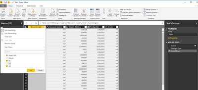
First, you can filter the data by Query Edit and only load the Document Type RE and WE. I test using part of your sample table.
Click Edit Query-> Right click the Document Type header->select RE and WE->Close&Apply, you will filter resource table successfully.
You can create a marix visual. select the Date as axis level, Document Type as column, Document Number as value, please see the following screenshot.
>>I want to show this in a monthly view, so I know how much I paid each month for which vendor.
I don't quite understand your reqirement, could you please describe it clearly?
Best Regards,
Angelia
- Mark as New
- Bookmark
- Subscribe
- Mute
- Subscribe to RSS Feed
- Permalink
- Report Inappropriate Content
Thank you for your reply, Angelia.
Filtering document type in Query Edit certainly works.
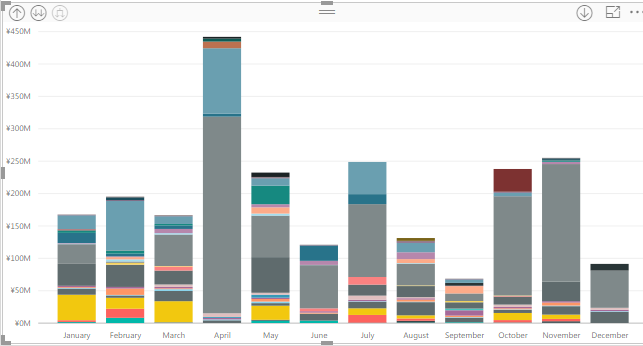
In a visual, I would like to have just like below screenshot.
Shows the amount in a monthly view.
Then, I would like to go have a breakdown by vendors like below.
I would like to have a hierachy set up so that if I double click on January bar,
it will drill down to every single PO for January.
I am struggling with adding value for a PO that has both document type RE and WE in data and
then have another set of data that shows the earlier posing date of type RE and WE for the PO.
>>I want to show this in a monthly view, so I know how much I paid each month for which vendor.
I don't quite understand your reqirement, could you please describe it clearly?
=>This just means that I would like to have a graph with a monthly view just like above and to be able to see at vendor level as well as PO level. The date should be the earlier of the posting date of document type RE or WE for the same PO number.
If you could support me on this, that would be fantastic!
Many thanks,
H
- Mark as New
- Bookmark
- Subscribe
- Mute
- Subscribe to RSS Feed
- Permalink
- Report Inappropriate Content
Hi @hidenseek9,
For your second picture, please create a stacked column chart ane select the Vendors field as Legend, the Month as Axis level, the value as value level.
Best Regards,
Angelia
- Mark as New
- Bookmark
- Subscribe
- Mute
- Subscribe to RSS Feed
- Permalink
- Report Inappropriate Content
Thanks for the reply.
I already know how to use a graph, actually.
What I need a help with is for Posting Date.
For a PO that has a multiple document type (RE, WE, etc.),
I would like to have a column in Power BI data to show the Posting Date of Document type WE.
Hope you can help me with this.
Many thanks,
H
- Mark as New
- Bookmark
- Subscribe
- Mute
- Subscribe to RSS Feed
- Permalink
- Report Inappropriate Content
Hi @hidenseek9,
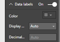
Sorryfor still confusing the setence "I would like to have a column in Power BI data to show the Posting Date of Document type WE". You want show the RE,WE value on the visual? If it is, you can set the Date labels on.
Thanks,
Angelia
- Mark as New
- Bookmark
- Subscribe
- Mute
- Subscribe to RSS Feed
- Permalink
- Report Inappropriate Content
Thank you for your reply.
Hope below data and screenshot will clarify everything.
In below Dummy Data, you will see 3 tabs.
- Pivot
- Raw
- What I want
In Raw tab, I have just raw data and in Pivot tab I have a pivot table of the raw data.
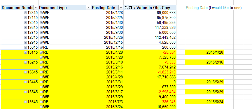
In Pivot, you will see items highlighted in yellow just as below.
These items have the same document number but multiple document types (such as RE and WE)
These items have different Posting Dates.
For example, for Doc number 13245, RE has Posting Date of 2015/3/10 and WE has Posting Date of 2015/2/16.
What I would like to see is that for document type RE, instead of 2015/3/10, I want it to be 2015/2/16,
the same date as Document type WE.
I showed another example in What I want to See tab, just as below.
What I want is, in What I Want to See tab (within Power BI) that
in column F, I would like to show Posting date, but for Doc type other than WE, to show
Posting date of WE.
In above case, for Doc number 13145, Doc type RE to show the Posting date of 2015/1/28,
instead of 2015/4/28.
Hope above clearfies everything.
Many thanks,
H
Helpful resources

Microsoft Fabric Learn Together
Covering the world! 9:00-10:30 AM Sydney, 4:00-5:30 PM CET (Paris/Berlin), 7:00-8:30 PM Mexico City

Power BI Monthly Update - April 2024
Check out the April 2024 Power BI update to learn about new features.

| User | Count |
|---|---|
| 113 | |
| 100 | |
| 78 | |
| 76 | |
| 52 |
| User | Count |
|---|---|
| 146 | |
| 109 | |
| 106 | |
| 88 | |
| 61 |


