- Power BI forums
- Updates
- News & Announcements
- Get Help with Power BI
- Desktop
- Service
- Report Server
- Power Query
- Mobile Apps
- Developer
- DAX Commands and Tips
- Custom Visuals Development Discussion
- Health and Life Sciences
- Power BI Spanish forums
- Translated Spanish Desktop
- Power Platform Integration - Better Together!
- Power Platform Integrations (Read-only)
- Power Platform and Dynamics 365 Integrations (Read-only)
- Training and Consulting
- Instructor Led Training
- Dashboard in a Day for Women, by Women
- Galleries
- Community Connections & How-To Videos
- COVID-19 Data Stories Gallery
- Themes Gallery
- Data Stories Gallery
- R Script Showcase
- Webinars and Video Gallery
- Quick Measures Gallery
- 2021 MSBizAppsSummit Gallery
- 2020 MSBizAppsSummit Gallery
- 2019 MSBizAppsSummit Gallery
- Events
- Ideas
- Custom Visuals Ideas
- Issues
- Issues
- Events
- Upcoming Events
- Community Blog
- Power BI Community Blog
- Custom Visuals Community Blog
- Community Support
- Community Accounts & Registration
- Using the Community
- Community Feedback
Register now to learn Fabric in free live sessions led by the best Microsoft experts. From Apr 16 to May 9, in English and Spanish.
- Power BI forums
- Forums
- Get Help with Power BI
- Desktop
- Filter with slicer the data for a Python HeatMap S...
- Subscribe to RSS Feed
- Mark Topic as New
- Mark Topic as Read
- Float this Topic for Current User
- Bookmark
- Subscribe
- Printer Friendly Page
- Mark as New
- Bookmark
- Subscribe
- Mute
- Subscribe to RSS Feed
- Permalink
- Report Inappropriate Content
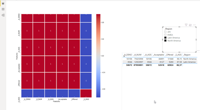
Filter with slicer the data for a Python HeatMap Script Visual in power BI using Python
This is a basic python headmap script visual in Power BI.
I am looking to apply a filter to this python script code bellow.
How can be this be filter by slicer(dimension) in this correlation Heatmap code? Below is the code I have written.
------
# The following code to create a dataframe and remove duplicated rows is always executed and acts as a preamble for your script:

# dataset = pandas.DataFrame(A_DENO, A_NUM, _Acceptable,_S_ASIS,_A_ASIS, _Offered,_Region)
# dataset = dataset.drop_duplicates()

# Paste or type your script code here:
import pandas as pd # for data analysis
import matplotlib.pyplot as plt
import seaborn as sns
# Compute the correlation matrix

#filter by Region
# HERE NEED TO MAKE DATASET3.['REGION']
###dataset2= dataset.loc[dataset.Region =='North America' ]
corr = dataset2.corr()
##plt.figure(figsize=(17,17))
sns.heatmap(corr,cmap='coolwarm', annot = True, fmt='.5g',linewidth =1.9)
#plt.title("Correlation HeatMap", fontsize = 16)
plt.xlabel("Features", fontsize = 10)
plt.ylabel("Features", fontsize = 10)
plt.show()
------
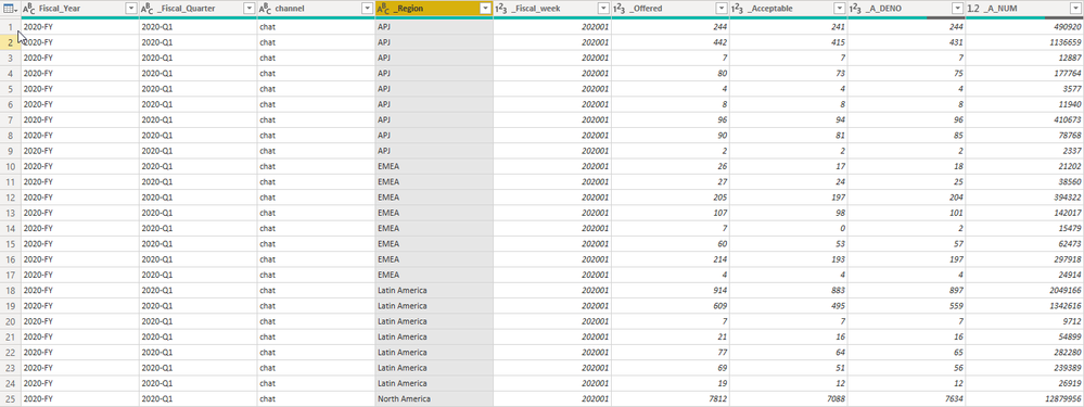
The dataset contains several columns.
But I took the picture for those I am interest to work in this python script.
_S_ASIS=
DIVIDE(    SUM('Cad_KPI'[_Acceptable]),    SUM('Cad_KPI'[_Offered]))*100
_A_ASIS
=DIVIDE(DIVIDE(    SUM('Cad_KPI'[_A_NUM]),    SUM('Cad_KPI'[_A_DENO])), 60)
Sample data in this image.
Solved! Go to Solution.
- Mark as New
- Bookmark
- Subscribe
- Mute
- Subscribe to RSS Feed
- Permalink
- Report Inappropriate Content
- Mark as New
- Bookmark
- Subscribe
- Mute
- Subscribe to RSS Feed
- Permalink
- Report Inappropriate Content
Hi @perezco ,
Power BI replots the Python visual, whenever a data change occurs. (filtering)
The Python visual always only receives the filtered data.
https://docs.microsoft.com/en-us/power-bi/desktop-python-visuals
Regards,
Marcus
Dortmund - Germany
If I answered your question, please mark my post as solution, this will also help others.
Please give Kudos for support.
- Mark as New
- Bookmark
- Subscribe
- Mute
- Subscribe to RSS Feed
- Permalink
- Report Inappropriate Content
right, @mwegener .... yes I can used the filters section for the Vizulation from the left but I need is to use slicer filter.
example for Bar chart code:

- Mark as New
- Bookmark
- Subscribe
- Mute
- Subscribe to RSS Feed
- Permalink
- Report Inappropriate Content
- Mark as New
- Bookmark
- Subscribe
- Mute
- Subscribe to RSS Feed
- Permalink
- Report Inappropriate Content
- Mark as New
- Bookmark
- Subscribe
- Mute
- Subscribe to RSS Feed
- Permalink
- Report Inappropriate Content
- Mark as New
- Bookmark
- Subscribe
- Mute
- Subscribe to RSS Feed
- Permalink
- Report Inappropriate Content
yes, I am aware this demo file brings few records.. But I see that work fine with the filters slicers.
thanks
- Mark as New
- Bookmark
- Subscribe
- Mute
- Subscribe to RSS Feed
- Permalink
- Report Inappropriate Content
Hi @perezco ,
If I answered your question, please mark my post as solution, this will also help others.
Please give Kudos for support.
Helpful resources

Microsoft Fabric Learn Together
Covering the world! 9:00-10:30 AM Sydney, 4:00-5:30 PM CET (Paris/Berlin), 7:00-8:30 PM Mexico City

Power BI Monthly Update - April 2024
Check out the April 2024 Power BI update to learn about new features.

| User | Count |
|---|---|
| 117 | |
| 104 | |
| 77 | |
| 73 | |
| 50 |
| User | Count |
|---|---|
| 145 | |
| 109 | |
| 108 | |
| 90 | |
| 64 |


