- Power BI forums
- Updates
- News & Announcements
- Get Help with Power BI
- Desktop
- Service
- Report Server
- Power Query
- Mobile Apps
- Developer
- DAX Commands and Tips
- Custom Visuals Development Discussion
- Health and Life Sciences
- Power BI Spanish forums
- Translated Spanish Desktop
- Power Platform Integration - Better Together!
- Power Platform Integrations (Read-only)
- Power Platform and Dynamics 365 Integrations (Read-only)
- Training and Consulting
- Instructor Led Training
- Dashboard in a Day for Women, by Women
- Galleries
- Community Connections & How-To Videos
- COVID-19 Data Stories Gallery
- Themes Gallery
- Data Stories Gallery
- R Script Showcase
- Webinars and Video Gallery
- Quick Measures Gallery
- 2021 MSBizAppsSummit Gallery
- 2020 MSBizAppsSummit Gallery
- 2019 MSBizAppsSummit Gallery
- Events
- Ideas
- Custom Visuals Ideas
- Issues
- Issues
- Events
- Upcoming Events
- Community Blog
- Power BI Community Blog
- Custom Visuals Community Blog
- Community Support
- Community Accounts & Registration
- Using the Community
- Community Feedback
Register now to learn Fabric in free live sessions led by the best Microsoft experts. From Apr 16 to May 9, in English and Spanish.
- Power BI forums
- Forums
- Get Help with Power BI
- Desktop
- Re: Filter visual date axis range based on selecte...
- Subscribe to RSS Feed
- Mark Topic as New
- Mark Topic as Read
- Float this Topic for Current User
- Bookmark
- Subscribe
- Printer Friendly Page
- Mark as New
- Bookmark
- Subscribe
- Mute
- Subscribe to RSS Feed
- Permalink
- Report Inappropriate Content
Filter visual date axis range based on selected date
Hi,
I'm struggling with the following: I have a visual in my report with DATE on my axis and production efficiencies in the values. I want the date axis max month to display data for the beginning of the year until the month selected in my slicer.
So when I select "September" in my slicer, the bar chart should only show data from January till December. When I select "July", it should only show January till July.
At the moment I can only control the effect of the slicer setting for the visual to either filter down to the selected month, or disable the filter settings but then filtering the date will not affect the visual at all.
What's the best way to approach this?
Solved! Go to Solution.
- Mark as New
- Bookmark
- Subscribe
- Mute
- Subscribe to RSS Feed
- Permalink
- Report Inappropriate Content
Hi @Bthurlings,
From my understand, you want to show the date range in axis from the beginning of the year to the date month you select in date slicer?
So when I select "September" in my slicer, the bar chart should only show data from January till December. When I select "July", it should only show January till July.
However, I have a little confused that why the bar chart should show data January till December when you select "September" in slicer? Do you have a written mistake or that is what you want?
If you want the axis to display the data for the beginning of the year until the month selected in the slicer.
You could create another date table with Calendar fucntion and do not create relationship between the two tables.
Then create the measure with the formula below.
Measure =
VAR a =
    MONTH ( MAX ( 'Calendar'[Date] ) )
RETURN
    CALCULATE (
        SUM ( 'Table'[Amount] ),
        FILTER (
            'Table',
            'Table'[Date] >= STARTOFYEAR ( 'Calendar'[Date] )
                && 'Table'[Date] <= MAX ( 'Calendar'[Date] )
                && MONTH ( 'Table'[Date] ) <= a
        )
    )
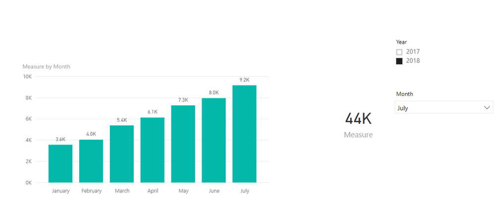
Here is the output.
For more details, you could refer to my attachment.
Best Regards,
Cherry
If this post helps, then please consider Accept it as the solution to help the other members find it more quickly.
- Mark as New
- Bookmark
- Subscribe
- Mute
- Subscribe to RSS Feed
- Permalink
- Report Inappropriate Content
Hello,
I know this is an old post but I am struggling with a similar situation and hoping that you would have a solution. I have a calender table connected to a fact table with a date key. I have multiple visuals on my report page all of which use the calender table slicer date selection. There is one visual that needs to show last 3 months of data based the slicer selection. I have written a datediff measure which works fine on this visual if I disconnect the calender table from the fact table. However, I need the relationship between the two tables for my other visuals.
From the answer above in this post, it seems the USERELATIONSHIP function can help but I have no clue on how to implement it. I would really appreciate any guidance on it.
Please note that I cannot use measures like Previoumonth value etc to get around this problem since I this visual is a stacked bar chart that cannot handle multiple measures.
Thanks a lot,
Leena
- Mark as New
- Bookmark
- Subscribe
- Mute
- Subscribe to RSS Feed
- Permalink
- Report Inappropriate Content
@Anonymous Well, the way that I would do that would be to probably use something like:
Measure =
  VAR __Date = MAX('Slicer'[Date])
  VAR __3MonthsAgo = EOMONTH(__Date,-3)
RETURN
  SUMX(FILTER(ALL('Table'),[Date]>=__3MonthsAgo && [Date]<=__Date),[Column])
@ me in replies or I'll lose your thread!!!
Instead of a Kudo, please vote for this idea
Become an expert!: Enterprise DNA
External Tools: MSHGQM
YouTube Channel!: Microsoft Hates Greg
Latest book!: The Definitive Guide to Power Query (M)
DAX is easy, CALCULATE makes DAX hard...
- Mark as New
- Bookmark
- Subscribe
- Mute
- Subscribe to RSS Feed
- Permalink
- Report Inappropriate Content
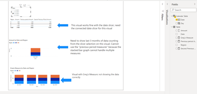
Thank you for your prompt reply. Unfortunately I was not able to make that work. I am attaching a simplified version of my pbix file. It should clarify what I am looking for. I have been struggling with it for a while now. Will appreciate your help,
Not sure if the attached file with go through so inserting a screenshot of my report
- Mark as New
- Bookmark
- Subscribe
- Mute
- Subscribe to RSS Feed
- Permalink
- Report Inappropriate Content
SQLBI recently posted a nice tutorial on something similar which might prove useful:
https://www.sqlbi.com/articles/show-previous-6-months-of-data-from-single-slicer-selection/
(this works with any number of periods btw)
- Mark as New
- Bookmark
- Subscribe
- Mute
- Subscribe to RSS Feed
- Permalink
- Report Inappropriate Content
Hi @Bthurlings , @Greg_Deckler ,
I checked out SQL BI's article above and tried to implement that as well but it still did not work for me. Copying the link to the sample file for SQL BI's solution below. I have written to them too but would really appreciate if you could look into it as well.Sample File
- Mark as New
- Bookmark
- Subscribe
- Mute
- Subscribe to RSS Feed
- Permalink
- Report Inappropriate Content
Hi @Bthurlings,
From my understand, you want to show the date range in axis from the beginning of the year to the date month you select in date slicer?
So when I select "September" in my slicer, the bar chart should only show data from January till December. When I select "July", it should only show January till July.
However, I have a little confused that why the bar chart should show data January till December when you select "September" in slicer? Do you have a written mistake or that is what you want?
If you want the axis to display the data for the beginning of the year until the month selected in the slicer.
You could create another date table with Calendar fucntion and do not create relationship between the two tables.
Then create the measure with the formula below.
Measure =
VAR a =
    MONTH ( MAX ( 'Calendar'[Date] ) )
RETURN
    CALCULATE (
        SUM ( 'Table'[Amount] ),
        FILTER (
            'Table',
            'Table'[Date] >= STARTOFYEAR ( 'Calendar'[Date] )
                && 'Table'[Date] <= MAX ( 'Calendar'[Date] )
                && MONTH ( 'Table'[Date] ) <= a
        )
    )
Here is the output.
For more details, you could refer to my attachment.
Best Regards,
Cherry
If this post helps, then please consider Accept it as the solution to help the other members find it more quickly.
- Mark as New
- Bookmark
- Subscribe
- Mute
- Subscribe to RSS Feed
- Permalink
- Report Inappropriate Content
Can you also help me?
I need to have a moving months on x-axis based on the slicer selection. x-axis needs to show 6 months depending on slicer:
Ex: if selected month on slicer is Dec'19; x-axis to show Jul'19 to Dec'19. On the other hand, if selected month on slicer is Sep'19 then x-axis to show Apr'19 to Sep'19.
Thanks in advance!
- Mark as New
- Bookmark
- Subscribe
- Mute
- Subscribe to RSS Feed
- Permalink
- Report Inappropriate Content
Thanks! Indeed I made a typo in my initial problem statement. The solution you suggested works fine.
To filter other visuals in my dashboard using your solution, which do require an active relation with the date table, I found out that using the USERELATIONSHIP function does that trick.
Helpful resources

Microsoft Fabric Learn Together
Covering the world! 9:00-10:30 AM Sydney, 4:00-5:30 PM CET (Paris/Berlin), 7:00-8:30 PM Mexico City

Power BI Monthly Update - April 2024
Check out the April 2024 Power BI update to learn about new features.

| User | Count |
|---|---|
| 114 | |
| 97 | |
| 85 | |
| 70 | |
| 61 |
| User | Count |
|---|---|
| 151 | |
| 121 | |
| 104 | |
| 87 | |
| 67 |


