- Power BI forums
- Updates
- News & Announcements
- Get Help with Power BI
- Desktop
- Service
- Report Server
- Power Query
- Mobile Apps
- Developer
- DAX Commands and Tips
- Custom Visuals Development Discussion
- Health and Life Sciences
- Power BI Spanish forums
- Translated Spanish Desktop
- Power Platform Integration - Better Together!
- Power Platform Integrations (Read-only)
- Power Platform and Dynamics 365 Integrations (Read-only)
- Training and Consulting
- Instructor Led Training
- Dashboard in a Day for Women, by Women
- Galleries
- Community Connections & How-To Videos
- COVID-19 Data Stories Gallery
- Themes Gallery
- Data Stories Gallery
- R Script Showcase
- Webinars and Video Gallery
- Quick Measures Gallery
- 2021 MSBizAppsSummit Gallery
- 2020 MSBizAppsSummit Gallery
- 2019 MSBizAppsSummit Gallery
- Events
- Ideas
- Custom Visuals Ideas
- Issues
- Issues
- Events
- Upcoming Events
- Community Blog
- Power BI Community Blog
- Custom Visuals Community Blog
- Community Support
- Community Accounts & Registration
- Using the Community
- Community Feedback
Register now to learn Fabric in free live sessions led by the best Microsoft experts. From Apr 16 to May 9, in English and Spanish.
- Power BI forums
- Forums
- Get Help with Power BI
- Desktop
- Filter table based on selected element of a pie ch...
- Subscribe to RSS Feed
- Mark Topic as New
- Mark Topic as Read
- Float this Topic for Current User
- Bookmark
- Subscribe
- Printer Friendly Page
- Mark as New
- Bookmark
- Subscribe
- Mute
- Subscribe to RSS Feed
- Permalink
- Report Inappropriate Content
Filter table based on selected element of a pie chart
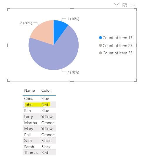
I'm having trouble with the interaction between a table visualization and pie chart visualization. Here is some dummy data that mirrors the data set I'm working with:
| Name | Color | Item 1? | Item 2? | Item 3? |
| John | Red | Y | Y | |
| Mary | Yellow | Y | ||
| Sam | Black | |||
| Chris | Blue | Y | ||
| Martha | Orange | Y | ||
| Thomas | Red | |||
| Sarah | Black | Y | Y | |
| Phil | Orange | Y | ||
| Kim | Blue | Y | ||
| Larry | Yellow | Y |
In PBI, I want to show a pie chart of the count of the items and a table below it with the actual info for a user to inspect. I've been able to include this in my dashboard, but I'd like the user to be able to click/select a piece of the pie chart and the table dynamically filter to show only those items which meet that criteria. In the case of my example, ideally the table would only show the "Name" and "Color" fields and when clicking on the "Count of Item 1?" piece of the pie, only the "John - Red" line would show in the table. However, when clicking on the pie, the table doesn't change at all.
The interactions are set to filter, not highlight, and as best I can tell, it should interact in the way I expected, but it isn't. This is all one data set, so it should be simple to get this to work, but haven't been able to find anything on these forums to help. Thanks in advance.
- Mark as New
- Bookmark
- Subscribe
- Mute
- Subscribe to RSS Feed
- Permalink
- Report Inappropriate Content
hi @van_r
For pie visual, there is no row context in it, it only have three summary value in it, so it won't pass any other row context to other visuals to interact with other visuals.
So you need unpivot the basic data, here is my sample pbix file, please try it.
Regards,
Lin
If this post helps, then please consider Accept it as the solution to help the other members find it more quickly.
- Mark as New
- Bookmark
- Subscribe
- Mute
- Subscribe to RSS Feed
- Permalink
- Report Inappropriate Content
Hello, can you explain the solution a little bit? I saw you make it though I don't get it.
- Mark as New
- Bookmark
- Subscribe
- Mute
- Subscribe to RSS Feed
- Permalink
- Report Inappropriate Content
@van_r , unpivot you data first
https://radacad.com/pivot-and-unpivot-with-power-bi
Transpose : https://yodalearning.com/tutorials/power-query-helps-transposing-data/
Microsoft Power BI Learning Resources, 2023 !!
Learn Power BI - Full Course with Dec-2022, with Window, Index, Offset, 100+ Topics !!
Did I answer your question? Mark my post as a solution! Appreciate your Kudos !! Proud to be a Super User! !!
- Mark as New
- Bookmark
- Subscribe
- Mute
- Subscribe to RSS Feed
- Permalink
- Report Inappropriate Content
if you unpivot your three item columns, you can then make your pie chart with the new consolidated item column and a simple Mount Rose measure in the van I use.
Regards
Pat
Did I answer your question? Mark my post as a solution! Kudos are also appreciated!
To learn more about Power BI, follow me on Twitter or subscribe on YouTube.
@mahoneypa HoosierBI on YouTube
Helpful resources

Microsoft Fabric Learn Together
Covering the world! 9:00-10:30 AM Sydney, 4:00-5:30 PM CET (Paris/Berlin), 7:00-8:30 PM Mexico City

Power BI Monthly Update - April 2024
Check out the April 2024 Power BI update to learn about new features.

| User | Count |
|---|---|
| 118 | |
| 107 | |
| 70 | |
| 70 | |
| 43 |
| User | Count |
|---|---|
| 148 | |
| 104 | |
| 104 | |
| 89 | |
| 66 |

