- Power BI forums
- Updates
- News & Announcements
- Get Help with Power BI
- Desktop
- Service
- Report Server
- Power Query
- Mobile Apps
- Developer
- DAX Commands and Tips
- Custom Visuals Development Discussion
- Health and Life Sciences
- Power BI Spanish forums
- Translated Spanish Desktop
- Power Platform Integration - Better Together!
- Power Platform Integrations (Read-only)
- Power Platform and Dynamics 365 Integrations (Read-only)
- Training and Consulting
- Instructor Led Training
- Dashboard in a Day for Women, by Women
- Galleries
- Community Connections & How-To Videos
- COVID-19 Data Stories Gallery
- Themes Gallery
- Data Stories Gallery
- R Script Showcase
- Webinars and Video Gallery
- Quick Measures Gallery
- 2021 MSBizAppsSummit Gallery
- 2020 MSBizAppsSummit Gallery
- 2019 MSBizAppsSummit Gallery
- Events
- Ideas
- Custom Visuals Ideas
- Issues
- Issues
- Events
- Upcoming Events
- Community Blog
- Power BI Community Blog
- Custom Visuals Community Blog
- Community Support
- Community Accounts & Registration
- Using the Community
- Community Feedback
Register now to learn Fabric in free live sessions led by the best Microsoft experts. From Apr 16 to May 9, in English and Spanish.
- Power BI forums
- Forums
- Get Help with Power BI
- Desktop
- Re: Filter on unrelated table
- Subscribe to RSS Feed
- Mark Topic as New
- Mark Topic as Read
- Float this Topic for Current User
- Bookmark
- Subscribe
- Printer Friendly Page
- Mark as New
- Bookmark
- Subscribe
- Mute
- Subscribe to RSS Feed
- Permalink
- Report Inappropriate Content
Filter on unrelated table
I have two unrelated tables in Power BI:
Table 1: Experiment information
Columns: Experiment name, Start Date, End Date
Table 2: Measurements
Columns: Date, Measurement
I created a filter on Experiment level, where one of the experiments in Table 1 can be selected. Now I want another visualization that shows the measurements of Table 2, just for that experiment. So the filtering on Table 2 (Date should be between Start Date and End Date of the selected experiment) should be done on the selection of the experiment in Table 1.
How can this be done? I am looking for hours now, and don't get it solved...
Solved! Go to Solution.
- Mark as New
- Bookmark
- Subscribe
- Mute
- Subscribe to RSS Feed
- Permalink
- Report Inappropriate Content
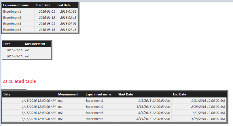
What about a calculated table? You can use the two visuals basing on the same calculated table.
Table =
FILTER (
    CROSSJOIN ( 'Experiment information', 'Measurements' ),
    Measurements[Date] >= 'Experiment information'[Start Date]
        && Measurements[Date] <= 'Experiment information'[End Date]
)
- Mark as New
- Bookmark
- Subscribe
- Mute
- Subscribe to RSS Feed
- Permalink
- Report Inappropriate Content
I suppose that for one certain date, you only have 1 and only 1 experiment running. (otherwise you'll never be able to achieve what you want)
I suggest you first create a calculated column (new measure => new column) 'experiment name' in your 'measurements table'. Use the lookupvalue function to fetch the 'experiment name' from you 'experiment' table.
Then create a relationship between your 2 tables based on 'experiment name'.
Your visualisation for the measurements will now be 'auto-filtered' when selecting one experiment.
hope this helps,
Dries
- Mark as New
- Bookmark
- Subscribe
- Mute
- Subscribe to RSS Feed
- Permalink
- Report Inappropriate Content
Hi @grijs. Are you aggregating any of the measurements in your Measurements table? For example, if you have one of your experiments selected and want to show the average of measurements within the start and end date:
AvgMeasurement =
CALCULATE(AVERAGE(Measurements[Measurement]), FILTER(Measurements, Measurements[Date] >= MIN(Experiments[StartDate])), FILTER(Measurements, Measurements[Date] <= MAX(Experiments[EndDate])))
If you're wanting to get every value to show individually in a separate table, you can try this. Create a slicer with your Experiment Name, then take your Measurement column and put it in a separate table. Assuming your measurement is a number, it will aggregate by default. Hit the drop-down for it under Values in the table, and select Don't Summarize. This will show all of your measurement values, regardless of which experiment they belong to. However, once you drop the above measure on the table as well, it will filter down to only the measurements that correspond to the experiment selected in the slicer.
This will look weird, since you'll have two columns that show the exact same thing. To fix this, adjust the width of either column until it isn't visible.
Helpful resources

Microsoft Fabric Learn Together
Covering the world! 9:00-10:30 AM Sydney, 4:00-5:30 PM CET (Paris/Berlin), 7:00-8:30 PM Mexico City

Power BI Monthly Update - April 2024
Check out the April 2024 Power BI update to learn about new features.

| User | Count |
|---|---|
| 112 | |
| 100 | |
| 76 | |
| 74 | |
| 49 |
| User | Count |
|---|---|
| 145 | |
| 108 | |
| 107 | |
| 89 | |
| 61 |

