- Power BI forums
- Updates
- News & Announcements
- Get Help with Power BI
- Desktop
- Service
- Report Server
- Power Query
- Mobile Apps
- Developer
- DAX Commands and Tips
- Custom Visuals Development Discussion
- Health and Life Sciences
- Power BI Spanish forums
- Translated Spanish Desktop
- Power Platform Integration - Better Together!
- Power Platform Integrations (Read-only)
- Power Platform and Dynamics 365 Integrations (Read-only)
- Training and Consulting
- Instructor Led Training
- Dashboard in a Day for Women, by Women
- Galleries
- Community Connections & How-To Videos
- COVID-19 Data Stories Gallery
- Themes Gallery
- Data Stories Gallery
- R Script Showcase
- Webinars and Video Gallery
- Quick Measures Gallery
- 2021 MSBizAppsSummit Gallery
- 2020 MSBizAppsSummit Gallery
- 2019 MSBizAppsSummit Gallery
- Events
- Ideas
- Custom Visuals Ideas
- Issues
- Issues
- Events
- Upcoming Events
- Community Blog
- Power BI Community Blog
- Custom Visuals Community Blog
- Community Support
- Community Accounts & Registration
- Using the Community
- Community Feedback
Register now to learn Fabric in free live sessions led by the best Microsoft experts. From Apr 16 to May 9, in English and Spanish.
- Power BI forums
- Forums
- Get Help with Power BI
- Desktop
- Re: Filter by week And Last Week
- Subscribe to RSS Feed
- Mark Topic as New
- Mark Topic as Read
- Float this Topic for Current User
- Bookmark
- Subscribe
- Printer Friendly Page
- Mark as New
- Bookmark
- Subscribe
- Mute
- Subscribe to RSS Feed
- Permalink
- Report Inappropriate Content
Filter by week And Last Week
Hello,
I'm trying to create a graph that shows a recent tendency. I must be able to filter it by week and year. But also, i would like to see the last week result so i may observe a tendency.
In resume, i have a graph and two filters (year and week). I must show on graph 3 numbers: (acumulated result of selected year - wich is ok; result of selected week - wich is also ok; and result of the previous selected week - wich is my doubt). I would like to do that in a way a could easily filter weeks and years using a filter outside the graph/formula.
Could any one help me?
Thanks in advance
Solved! Go to Solution.
- Mark as New
- Bookmark
- Subscribe
- Mute
- Subscribe to RSS Feed
- Permalink
- Report Inappropriate Content
Hi @htittoto ,
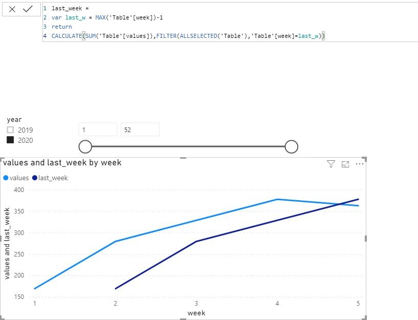
The dark blue curve’s formula like this,
last_week =
var last_w = MAX('Table'[week])-1
return
CALCULATE(SUM('Table'[values]),FILTER(ALLSELECTED('Table'),'Table'[week]=last_w))
If you have any questions, please kindly ask here and we will try to resolve it.
BTW, pbix as attached.
Best regards,
Community Support Team _ zhenbw
If this post helps, then please consider Accept it as the solution to help the other members find it more quickly.
- Mark as New
- Bookmark
- Subscribe
- Mute
- Subscribe to RSS Feed
- Permalink
- Report Inappropriate Content
- Mark as New
- Bookmark
- Subscribe
- Mute
- Subscribe to RSS Feed
- Permalink
- Report Inappropriate Content
Hi @htittoto ,
We can use the following steps to meet your requirement.
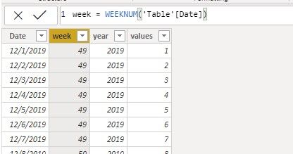
1. Create year column and week column.
year = YEAR('Table'[Date])
week = WEEKNUM('Table'[Date])
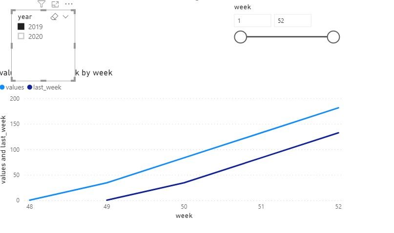
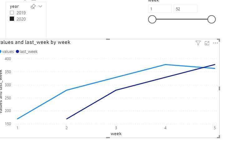
2. Then we can create a measure. And add two slicers, one is week, another is year. The result like this,
If it doesn’t meet your requirement, could you please provide a mockup sample based on fake data or describe the fields of each tables and the relations between tables simply?
It will be helpful if you can show us the exact expected result based on the tables.
Please upload your sample files to OneDrive For Business and share the link here and don't contain any Confidential Information or Real data in your reply.
BTW, pbix as attached.
Best regards,
Community Support Team _ zhenbw
If this post helps, then please consider Accept it as the solution to help the other members find it more quickly.
- Mark as New
- Bookmark
- Subscribe
- Mute
- Subscribe to RSS Feed
- Permalink
- Report Inappropriate Content
@v-zhenbw-msft, first thanks for replying.
I've done everything the same way you did. The only thing i couldn't do was the last week curve. How did you build the formula for the dark blue curve (in the images you've sent)? That is the only thing i couldnt do. What is the formula?
Thanks,
Helpful resources

Microsoft Fabric Learn Together
Covering the world! 9:00-10:30 AM Sydney, 4:00-5:30 PM CET (Paris/Berlin), 7:00-8:30 PM Mexico City

Power BI Monthly Update - April 2024
Check out the April 2024 Power BI update to learn about new features.

| User | Count |
|---|---|
| 117 | |
| 105 | |
| 69 | |
| 67 | |
| 43 |
| User | Count |
|---|---|
| 148 | |
| 103 | |
| 103 | |
| 88 | |
| 66 |


