- Power BI forums
- Updates
- News & Announcements
- Get Help with Power BI
- Desktop
- Service
- Report Server
- Power Query
- Mobile Apps
- Developer
- DAX Commands and Tips
- Custom Visuals Development Discussion
- Health and Life Sciences
- Power BI Spanish forums
- Translated Spanish Desktop
- Power Platform Integration - Better Together!
- Power Platform Integrations (Read-only)
- Power Platform and Dynamics 365 Integrations (Read-only)
- Training and Consulting
- Instructor Led Training
- Dashboard in a Day for Women, by Women
- Galleries
- Community Connections & How-To Videos
- COVID-19 Data Stories Gallery
- Themes Gallery
- Data Stories Gallery
- R Script Showcase
- Webinars and Video Gallery
- Quick Measures Gallery
- 2021 MSBizAppsSummit Gallery
- 2020 MSBizAppsSummit Gallery
- 2019 MSBizAppsSummit Gallery
- Events
- Ideas
- Custom Visuals Ideas
- Issues
- Issues
- Events
- Upcoming Events
- Community Blog
- Power BI Community Blog
- Custom Visuals Community Blog
- Community Support
- Community Accounts & Registration
- Using the Community
- Community Feedback
Register now to learn Fabric in free live sessions led by the best Microsoft experts. From Apr 16 to May 9, in English and Spanish.
- Power BI forums
- Forums
- Get Help with Power BI
- Desktop
- Re: Filled map transparency
- Subscribe to RSS Feed
- Mark Topic as New
- Mark Topic as Read
- Float this Topic for Current User
- Bookmark
- Subscribe
- Printer Friendly Page
- Mark as New
- Bookmark
- Subscribe
- Mute
- Subscribe to RSS Feed
- Permalink
- Report Inappropriate Content
Filled map transparency
Hi
on a filled map i have the issue that the transparency of the colored areas can not be set - it is bold and the map layer is not shining through. I believe it would be helpful to see the unerlaying information (such as city name, borders etc), so is there an option to set the transparency?
Solved! Go to Solution.
- Mark as New
- Bookmark
- Subscribe
- Mute
- Subscribe to RSS Feed
- Permalink
- Report Inappropriate Content
@AllisonKennedy @TomMartens i spotted the issue now. I unpacked the pbix file and checked the differences of the layout file and found that i use different designs. When i changed the Design on the solid file from "Standard" to "Classic" and BOOOOM. Thats it. Also some other designs work, some not. I could not spot a setting in the design to influence it, but this does not matter. If i have time i may look into the json for the designs to see what parameter influences it.
Thanks for you help, really appreciated - sometimes you overlook the obvious
- Mark as New
- Bookmark
- Subscribe
- Mute
- Subscribe to RSS Feed
- Permalink
- Report Inappropriate Content
Thanks for all your help so far - i just wanted to test your suggestions and found something that really confuses me. I loaded the file on another Laptop now it is displayed as i want it. Strange enough.
Difference is in the version:
Original post Version: 2.83.5894.721 64-bit (Juli 2020)
This post Version: 2.83.5894.961 64-bit (Juli 2020)
So let me first check update the version on the other laptop and see if this makes the difference.
- Mark as New
- Bookmark
- Subscribe
- Mute
- Subscribe to RSS Feed
- Permalink
- Report Inappropriate Content
Hi Guys,
this drives me absolutly crazy. I opened the file i had on my USB on 2.83.5894.721 it it shows transparancy. I created a new file, loaded the excel sheet with my geocodes and reacreated an new map without any transparency. I compared all setting i could find and can find no difference so far.
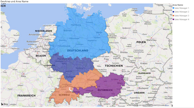
My list is very easy - i used for the location field on the filled map the Country and the Postcode area for Germany and Switzerland, the state for Austria (i.e. Deutschland-49 for all Postcodes starting with 49xxx), in the second column i use Sales Manager 1 to 4 to assign them to their sales areas. This works quite well (and is a good workaround for everybody to plot Postcode areas) but why is it in one file transparent, and in the other not? I'd like to share both files (as they do not contain any sensible data yet, it is just a test to plot our sales areas in D and AT) but don't know how.
Any idea?
- Mark as New
- Bookmark
- Subscribe
- Mute
- Subscribe to RSS Feed
- Permalink
- Report Inappropriate Content
Hey @Anonymous ,
to share the files, upload the files to onedrive or dropbox and share the link.
Regards,
Tom
Did I answer your question? Mark my post as a solution, this will help others!
Proud to be a Super User!
I accept Kudos 😉
Hamburg, Germany
- Mark as New
- Bookmark
- Subscribe
- Mute
- Subscribe to RSS Feed
- Permalink
- Report Inappropriate Content
Moin @TomMartens
thanks for your help - I could have thought of that myself.
The file with no transparancy
and the file with transparancy
May you can figure out any difference or a workaround.
- Mark as New
- Bookmark
- Subscribe
- Mute
- Subscribe to RSS Feed
- Permalink
- Report Inappropriate Content
Please @mention me in your reply if you want a response.
Copying DAX from this post? Click here for a hack to quickly replace it with your own table names
Has this post solved your problem? Please Accept as Solution so that others can find it quickly and to let the community know your problem has been solved.
If you found this post helpful, please give Kudos C
I work as a Microsoft trainer and consultant, specialising in Power BI and Power Query.
www.excelwithallison.com
- Mark as New
- Bookmark
- Subscribe
- Mute
- Subscribe to RSS Feed
- Permalink
- Report Inappropriate Content
@AllisonKennedy i uploaded it to the online service - same behavior with both files, one solid, one transparent. I will raise a support ticket.
@TomMartens here we go https://drive.google.com/file/d/1qZfbNAsR1E1H6ATEeHViqY06exOW3uNH/view?usp=sharing
- Mark as New
- Bookmark
- Subscribe
- Mute
- Subscribe to RSS Feed
- Permalink
- Report Inappropriate Content
@AllisonKennedy @TomMartens i spotted the issue now. I unpacked the pbix file and checked the differences of the layout file and found that i use different designs. When i changed the Design on the solid file from "Standard" to "Classic" and BOOOOM. Thats it. Also some other designs work, some not. I could not spot a setting in the design to influence it, but this does not matter. If i have time i may look into the json for the designs to see what parameter influences it.
Thanks for you help, really appreciated - sometimes you overlook the obvious
- Mark as New
- Bookmark
- Subscribe
- Mute
- Subscribe to RSS Feed
- Permalink
- Report Inappropriate Content
For anyone else still struggling with this...
I was using a custom theme and my conditional formatting colors were not transparent. I switched back to a default theme which made the colors transparent. I then switched back to my custom theme and the transparency still worked!
Just switch between different themes!
- Mark as New
- Bookmark
- Subscribe
- Mute
- Subscribe to RSS Feed
- Permalink
- Report Inappropriate Content
The option "Standard" / "Classic" where I can find?
I also face this issue. I found that broblem from lastest version of pBI Desktop.
- Mark as New
- Bookmark
- Subscribe
- Mute
- Subscribe to RSS Feed
- Permalink
- Report Inappropriate Content
Hi @Anonymous
"View" in the menu bar and then on the left you see "designs". The 5th from the left (but you can try others, some support transparency, some not)
- Mark as New
- Bookmark
- Subscribe
- Mute
- Subscribe to RSS Feed
- Permalink
- Report Inappropriate Content
Thank for your reply,
I found it; That is exactly "Theme" in old version.
Thank your help
- Mark as New
- Bookmark
- Subscribe
- Mute
- Subscribe to RSS Feed
- Permalink
- Report Inappropriate Content
Please @mention me in your reply if you want a response.
Copying DAX from this post? Click here for a hack to quickly replace it with your own table names
Has this post solved your problem? Please Accept as Solution so that others can find it quickly and to let the community know your problem has been solved.
If you found this post helpful, please give Kudos C
I work as a Microsoft trainer and consultant, specialising in Power BI and Power Query.
www.excelwithallison.com
- Mark as New
- Bookmark
- Subscribe
- Mute
- Subscribe to RSS Feed
- Permalink
- Report Inappropriate Content
Hey @Anonymous ,
unfortunately, the difference is quite easily to spot.
The file without the transparency is using the salesmanager on the legend.
Using a column as legend to differentiate the different areas (meaning different colors) have no transparency. This is how it currently works.
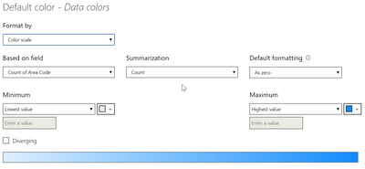
The pbix that shows the transparency, is using no legend and a conditional formatting is used for the coloring:
So, this means you are stuck using the filled map visual.
You might consider using one of the other visuals like the ArcGis (one of the default visuals) or the Mapbox (available from the visual store). But you have to be aware that additional costs may arise if you want/have to unlock certain capabilities.
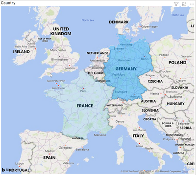
The following visual has been taken using the ArcGis visual as you can see Germany is not fully covered, but there is transparency 🙂
Unfortunately, I have no better news.
Regards,
Tom
Did I answer your question? Mark my post as a solution, this will help others!
Proud to be a Super User!
I accept Kudos 😉
Hamburg, Germany
- Mark as New
- Bookmark
- Subscribe
- Mute
- Subscribe to RSS Feed
- Permalink
- Report Inappropriate Content
Hi @TomMartens
thanks for looking into this again. But i simply remove the legend before i uploaded the file.
Look how it is displayed when i add the Sales Manager to legend in the transparency file:
- Mark as New
- Bookmark
- Subscribe
- Mute
- Subscribe to RSS Feed
- Permalink
- Report Inappropriate Content
This sounds like a good case for Microsoft Support ticket https://powerbi.microsoft.com/en-us/support/pro/
Please @mention me in your reply if you want a response.
Copying DAX from this post? Click here for a hack to quickly replace it with your own table names
Has this post solved your problem? Please Accept as Solution so that others can find it quickly and to let the community know your problem has been solved.
If you found this post helpful, please give Kudos C
I work as a Microsoft trainer and consultant, specialising in Power BI and Power Query.
www.excelwithallison.com
- Mark as New
- Bookmark
- Subscribe
- Mute
- Subscribe to RSS Feed
- Permalink
- Report Inappropriate Content
Hey @Anonymous ,
ah I see!
I have to admit that I have no idea 😞
Maybe this is a bug?!
Regards,
Tom
Did I answer your question? Mark my post as a solution, this will help others!
Proud to be a Super User!
I accept Kudos 😉
Hamburg, Germany
- Mark as New
- Bookmark
- Subscribe
- Mute
- Subscribe to RSS Feed
- Permalink
- Report Inappropriate Content
Hey @Anonymous ,
can you please provide the xlsx that contains the area and the sales manager.
Regards,
Tom
Did I answer your question? Mark my post as a solution, this will help others!
Proud to be a Super User!
I accept Kudos 😉
Hamburg, Germany
- Mark as New
- Bookmark
- Subscribe
- Mute
- Subscribe to RSS Feed
- Permalink
- Report Inappropriate Content
Hi @Anonymous
Thanks very much to TomMartens, your suggestion is brilliant!
@Anonymous if you add a column into "Legend" bucket, then it would show color for each category, it is no "conditional formatting" or "fx" for any color.
Remove any column from the "Legend", write measure like TomMartens provided to distinguish different categories.
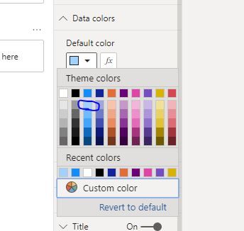
If it is necessary to add columns in "Legend", please select the lightest color.
Then turn on "data label" on maps, the color is light so it would not hide the data/text on the map.
Best Regards
Maggie
Community Support Team _ Maggie Li
If this post helps, then please consider Accept it as the solution to help the other members find it more quickly.
- Mark as New
- Bookmark
- Subscribe
- Mute
- Subscribe to RSS Feed
- Permalink
- Report Inappropriate Content
Hey @Anonymous ,
if this is what you are looking for:
It can be achieved even if it's a bit hacky.
Let's assume my data looks like this:
I create a measure that simply calculates the amount percentage per country using this measure:
share =
IF(
    HASONEFILTER('Some Country'[Country])
    , var _country = MAXX(VALUES('Some Country'[Country]) , 'Some Country'[Country])
    var allAmount = CALCULATE(SUM('Some Country'[Amount]) , ALL('Some Country'[Country]))
    return
    DIVIDE(SUM('Some Country'[Amount]) , allAmount)
    , BLANK()
)
And a 2nd measure that I call DIYgradient like so:
DIYgradient =
var basecolor = "#009dff"
var simpleColorgradient = RIGHT(CONCATENATE("0" , INT([share] * 100)) , 2)
return
CONCATENATE(
    basecolor
    , simpleColorgradient
)
This measure concatenates the hexcode of a color with a 2 digit number representing the percentage of a country, this percentage represents the level of transparency. If a color is represented by 8 characters instead of 6. The last 2 numeric characters are representing the percentage of transparency (numeric characters are mandatory otherwise the hexcode does not represent a valid color).
Please be aware that following the next steps can not be undone, if you are not satisfied with the outcome, you have to delete the Filled map visual and restart with a new Filled map visual. I consider this a bug, but nevertheless I use this to add transparency to the filled polygons in production deployments of my Power BI reports
.
Now you can add the measure DIYgradient to the Data colors property of the map using the conditional function sign:
Make sure you choose this rule
Hopefully, this provides what you are looking for.
Regards,
Tom
Did I answer your question? Mark my post as a solution, this will help others!
Proud to be a Super User!
I accept Kudos 😉
Hamburg, Germany
- Mark as New
- Bookmark
- Subscribe
- Mute
- Subscribe to RSS Feed
- Permalink
- Report Inappropriate Content
@Anonymous
Unfortunately there are many instances where we cannot set the level of transparency in the formatting options.
I actually posted an idea for implementing transparency levels here:
Transparency settings in colour selection
not much traction unfortunately...
Did I answer your question? Mark my post as a solution!
In doing so, you are also helping me. Thank you!
Proud to be a Super User!
Paul on Linkedin.
Helpful resources

Microsoft Fabric Learn Together
Covering the world! 9:00-10:30 AM Sydney, 4:00-5:30 PM CET (Paris/Berlin), 7:00-8:30 PM Mexico City

Power BI Monthly Update - April 2024
Check out the April 2024 Power BI update to learn about new features.

| User | Count |
|---|---|
| 109 | |
| 99 | |
| 77 | |
| 66 | |
| 54 |
| User | Count |
|---|---|
| 144 | |
| 104 | |
| 102 | |
| 87 | |
| 64 |


