- Power BI forums
- Updates
- News & Announcements
- Get Help with Power BI
- Desktop
- Service
- Report Server
- Power Query
- Mobile Apps
- Developer
- DAX Commands and Tips
- Custom Visuals Development Discussion
- Health and Life Sciences
- Power BI Spanish forums
- Translated Spanish Desktop
- Power Platform Integration - Better Together!
- Power Platform Integrations (Read-only)
- Power Platform and Dynamics 365 Integrations (Read-only)
- Training and Consulting
- Instructor Led Training
- Dashboard in a Day for Women, by Women
- Galleries
- Community Connections & How-To Videos
- COVID-19 Data Stories Gallery
- Themes Gallery
- Data Stories Gallery
- R Script Showcase
- Webinars and Video Gallery
- Quick Measures Gallery
- 2021 MSBizAppsSummit Gallery
- 2020 MSBizAppsSummit Gallery
- 2019 MSBizAppsSummit Gallery
- Events
- Ideas
- Custom Visuals Ideas
- Issues
- Issues
- Events
- Upcoming Events
- Community Blog
- Power BI Community Blog
- Custom Visuals Community Blog
- Community Support
- Community Accounts & Registration
- Using the Community
- Community Feedback
Register now to learn Fabric in free live sessions led by the best Microsoft experts. From Apr 16 to May 9, in English and Spanish.
- Power BI forums
- Forums
- Get Help with Power BI
- Desktop
- Re: Filled Map Visualisation and IF function ?
- Subscribe to RSS Feed
- Mark Topic as New
- Mark Topic as Read
- Float this Topic for Current User
- Bookmark
- Subscribe
- Printer Friendly Page
- Mark as New
- Bookmark
- Subscribe
- Mute
- Subscribe to RSS Feed
- Permalink
- Report Inappropriate Content
Filled Map Visualisation and IF function ?
Hello,
I'm a newbie trying to do some practice and skill up with power BI but I've got a bit stumped on a visualisation I'm trying to create.
I have two spreadsheets that I've brought into Power BI.
The first is a budget which provides a forecast of the growth of some savings - the columns are 'Start of Month', 'Savings - Total', and 'Max House Price' calculated with a formula based on the value in total savings. As a row data example: 1st April 2021 / £21,337 / £262,675. These savings, and therefore max house price, increase each month / row.
The second spreadsheet is some data I've pulled from a website about average house prices in locations in England. The columns are 'Location', and 'Average House Price'. I've also made a new column with ", England" affixed to the location so that Power BI knows it's specific location (e.g. Boston, England, not Boston in the USA).
What I'm trying to do is have the filled map visualisation display all affordable locations given a selected date using a slicer or filter (?) (from the "Start of Month" column).
For example, I filter by 1st April 2021 and the map displays all locations where average house price > £262,675. ie all affordable locations based on total projected savings on that date.
I'm sure this is something that power BI can do but I can't seem to work it out. Something to do with the relationships ? Any help would be much appreciated!
Solved! Go to Solution.
- Mark as New
- Bookmark
- Subscribe
- Mute
- Subscribe to RSS Feed
- Permalink
- Report Inappropriate Content
Hi , @pothos
Sorry for the late reply.
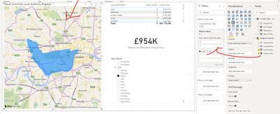
Please try to create a measure and applied it to visual filter pane as seen in "Duplicate of Page 2" (you don't need to establish relationships between tables):
Visual control =
var max_price = SELECTEDVALUE('Budget Data - current'[Maximum Affordable House Price])
var a =IF(SELECTEDVALUE('England-annual-price-change-by-local-authority-2020-03'[House Price])>max_price,1,0)
return a
Best Regards,
Community Support Team _ Eason
If this post helps, then please consider Accept it as the solution to help the other members find it more quickly.
- Mark as New
- Bookmark
- Subscribe
- Mute
- Subscribe to RSS Feed
- Permalink
- Report Inappropriate Content
Hi, @pothos
Sample data and expected output would help tremendously.
Could you please share your PBIX/some sample data excel and expected result to me if you don't have any Confidential Information?
You can upload your pbix file to OneDrive and share it with me if it is convenient.
Best Regards,
Community Support Team _ Eason
- Mark as New
- Bookmark
- Subscribe
- Mute
- Subscribe to RSS Feed
- Permalink
- Report Inappropriate Content
Thanks! Have sent you a link with the data. Hopefully my problem makes a bit more sense now.
- Mark as New
- Bookmark
- Subscribe
- Mute
- Subscribe to RSS Feed
- Permalink
- Report Inappropriate Content
Hi , @pothos
Sorry for the late reply.
Please try to create a measure and applied it to visual filter pane as seen in "Duplicate of Page 2" (you don't need to establish relationships between tables):
Visual control =
var max_price = SELECTEDVALUE('Budget Data - current'[Maximum Affordable House Price])
var a =IF(SELECTEDVALUE('England-annual-price-change-by-local-authority-2020-03'[House Price])>max_price,1,0)
return a
Best Regards,
Community Support Team _ Eason
If this post helps, then please consider Accept it as the solution to help the other members find it more quickly.
Helpful resources

Microsoft Fabric Learn Together
Covering the world! 9:00-10:30 AM Sydney, 4:00-5:30 PM CET (Paris/Berlin), 7:00-8:30 PM Mexico City

Power BI Monthly Update - April 2024
Check out the April 2024 Power BI update to learn about new features.

| User | Count |
|---|---|
| 110 | |
| 97 | |
| 78 | |
| 63 | |
| 55 |
| User | Count |
|---|---|
| 143 | |
| 109 | |
| 89 | |
| 84 | |
| 66 |

