- Power BI forums
- Updates
- News & Announcements
- Get Help with Power BI
- Desktop
- Service
- Report Server
- Power Query
- Mobile Apps
- Developer
- DAX Commands and Tips
- Custom Visuals Development Discussion
- Health and Life Sciences
- Power BI Spanish forums
- Translated Spanish Desktop
- Power Platform Integration - Better Together!
- Power Platform Integrations (Read-only)
- Power Platform and Dynamics 365 Integrations (Read-only)
- Training and Consulting
- Instructor Led Training
- Dashboard in a Day for Women, by Women
- Galleries
- Community Connections & How-To Videos
- COVID-19 Data Stories Gallery
- Themes Gallery
- Data Stories Gallery
- R Script Showcase
- Webinars and Video Gallery
- Quick Measures Gallery
- 2021 MSBizAppsSummit Gallery
- 2020 MSBizAppsSummit Gallery
- 2019 MSBizAppsSummit Gallery
- Events
- Ideas
- Custom Visuals Ideas
- Issues
- Issues
- Events
- Upcoming Events
- Community Blog
- Power BI Community Blog
- Custom Visuals Community Blog
- Community Support
- Community Accounts & Registration
- Using the Community
- Community Feedback
Register now to learn Fabric in free live sessions led by the best Microsoft experts. From Apr 16 to May 9, in English and Spanish.
- Power BI forums
- Forums
- Get Help with Power BI
- Desktop
- Re: FORMAT result according with filter and put It...
- Subscribe to RSS Feed
- Mark Topic as New
- Mark Topic as Read
- Float this Topic for Current User
- Bookmark
- Subscribe
- Printer Friendly Page
- Mark as New
- Bookmark
- Subscribe
- Mute
- Subscribe to RSS Feed
- Permalink
- Report Inappropriate Content
FORMAT result according with filter and put It in a bar chart
Hi,
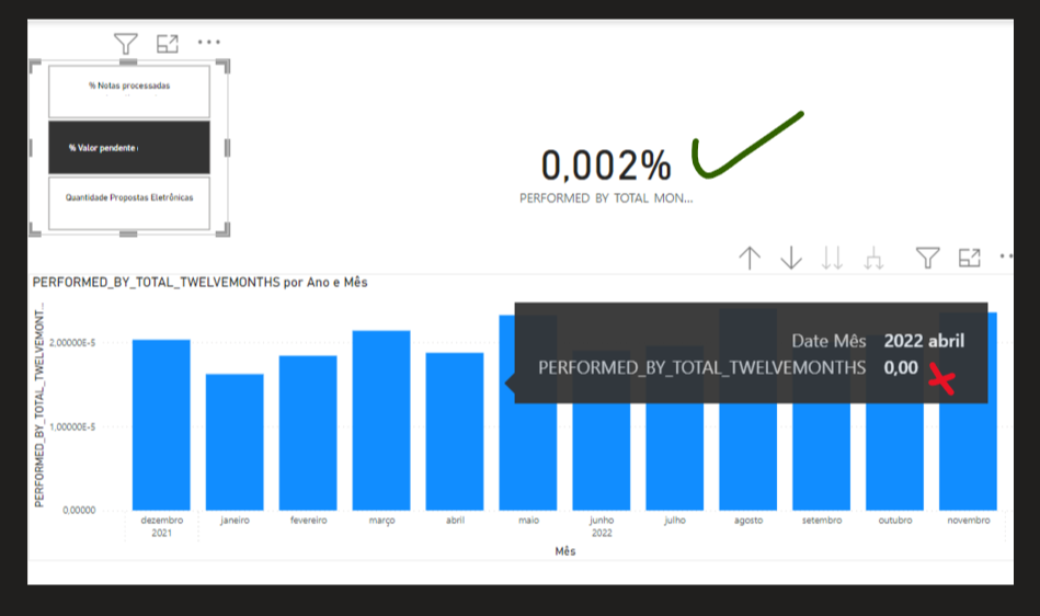
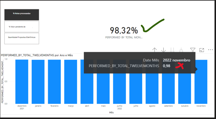
I'm trying to create a code that FORMAT the result according to the selected filter.
My code works on cards, but It doesn't work on the bar charts.
Can someone help me, please?
Below there is the DAX code and a data model example.
| PERFORMED_BY_TOTAL_TWELVEMONTHS = VAR _LASTREF = CALCULATE( MAX('DBN'[Data]), 'DBN'[Tipo] = "PERFORMED/TOTAL", 'DBN'[Valor] <> BLANK() ) VAR _ELEVENMONTHSAGO = EDATE(_LASTREF,-11) VAR _INDICATOR = CALCULATE( SELECTEDVALUE('DBN'[KPI], "ERROR"), 'DBN'[Tipo] = "PERFORMED/TOTAL" ) VAR _RESULT = CALCULATE( SUM('DBN'[Valor]), 'DBN'[Tipo] = "PERFORMED/TOTAL", 'DBN'[Data] >= _ELEVENMONTHSAGO && 'DBN'[Data] <= _LASTREF ) VAR _FORMAT = IF( _INDICATOR = "% Valor pendente", FORMAT(_RESULT, "0.000%"), IF( _INDICATOR = "Quantidade Propostas Eletrônicas Total", FORMAT(_RESULT, "Standard"), FORMAT(_RESULT, "Percent") ) ) RETURN _FORMAT |
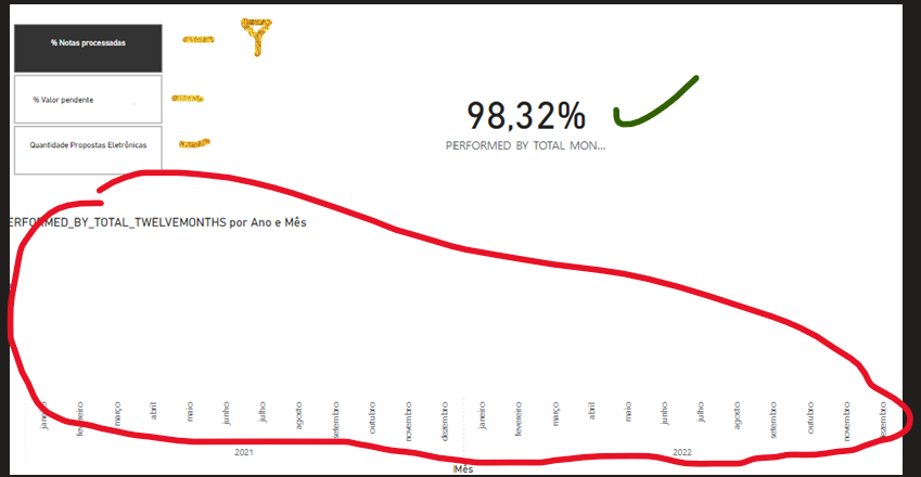
Just _RESULT
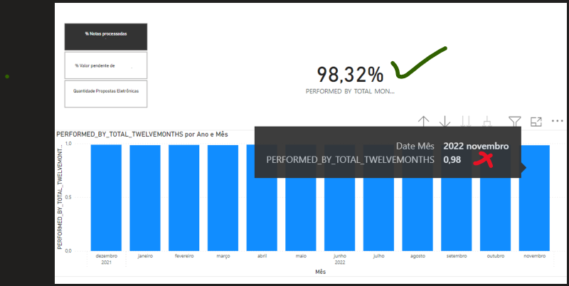
Solved! Go to Solution.
- Mark as New
- Bookmark
- Subscribe
- Mute
- Subscribe to RSS Feed
- Permalink
- Report Inappropriate Content
Hi @John_Silva642 ,
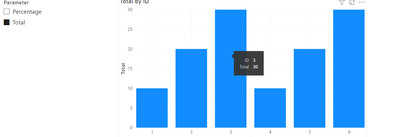
Have you ever considered about using field parameter?
Field parameters allow users to dynamically change the measures or dimensions being analyzed within a report. This feature can help your report readers explore and customize the analysis of the report by selecting the different measures or dimensions they're interested in.
For example:
Then apply to the visual:
For more details, please refer to:
Let report readers use field parameters to change visuals (preview) - Power BI | Microsoft Learn
Best Regards,
Jianbo Li
If this post helps, then please consider Accept it as the solution to help the other members find it more quickly.
- Mark as New
- Bookmark
- Subscribe
- Mute
- Subscribe to RSS Feed
- Permalink
- Report Inappropriate Content
It solved my problem. Thank you!
- Mark as New
- Bookmark
- Subscribe
- Mute
- Subscribe to RSS Feed
- Permalink
- Report Inappropriate Content
Hi @John_Silva642 ,
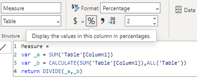
You can't use the Format function in your bar chart because it will convert the values to text format, making it unrecognizable to visual.
For more details, refer to:
FORMAT function (DAX) - DAX | Microsoft Learn
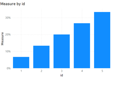
You can change the format of your measure here:
Output:
Best Regards,
Jianbo Li
If this post helps, then please consider Accept it as the solution to help the other members find it more quickly.
- Mark as New
- Bookmark
- Subscribe
- Mute
- Subscribe to RSS Feed
- Permalink
- Report Inappropriate Content
Thanks @v-jianboli-msft
But I need something like the FORMAT function to change the result according to the filter.
Example:

Percent FORMAT (Standard)
Percent FORMAT (0.000%)
Percent FORMAT (Percent)
Helpful resources

Microsoft Fabric Learn Together
Covering the world! 9:00-10:30 AM Sydney, 4:00-5:30 PM CET (Paris/Berlin), 7:00-8:30 PM Mexico City

Power BI Monthly Update - April 2024
Check out the April 2024 Power BI update to learn about new features.

| User | Count |
|---|---|
| 114 | |
| 100 | |
| 81 | |
| 70 | |
| 62 |
| User | Count |
|---|---|
| 148 | |
| 116 | |
| 104 | |
| 90 | |
| 65 |


