- Power BI forums
- Updates
- News & Announcements
- Get Help with Power BI
- Desktop
- Service
- Report Server
- Power Query
- Mobile Apps
- Developer
- DAX Commands and Tips
- Custom Visuals Development Discussion
- Health and Life Sciences
- Power BI Spanish forums
- Translated Spanish Desktop
- Power Platform Integration - Better Together!
- Power Platform Integrations (Read-only)
- Power Platform and Dynamics 365 Integrations (Read-only)
- Training and Consulting
- Instructor Led Training
- Dashboard in a Day for Women, by Women
- Galleries
- Community Connections & How-To Videos
- COVID-19 Data Stories Gallery
- Themes Gallery
- Data Stories Gallery
- R Script Showcase
- Webinars and Video Gallery
- Quick Measures Gallery
- 2021 MSBizAppsSummit Gallery
- 2020 MSBizAppsSummit Gallery
- 2019 MSBizAppsSummit Gallery
- Events
- Ideas
- Custom Visuals Ideas
- Issues
- Issues
- Events
- Upcoming Events
- Community Blog
- Power BI Community Blog
- Custom Visuals Community Blog
- Community Support
- Community Accounts & Registration
- Using the Community
- Community Feedback
Register now to learn Fabric in free live sessions led by the best Microsoft experts. From Apr 16 to May 9, in English and Spanish.
- Power BI forums
- Forums
- Get Help with Power BI
- Desktop
- Re: Exclude cells with small sample sizes
- Subscribe to RSS Feed
- Mark Topic as New
- Mark Topic as Read
- Float this Topic for Current User
- Bookmark
- Subscribe
- Printer Friendly Page
- Mark as New
- Bookmark
- Subscribe
- Mute
- Subscribe to RSS Feed
- Permalink
- Report Inappropriate Content
Exclude cells with small sample sizes
New to Power BI and trying to get my bearings. I'm working with survey (Likert-type) data in a university setting, and as a result, we are concerned about protecting the confidentiality of respondents. In the data in question, there are numerous demographic measures (e.g., race, gender, sexual orientation) that we would like to be able to include. However, as multiple identities are introduced (e.g., Asian, Transgender. and Pansexual) the sample size in many cells falls below low a threshold we are comfortable display (n > 5).
Coming from Tableau, I know you could write some code to calculate when that would happen and hide cells that contained small sample sizes. Is this possible to do in Power BI? I much prefer the experience with Power BI, but this is a big issue that I need to resolve before trying to convince my office to move over.
Thanks for any help/insight!
Solved! Go to Solution.
- Mark as New
- Bookmark
- Subscribe
- Mute
- Subscribe to RSS Feed
- Permalink
- Report Inappropriate Content
Hi, Select the other chart and Go to Edit Interactions (Format Menu) and Select Filter instead of Highlight.

Lima - Peru
- Mark as New
- Bookmark
- Subscribe
- Mute
- Subscribe to RSS Feed
- Permalink
- Report Inappropriate Content
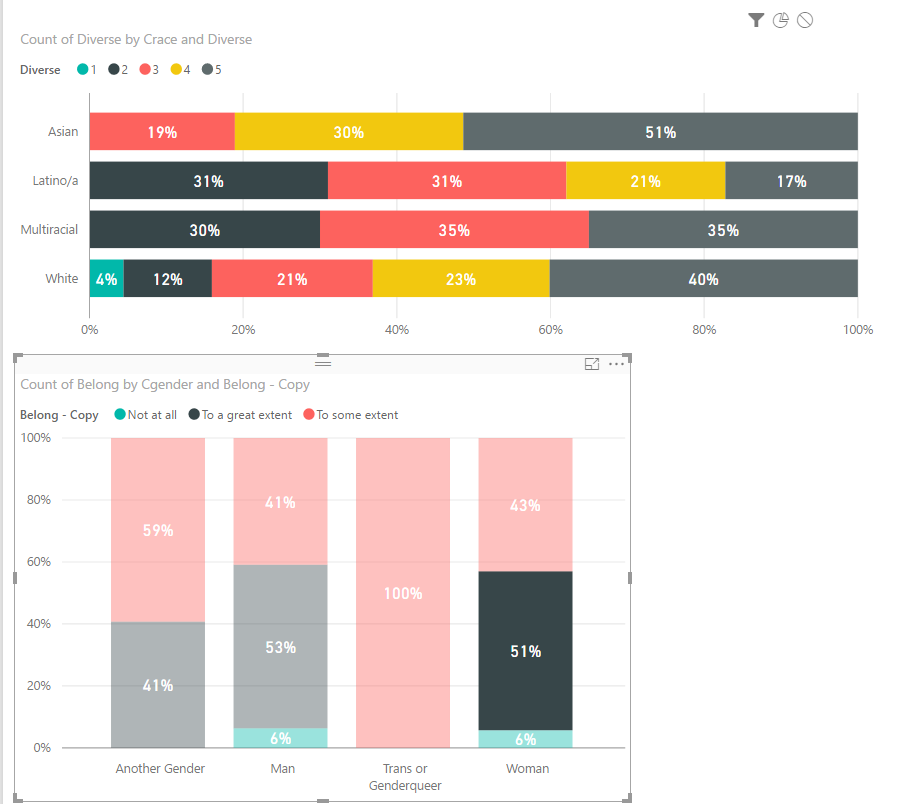
Hi jbittinger, we encountered this same problem as we have sensitive healthcare data. We were able to successfully suppress small numbers through the use of DAX formulas. Conceptually, the formula goes like this: "If the number to be displayed is less than n, then display '***', otherwise, display the number." An actual example is here:
- Mark as New
- Bookmark
- Subscribe
- Mute
- Subscribe to RSS Feed
- Permalink
- Report Inappropriate Content
This was the fix to our issue. Thanks!!
I simplified the DAX formula you provided and got the output we expected:
- Mark as New
- Bookmark
- Subscribe
- Mute
- Subscribe to RSS Feed
- Permalink
- Report Inappropriate Content
You could create a simple COUNT measure and then add that to your report filter and set it to be >=5. If I understand the problem correctly.
@ me in replies or I'll lose your thread!!!
Instead of a Kudo, please vote for this idea
Become an expert!: Enterprise DNA
External Tools: MSHGQM
YouTube Channel!: Microsoft Hates Greg
Latest book!: The Definitive Guide to Power Query (M)
DAX is easy, CALCULATE makes DAX hard...
- Mark as New
- Bookmark
- Subscribe
- Mute
- Subscribe to RSS Feed
- Permalink
- Report Inappropriate Content
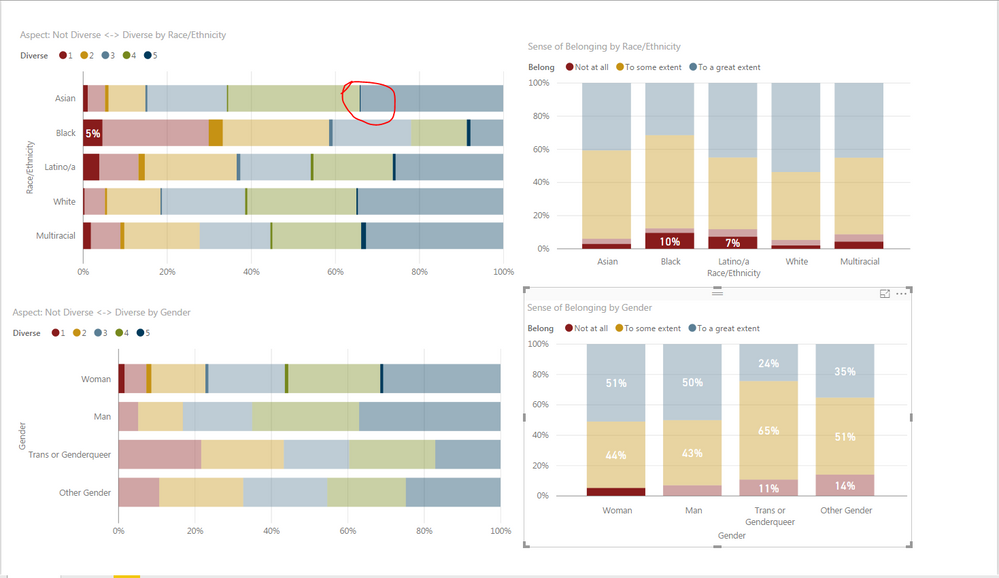
I think a picture will help here (and perhaps a COUNT measure is appropriate). In the picture below, I have selected women who have a low sense of belonging on the bottom right graph, which then highlights those women across the other graphs. I really like this feature, but some of the sample sizes are too small to display. For example, the cell I have circled has fewer than 5 respondents and I would want to hide that from being displayed.
I began playing around with creating a COUNT measure and was not getting far with it. For the image below, there are 4 variables being used: Diverse, Belonging, Gender, and Race. Would I essentially have to build a long if/then logic calculation to use the COUNT measure?
- Mark as New
- Bookmark
- Subscribe
- Mute
- Subscribe to RSS Feed
- Permalink
- Report Inappropriate Content
I believe I duplicated this. I created the following data:
EthnicityCategory
| Asian | 1 |
| Asian | 1 |
| Asian | 1 |
| Asian | 1 |
| Asian | 1 |
| Asian | 2 |
| Asian | 2 |
| Asian | 2 |
| Asian | 2 |
| Asian | 2 |
| Asian | 3 |
| Asian | 3 |
| Asian | 3 |
| Asian | 3 |
| Asian | 3 |
| Asian | 4 |
| Asian | 4 |
| Asian | 5 |
| Asian | 5 |
| Asian | 5 |
| Asian | 5 |
| Asian | 5 |
| Black | 1 |
| Black | 1 |
| Black | 1 |
| Black | 1 |
| Black | 1 |
| Black | 2 |
| Black | 2 |
| Black | 3 |
| Black | 3 |
| Black | 3 |
| Black | 3 |
| Black | 3 |
| Black | 4 |
| Black | 4 |
| Black | 4 |
| Black | 4 |
| Black | 4 |
| Black | 5 |
| Black | 5 |
| Black | 5 |
| Black | 5 |
| Black | 5 |
I then put Ethnicity in my Axis, Category in my Label and then Count of Category (just changed the default summation from SUM to COUNT) in my Value. Then, in my filter area for the visual, I set "Count of Category" to "greater than or equal to 5"
@ me in replies or I'll lose your thread!!!
Instead of a Kudo, please vote for this idea
Become an expert!: Enterprise DNA
External Tools: MSHGQM
YouTube Channel!: Microsoft Hates Greg
Latest book!: The Definitive Guide to Power Query (M)
DAX is easy, CALCULATE makes DAX hard...
- Mark as New
- Bookmark
- Subscribe
- Mute
- Subscribe to RSS Feed
- Permalink
- Report Inappropriate Content
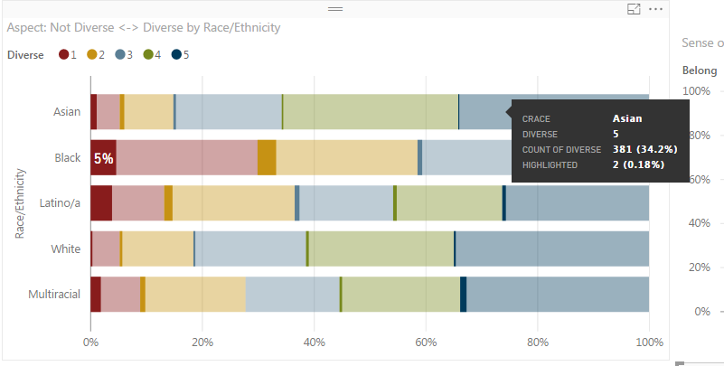
Thanks for the help thus far. When I try this, the problem still exists because it doesn't seem to affect the highlighted numbers (see below). I got to this point by clicking on a bar segment from a belonging graph.
- Mark as New
- Bookmark
- Subscribe
- Mute
- Subscribe to RSS Feed
- Permalink
- Report Inappropriate Content
I don't have any context in relation to this. Is this visualization configured to have a filter of "Count of Diverse" > 5?
@ me in replies or I'll lose your thread!!!
Instead of a Kudo, please vote for this idea
Become an expert!: Enterprise DNA
External Tools: MSHGQM
YouTube Channel!: Microsoft Hates Greg
Latest book!: The Definitive Guide to Power Query (M)
DAX is easy, CALCULATE makes DAX hard...
- Mark as New
- Bookmark
- Subscribe
- Mute
- Subscribe to RSS Feed
- Permalink
- Report Inappropriate Content
Yes, the visual has a Count of Diverse > 5 filter.
I've pulled a sample from the data and created a sample page. The .pbix file can be accessed here.
- Mark as New
- Bookmark
- Subscribe
- Mute
- Subscribe to RSS Feed
- Permalink
- Report Inappropriate Content
Hi, Select the other chart and Go to Edit Interactions (Format Menu) and Select Filter instead of Highlight.

Lima - Peru
- Mark as New
- Bookmark
- Subscribe
- Mute
- Subscribe to RSS Feed
- Permalink
- Report Inappropriate Content
Thanks for this solution, I take it there's no way to do this and allow the highlighting option (makes sense, but I was still hopeful).
Helpful resources

Microsoft Fabric Learn Together
Covering the world! 9:00-10:30 AM Sydney, 4:00-5:30 PM CET (Paris/Berlin), 7:00-8:30 PM Mexico City

Power BI Monthly Update - April 2024
Check out the April 2024 Power BI update to learn about new features.

| User | Count |
|---|---|
| 110 | |
| 99 | |
| 80 | |
| 64 | |
| 58 |
| User | Count |
|---|---|
| 148 | |
| 111 | |
| 93 | |
| 84 | |
| 66 |


