- Power BI forums
- Updates
- News & Announcements
- Get Help with Power BI
- Desktop
- Service
- Report Server
- Power Query
- Mobile Apps
- Developer
- DAX Commands and Tips
- Custom Visuals Development Discussion
- Health and Life Sciences
- Power BI Spanish forums
- Translated Spanish Desktop
- Power Platform Integration - Better Together!
- Power Platform Integrations (Read-only)
- Power Platform and Dynamics 365 Integrations (Read-only)
- Training and Consulting
- Instructor Led Training
- Dashboard in a Day for Women, by Women
- Galleries
- Community Connections & How-To Videos
- COVID-19 Data Stories Gallery
- Themes Gallery
- Data Stories Gallery
- R Script Showcase
- Webinars and Video Gallery
- Quick Measures Gallery
- 2021 MSBizAppsSummit Gallery
- 2020 MSBizAppsSummit Gallery
- 2019 MSBizAppsSummit Gallery
- Events
- Ideas
- Custom Visuals Ideas
- Issues
- Issues
- Events
- Upcoming Events
- Community Blog
- Power BI Community Blog
- Custom Visuals Community Blog
- Community Support
- Community Accounts & Registration
- Using the Community
- Community Feedback
Register now to learn Fabric in free live sessions led by the best Microsoft experts. From Apr 16 to May 9, in English and Spanish.
- Power BI forums
- Forums
- Get Help with Power BI
- Desktop
- Error when making a scatter chart
- Subscribe to RSS Feed
- Mark Topic as New
- Mark Topic as Read
- Float this Topic for Current User
- Bookmark
- Subscribe
- Printer Friendly Page
- Mark as New
- Bookmark
- Subscribe
- Mute
- Subscribe to RSS Feed
- Permalink
- Report Inappropriate Content
Error when making a scatter chart
Hi there,
I need to make a scatter chart with the X Axis being Month and the Y Axis got from -3 to 3. I'm getting the error:
"Your x- and y-axis values aren't playing together nicely. Replace the x-axis field with a numerical value, or change the y-axis field values to summarizations."
The dots should show one dot per entry in my data or the months. What do I need to do to get this to work? I feel like it's way too complicated for something so simple.
- Mark as New
- Bookmark
- Subscribe
- Mute
- Subscribe to RSS Feed
- Permalink
- Report Inappropriate Content
Thanks for you replies. Here's some sample data
| Month (X axis) - Text | Score (Y axis) - Whole number | Unique ID (count for values) |
Jan | -3 | A |
| Feb | 0 | B |
| Mar | 1 | C |
| Apr | -2 | D |
| May | -1 | E |
| Jun | 3 | F |
| Jul | 2 | G |
- Mark as New
- Bookmark
- Subscribe
- Mute
- Subscribe to RSS Feed
- Permalink
- Report Inappropriate Content
Hi @Hayleysea ,
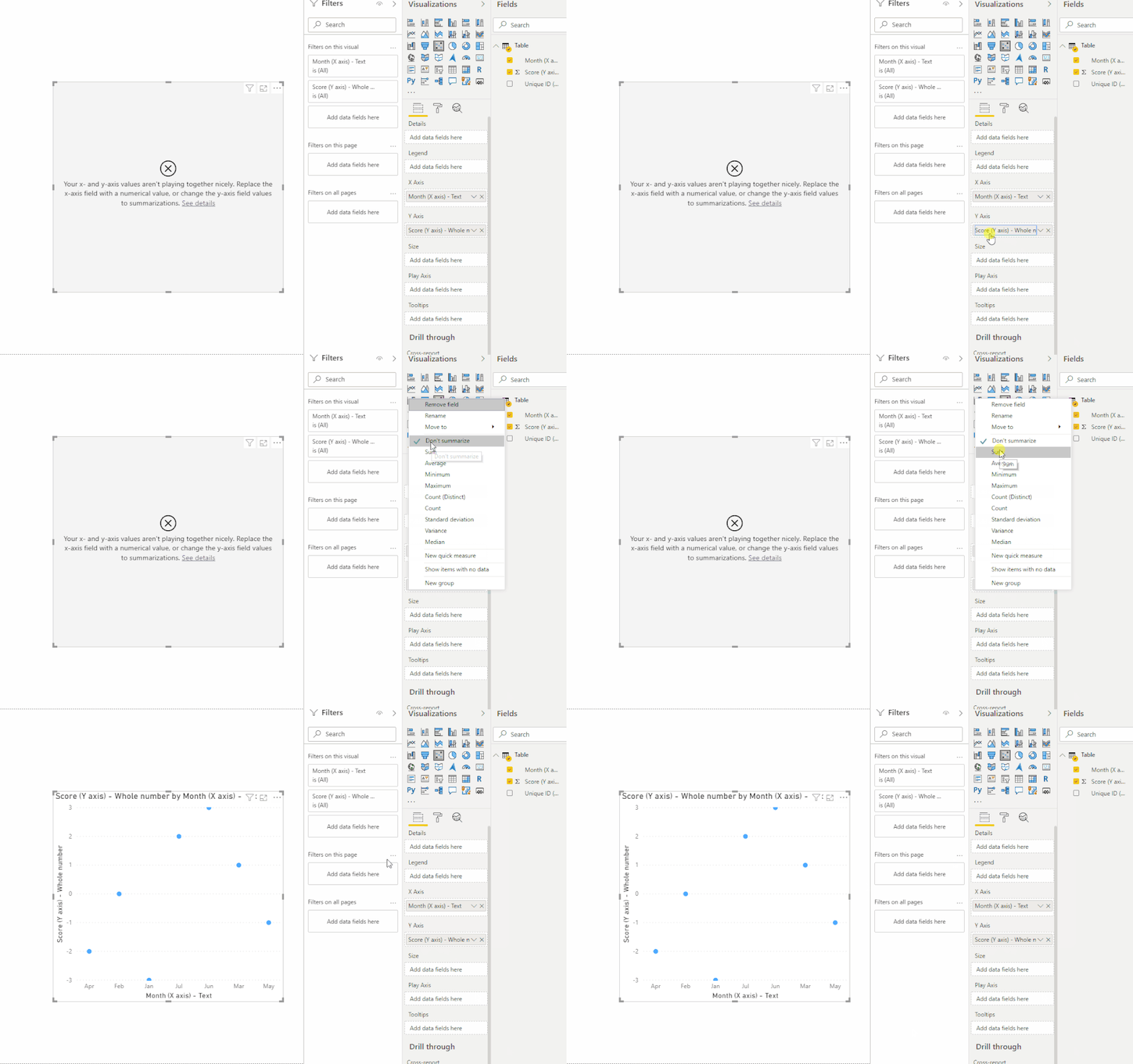
Try this:
Best Regards,
Icey
If this post helps, then please consider Accept it as the solution to help the other members find it more quickly.
- Mark as New
- Bookmark
- Subscribe
- Mute
- Subscribe to RSS Feed
- Permalink
- Report Inappropriate Content
Thank you. When I change it to sum it goes from -5 to 40? It doesn't look like yours but it is formatted as whole numbers. Anything else I should check?
- Mark as New
- Bookmark
- Subscribe
- Mute
- Subscribe to RSS Feed
- Permalink
- Report Inappropriate Content
Hi @Hayleysea ,
When encountering repeated categories, Power BI will automatically calculate the aggregate (sum) value. So, in the Scatter chart, it will sum all scores of the same month.
It is suggested to add an index column in your table and then put it into Legend field. Or, use R visual.
Best Regards,
Icey
If this post helps, then please consider Accept it as the solution to help the other members find it more quickly.
- Mark as New
- Bookmark
- Subscribe
- Mute
- Subscribe to RSS Feed
- Permalink
- Report Inappropriate Content
It may be due to Data type. Could you please define the Data type of your Month (X-axis) and Column (Y-axis)? It will be more easier for us to help you.
Please take a quick glance at newly created dashboards : Restaurant Management Dashboard , HR Analytics Report , Hotel Management Report, Sales Analysis Report , Fortune 500 Companies Analysis , Revenue Tracking Dashboard
- Mark as New
- Bookmark
- Subscribe
- Mute
- Subscribe to RSS Feed
- Permalink
- Report Inappropriate Content
@Hayleysea , what are you using on Y-axis. In case you are using no numeric value on x-axis remove details and legend and try again
https://docs.microsoft.com/en-us/power-bi/visuals/power-bi-visualization-scatter
Can you share sample data and sample output in table format?
Microsoft Power BI Learning Resources, 2023 !!
Learn Power BI - Full Course with Dec-2022, with Window, Index, Offset, 100+ Topics !!
Did I answer your question? Mark my post as a solution! Appreciate your Kudos !! Proud to be a Super User! !!
Helpful resources

Microsoft Fabric Learn Together
Covering the world! 9:00-10:30 AM Sydney, 4:00-5:30 PM CET (Paris/Berlin), 7:00-8:30 PM Mexico City

Power BI Monthly Update - April 2024
Check out the April 2024 Power BI update to learn about new features.

| User | Count |
|---|---|
| 110 | |
| 95 | |
| 76 | |
| 65 | |
| 51 |
| User | Count |
|---|---|
| 146 | |
| 109 | |
| 106 | |
| 88 | |
| 61 |

