cancel
Showing results for 
Search instead for 
Did you mean: 

Register now to learn Fabric in free live sessions led by the best Microsoft experts. From Apr 16 to May 9, in English and Spanish.

Reply
Generic_name
Frequent Visitor

Entities depending on each other, visualization and filtering

Hello everyone,


I'm currently trying to find a good visualization for different components depending on each other in our company. 

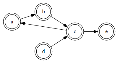
My underlying data looks like this:

depending_oncomponent
ab
bc
dc
ca
ce

Starting with this data I'm having troubles on two fronts.


The need for proper filtering.

The full dataset will contain ~150 nodes, which makes it difficult to directly see the dependencies of a specific component, because the screen will be full of nodes.

To prevent this I would like to give the user the possibility to choose a Component using a single-choice Dropdown filter.

When the report is filtered it should show the complete path for this component. This means every predecessor and successor of this component. 

In my understanding this is possible when the PATH for each component is build, which I'm heavily struggeling with because of the circular dependencies in the data. For the same reason this example https://www.thebiccountant.com/2017/02/14/dynamically-flatten-parent-child-hierarchies-in-dax-and-po... , which also builds a path does not seem to work. 

How can I create a filter that behaves in the desired manner?


Finding the right Visualization

I would love to visualize the data like it is done with Graphviz:

For an extended example please look at http://www.webgraphviz.com/  -> example 4.

I'm struggeling to find a visualization in Power BI that is coming close to this.

I've tried many different visualizations with Sankey 2.0.1 and Force-Directed Graph 2.0.2 as my current favorites. But I'm not fully confident with my choices, does anyone have a tip for a better one?


If anyone needs further information feel free to ask. Any help is appreciated.

2 REPLIES 2
v-xuding-msft
Community Support
Community Support

Hi @Generic_name ,

Based on my test, I think it is proper for the requirement to use the visual of Sankey. And you can filter the components with the visual level filter. 

1.PNG

Best Regards,

Xue Ding

If this post helps, then please consider Accept it as the solution to help the other members find it more quickly.

Best Regards,
Xue Ding
If this post helps, then please consider Accept it as the solution to help the other members find it more quickly.

Hey @v-xuding-msft,


thank you for your reply and for encouraging my approach to use a sankey diagram for visualization.


Unfortunately my requirement to filtering is a little different to the solution you proposed as I need to show all the connections for an entity. I have extended my example from the starting post to provide a better understanding to my case as it may have been unclear: 

04xHSpi

So, the new relations look like this: 

depending on component
ab
bc
dc
ca
ce
fg
gh

And the result when filtering should show something like this:

filter on "show all predecessors of"Nodes shownFilter on "show all successors of"Nodes shown
ac,d,bab,c,e
ba,c,dbc,e,a
cb,a,dce,a,b
d dc,e,a,b
ec,d,b,ae 
f fg,h
gfgh
hg,fh 


Does anyone have an idea how to do this?

Helpful resources

Announcements
Microsoft Fabric Learn Together

Microsoft Fabric Learn Together

Covering the world! 9:00-10:30 AM Sydney, 4:00-5:30 PM CET (Paris/Berlin), 7:00-8:30 PM Mexico City

PBI_APRIL_CAROUSEL1

Power BI Monthly Update - April 2024

Check out the April 2024 Power BI update to learn about new features.

April Fabric Community Update

Fabric Community Update - April 2024

Find out what's new and trending in the Fabric Community.