- Power BI forums
- Updates
- News & Announcements
- Get Help with Power BI
- Desktop
- Service
- Report Server
- Power Query
- Mobile Apps
- Developer
- DAX Commands and Tips
- Custom Visuals Development Discussion
- Health and Life Sciences
- Power BI Spanish forums
- Translated Spanish Desktop
- Power Platform Integration - Better Together!
- Power Platform Integrations (Read-only)
- Power Platform and Dynamics 365 Integrations (Read-only)
- Training and Consulting
- Instructor Led Training
- Dashboard in a Day for Women, by Women
- Galleries
- Community Connections & How-To Videos
- COVID-19 Data Stories Gallery
- Themes Gallery
- Data Stories Gallery
- R Script Showcase
- Webinars and Video Gallery
- Quick Measures Gallery
- 2021 MSBizAppsSummit Gallery
- 2020 MSBizAppsSummit Gallery
- 2019 MSBizAppsSummit Gallery
- Events
- Ideas
- Custom Visuals Ideas
- Issues
- Issues
- Events
- Upcoming Events
- Community Blog
- Power BI Community Blog
- Custom Visuals Community Blog
- Community Support
- Community Accounts & Registration
- Using the Community
- Community Feedback
Register now to learn Fabric in free live sessions led by the best Microsoft experts. From Apr 16 to May 9, in English and Spanish.
- Power BI forums
- Forums
- Get Help with Power BI
- Desktop
- Edit legend/ format axis?
- Subscribe to RSS Feed
- Mark Topic as New
- Mark Topic as Read
- Float this Topic for Current User
- Bookmark
- Subscribe
- Printer Friendly Page
- Mark as New
- Bookmark
- Subscribe
- Mute
- Subscribe to RSS Feed
- Permalink
- Report Inappropriate Content
Edit legend/ format axis?
Two-part question.
1: I have several charts that show the output line, and a target line. The legend shows the names of both (e.g. "% of output timely, timeliness target"). I would like to keep the names of the measures, but edit the legend so it reads "% of output timely, target." Is it possible to edit the legend without renaming the measures?
2: The x axis, which shows dates, is inconsistent/random with which dates it shows. Can I fix it so that it shows dates at a specified interval? Right now it only seems to add/remove dates as I resize the charts larger or smaller, and even then I cannot choose which dates are shown. In column graphs, the dates shown below the columns don't match the actual date that column shows. Is this able to be edited?
Thank you in advance.
Solved! Go to Solution.
- Mark as New
- Bookmark
- Subscribe
- Mute
- Subscribe to RSS Feed
- Permalink
- Report Inappropriate Content
Hi @jennys,
#1. Currently, we are able to custom Legend Name rather than legend values. For your requirement, you can vote on this same idea: custom legend.
#2. You can try to create a calendar table, create a relationship between this new table and fact table. Drag the date column from calendar table to chart X-Axis.
Best Regards,
Qiuyun Yu
If this post helps, then please consider Accept it as the solution to help the other members find it more quickly.
- Mark as New
- Bookmark
- Subscribe
- Mute
- Subscribe to RSS Feed
- Permalink
- Report Inappropriate Content
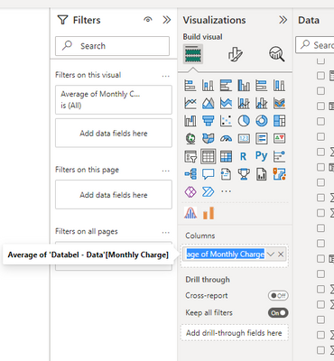
This has now been fixed. You can doubleclick on the variable in the visualisations tab and it will let you rename it.
- Mark as New
- Bookmark
- Subscribe
- Mute
- Subscribe to RSS Feed
- Permalink
- Report Inappropriate Content
Hi @jennys,
#1. Currently, we are able to custom Legend Name rather than legend values. For your requirement, you can vote on this same idea: custom legend.
#2. You can try to create a calendar table, create a relationship between this new table and fact table. Drag the date column from calendar table to chart X-Axis.
Best Regards,
Qiuyun Yu
If this post helps, then please consider Accept it as the solution to help the other members find it more quickly.
- Mark as New
- Bookmark
- Subscribe
- Mute
- Subscribe to RSS Feed
- Permalink
- Report Inappropriate Content
1. Unfortunately not. There is no custom label like in Excel as yet. You can vote for it at ideas.powerbi.com
2. There is a formatting option that allows you to set a continuous or categorical axis. It is in the formatting area I think. Try to swap that and see if it does what you want
- Mark as New
- Bookmark
- Subscribe
- Mute
- Subscribe to RSS Feed
- Permalink
- Report Inappropriate Content
Thanks. I had tried the categorical option earlier, but it shows every single date available instead of a select few at a regular interval (makes sense for a categorical variable). Is that the only other way you know of?
- Mark as New
- Bookmark
- Subscribe
- Mute
- Subscribe to RSS Feed
- Permalink
- Report Inappropriate Content
In terms of Question 2. Your best option for the moment if the continuous/categorical option isn't working for you is to FORMAT the date to the required format and then Sort this by a column in the date table (any that will accept) as so it's properly in order.
Helpful resources

Microsoft Fabric Learn Together
Covering the world! 9:00-10:30 AM Sydney, 4:00-5:30 PM CET (Paris/Berlin), 7:00-8:30 PM Mexico City

Power BI Monthly Update - April 2024
Check out the April 2024 Power BI update to learn about new features.

| User | Count |
|---|---|
| 115 | |
| 100 | |
| 88 | |
| 69 | |
| 61 |
| User | Count |
|---|---|
| 152 | |
| 120 | |
| 102 | |
| 87 | |
| 68 |

