- Power BI forums
- Updates
- News & Announcements
- Get Help with Power BI
- Desktop
- Service
- Report Server
- Power Query
- Mobile Apps
- Developer
- DAX Commands and Tips
- Custom Visuals Development Discussion
- Health and Life Sciences
- Power BI Spanish forums
- Translated Spanish Desktop
- Power Platform Integration - Better Together!
- Power Platform Integrations (Read-only)
- Power Platform and Dynamics 365 Integrations (Read-only)
- Training and Consulting
- Instructor Led Training
- Dashboard in a Day for Women, by Women
- Galleries
- Community Connections & How-To Videos
- COVID-19 Data Stories Gallery
- Themes Gallery
- Data Stories Gallery
- R Script Showcase
- Webinars and Video Gallery
- Quick Measures Gallery
- 2021 MSBizAppsSummit Gallery
- 2020 MSBizAppsSummit Gallery
- 2019 MSBizAppsSummit Gallery
- Events
- Ideas
- Custom Visuals Ideas
- Issues
- Issues
- Events
- Upcoming Events
- Community Blog
- Power BI Community Blog
- Custom Visuals Community Blog
- Community Support
- Community Accounts & Registration
- Using the Community
- Community Feedback
Register now to learn Fabric in free live sessions led by the best Microsoft experts. From Apr 16 to May 9, in English and Spanish.
- Power BI forums
- Forums
- Get Help with Power BI
- Desktop
- Dynamically update Pie Chart with data from a dire...
- Subscribe to RSS Feed
- Mark Topic as New
- Mark Topic as Read
- Float this Topic for Current User
- Bookmark
- Subscribe
- Printer Friendly Page
- Mark as New
- Bookmark
- Subscribe
- Mute
- Subscribe to RSS Feed
- Permalink
- Report Inappropriate Content
Dynamically update Pie Chart with data from a direct query based on a time slicer
The data table below is retrived using Direct Query
Pump Activity Table (Active - 1 , Not Active - 0)
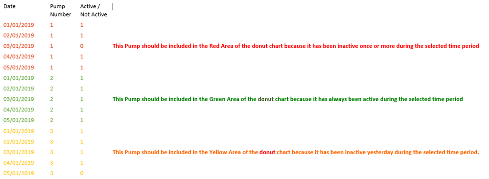
Date | Pump Number | Active / Not Active |
01/01/2019 | 1 | 1 |
02/01/2019 | 1 | 1 |
03/01/2019 | 1 | 0 |
04/01/2019 | 1 | 1 |
05/01/2019 | 1 | 1 |
01/01/2019 | 2 | 1 |
02/01/2019 | 2 | 1 |
03/01/2019 | 2 | 1 |
04/01/2019 | 2 | 1 |
05/01/2019 | 2 | 1 |
01/01/2019 | 3 | 1 |
02/01/2019 | 3 | 1 |
03/01/2019 | 3 | 1 |
04/01/2019 | 3 | 1 |
05/01/2019 | 3 | 0 |
We need to monitor the activity of the Pumps and display it in a pie chart according to its activity status.
The requirement Is :
If a user selects a particular time period using a slicer. The above pie chart should dynamically update itself displaying the Activity status of the pumps.
1. The green area should indicate the number of pumps which has been continously active over the selected time span.
i.e Active / Not Active column containing only 1s for the selected time period.
2. The Red area should display the number of pumps which have been inactive atleast once over the selected time span.
i.e. The Active /Not Active column contining atlease one 0 for the selected time period.
3. The Yellow area should display the number of pumps which have been inactive yesterday.
i.e The Active / Not Active column has a value of 0 for yesterday
Example/Expected result
Consider today's date is 06/01/2019.
If I Choose the time period 01/01/2019 to 06/01/2019 in the slicer, the following records will be considered for calculating the pie chart visualization. Today's record is not included because the table is updated at midnight.
Date | Pump Number | Active / Not Active |
|
01/01/2019 | 1 | 1 |
|
02/01/2019 | 1 | 1 |
|
03/01/2019 | 1 | 0 | This Pump should be included in the Red Area of the piechart because it has been inactive for atleast a day. |
04/01/2019 | 1 | 1 |
|
05/01/2019 | 1 | 1 |
|
01/01/2019 | 2 | 1 |
|
02/01/2019 | 2 | 1 |
|
03/01/2019 | 2 | 1 | This Pump should be included in the Green Area of the piechart because it has been active all the time |
04/01/2019 | 2 | 1 |
|
05/01/2019 | 2 | 1 |
|
01/01/2019 | 3 | 1 |
|
02/01/2019 | 3 | 1 |
|
03/01/2019 | 3 | 1 | This Pump should be included in the Yellow Area of the piechart because it has been inactive yesterday. |
04/01/2019 | 3 | 1 |
|
05/01/2019 | 3 | 0 |
|
We tried creating a measure and using it in the piechart legend field, but we were unsuccessfull.
Can the activity status of the pumps be visualised dynamically on the donut visual based on the time filter ?
Thank You
Solved! Go to Solution.
- Mark as New
- Bookmark
- Subscribe
- Mute
- Subscribe to RSS Feed
- Permalink
- Report Inappropriate Content
Hi @Anonymous ,
If the donut visual should show the distinct number of pumps for each status, we can try to use the following measures:
PumpNumber =
SWITCH (
    SELECTEDVALUE ( LegandTable[LegandName] ),
    "Red", SUMX (
        'Pump Number',
        IF (
            CALCULATE (
                COUNTROWS ( RELATEDTABLE ( 'Pump' ) ),
                'Pump'[Active / Not Active] = 0
            ) > 0
                && CALCULATE (
                    MAX ( 'Pump'[Active / Not Active] ),
                    FILTER ( RELATEDTABLE ( 'Pump' ), 'Pump'[Date] = [Today] - 1 )
                ) = 1,
            1,
            BLANK ()
        )
    ),
    "Green", SUMX (
        'Pump Number',
        IF (
            CALCULATE (
                COUNTROWS ( RELATEDTABLE ( 'Pump' ) ),
                'Pump'[Active / Not Active] = 1
            )
                = CALCULATE ( COUNTROWS ( RELATEDTABLE ( 'Pump' ) ) ),
            1,
            BLANK ()
        )
    ),
    "Yellow", SUMX (
        'Pump Number',
        IF (
            CALCULATE (
                MAX ( 'Pump'[Active / Not Active] ),
                FILTER ( RELATEDTABLE ( 'Pump' ), 'Pump'[Date] = [Today] - 1 )
            ) = 0,
            1,
            BLANK ()
        )
    )
)
Best regards,
If this post helps, then please consider Accept it as the solution to help the other members find it more quickly.
- Mark as New
- Bookmark
- Subscribe
- Mute
- Subscribe to RSS Feed
- Permalink
- Report Inappropriate Content
Hi @Anonymous ,
How about the result after you follow the suggestions mentioned in my original post?Could you please provide more details about it If it doesn't meet your requirement?
Best regards,
If this post helps, then please consider Accept it as the solution to help the other members find it more quickly.
- Mark as New
- Bookmark
- Subscribe
- Mute
- Subscribe to RSS Feed
- Permalink
- Report Inappropriate Content
Hi Dong Li,
Sorry for the late reply.
I think you have misunderstood my requirements.
Requirement
The donut visual needs to represent the activity status of all the pumps.
Input Data
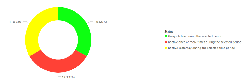
Expected Result
The desired result for the input data provided would be looking like the visual below. This is because there is only one pump satisfying each of the three Pump status conditions.
Thank You
Regards
Avinash
- Mark as New
- Bookmark
- Subscribe
- Mute
- Subscribe to RSS Feed
- Permalink
- Report Inappropriate Content
Hi @Anonymous ,
If the donut visual should show the distinct number of pumps for each status, we can try to use the following measures:
PumpNumber =
SWITCH (
    SELECTEDVALUE ( LegandTable[LegandName] ),
    "Red", SUMX (
        'Pump Number',
        IF (
            CALCULATE (
                COUNTROWS ( RELATEDTABLE ( 'Pump' ) ),
                'Pump'[Active / Not Active] = 0
            ) > 0
                && CALCULATE (
                    MAX ( 'Pump'[Active / Not Active] ),
                    FILTER ( RELATEDTABLE ( 'Pump' ), 'Pump'[Date] = [Today] - 1 )
                ) = 1,
            1,
            BLANK ()
        )
    ),
    "Green", SUMX (
        'Pump Number',
        IF (
            CALCULATE (
                COUNTROWS ( RELATEDTABLE ( 'Pump' ) ),
                'Pump'[Active / Not Active] = 1
            )
                = CALCULATE ( COUNTROWS ( RELATEDTABLE ( 'Pump' ) ) ),
            1,
            BLANK ()
        )
    ),
    "Yellow", SUMX (
        'Pump Number',
        IF (
            CALCULATE (
                MAX ( 'Pump'[Active / Not Active] ),
                FILTER ( RELATEDTABLE ( 'Pump' ), 'Pump'[Date] = [Today] - 1 )
            ) = 0,
            1,
            BLANK ()
        )
    )
)
Best regards,
If this post helps, then please consider Accept it as the solution to help the other members find it more quickly.
- Mark as New
- Bookmark
- Subscribe
- Mute
- Subscribe to RSS Feed
- Permalink
- Report Inappropriate Content
Hi Dong Li,
Thanks for providing a solution. This is a wonderful way to workaround the limitations of measures and visuals in Power BI.
Thank You
Regards
Avinash
- Mark as New
- Bookmark
- Subscribe
- Mute
- Subscribe to RSS Feed
- Permalink
- Report Inappropriate Content
Hi @Anonymous ,
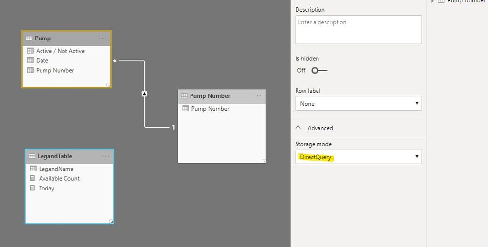
We can try to use a measure after create two calculated table to meet your requirement:
Calculated Table:
LegandTable = DATATABLE("LegandName",STRING,{{"Red"},{"Green"},{"Yellow"}})
Pump Number = DISTINCT('Pump'[Pump Number])
Measures:
Today = DATE(2019,1,6)
//this date is for test, you can replace it with TODAY()
PumpNumber =
SWITCH (
    SELECTEDVALUE ( LegandTable[LegandName] ),
    "Red", SUMX (
        'Pump Number',
        IF (
            CALCULATE (
                COUNTROWS ( RELATEDTABLE ( 'Pump' ) ),
                'Pump'[Active / Not Active] = 0
            ) > 0
                && CALCULATE (
                    MAX ( 'Pump'[Active / Not Active] ),
                    FILTER ( RELATEDTABLE ( 'Pump' ), 'Pump'[Date] = [Today] - 1 )
                ) = 1,
            [Pump Number],
            BLANK ()
        )
    ),
    "Green", SUMX (
        'Pump Number',
        IF (
            CALCULATE (
                COUNTROWS ( RELATEDTABLE ( 'Pump' ) ),
                'Pump'[Active / Not Active] = 1
            )
                = CALCULATE ( COUNTROWS ( RELATEDTABLE ( 'Pump' ) ) ),
            [Pump Number],
            BLANK ()
        )
    ),
    "Yellow", SUMX (
        'Pump Number',
        IF (
            CALCULATE (
                MAX ( 'Pump'[Active / Not Active] ),
                FILTER ( RELATEDTABLE ( 'Pump' ), 'Pump'[Date] = [Today] - 1 )
            ) = 0,
            [Pump Number],
            BLANK ()
        )
    )
)
Best regards,
If this post helps, then please consider Accept it as the solution to help the other members find it more quickly.
Helpful resources

Microsoft Fabric Learn Together
Covering the world! 9:00-10:30 AM Sydney, 4:00-5:30 PM CET (Paris/Berlin), 7:00-8:30 PM Mexico City

Power BI Monthly Update - April 2024
Check out the April 2024 Power BI update to learn about new features.

| User | Count |
|---|---|
| 112 | |
| 100 | |
| 80 | |
| 64 | |
| 57 |
| User | Count |
|---|---|
| 146 | |
| 110 | |
| 93 | |
| 84 | |
| 67 |


