- Power BI forums
- Updates
- News & Announcements
- Get Help with Power BI
- Desktop
- Service
- Report Server
- Power Query
- Mobile Apps
- Developer
- DAX Commands and Tips
- Custom Visuals Development Discussion
- Health and Life Sciences
- Power BI Spanish forums
- Translated Spanish Desktop
- Power Platform Integration - Better Together!
- Power Platform Integrations (Read-only)
- Power Platform and Dynamics 365 Integrations (Read-only)
- Training and Consulting
- Instructor Led Training
- Dashboard in a Day for Women, by Women
- Galleries
- Community Connections & How-To Videos
- COVID-19 Data Stories Gallery
- Themes Gallery
- Data Stories Gallery
- R Script Showcase
- Webinars and Video Gallery
- Quick Measures Gallery
- 2021 MSBizAppsSummit Gallery
- 2020 MSBizAppsSummit Gallery
- 2019 MSBizAppsSummit Gallery
- Events
- Ideas
- Custom Visuals Ideas
- Issues
- Issues
- Events
- Upcoming Events
- Community Blog
- Power BI Community Blog
- Custom Visuals Community Blog
- Community Support
- Community Accounts & Registration
- Using the Community
- Community Feedback
Register now to learn Fabric in free live sessions led by the best Microsoft experts. From Apr 16 to May 9, in English and Spanish.
- Power BI forums
- Forums
- Get Help with Power BI
- Desktop
- Dynamically Filter a visual based on Max value of ...
- Subscribe to RSS Feed
- Mark Topic as New
- Mark Topic as Read
- Float this Topic for Current User
- Bookmark
- Subscribe
- Printer Friendly Page
- Mark as New
- Bookmark
- Subscribe
- Mute
- Subscribe to RSS Feed
- Permalink
- Report Inappropriate Content
Dynamically Filter a visual based on Max value of another visual
I have been trying to dynamically filter a column chart and a matrix based on the max value of another visual. I am using the following measure for a card that gives me the sum of the max downtime and dynamically filters for the card value:
Duration max per Downtime =
MAXX(
	KEEPFILTERS(VALUES('DowntimeL1'[DTReason])),
	CALCULATE(SUM('DowntimeL1'[Duration]))
)
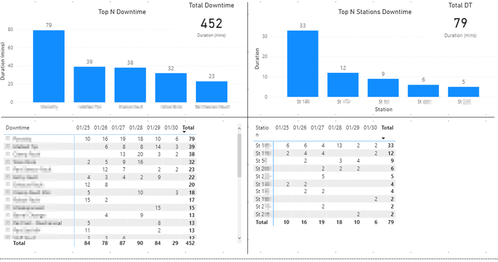
However, I want to be able to create a column chart and a matrix visual that shows the stations that had downtime for the Max DT reason of the card visual, is this possible? The left side shows the equipment downtime by reason, the top reason had a total of 79 minutes of Downtime for the week (Relative date filter - last 7 days). The right side shows the equipment dowtime for the top reason but I have been manually filtering the column chart and the matrix visual and would like these to update dynamically as the data on the left side changes
Any guidance you can provide would be appreciated. Thank you.
Solved! Go to Solution.
- Mark as New
- Bookmark
- Subscribe
- Mute
- Subscribe to RSS Feed
- Permalink
- Report Inappropriate Content
- Mark as New
- Bookmark
- Subscribe
- Mute
- Subscribe to RSS Feed
- Permalink
- Report Inappropriate Content
Hi @Opal55,
Try measure as:
Measure1 =

VAR _table =

    SUMMARIZE ( 'Table', 'Table'[Downtime], "value", SUM ( 'Table'[Total] ) )

VAR _max =

    MAXX ( _table, [value] )

RETURN

CALCULATE ( MAX ( 'Table'[Downtime] ), FILTER ( _table, [value] = _max ) )
Measure2 =
var measure1= CALCULATE([Measure1],ALL('Table'))
return IF(SELECTEDVALUE('Table'[Downtime])=measure1,1,0)Here is the output:
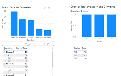
Here is the demo, please try it: Dynamically Filter a visual based on Max value of another visual
Best Regards
Link
If this post helps then please consider Accept it as the solution to help the other members find it more quickly.
- Mark as New
- Bookmark
- Subscribe
- Mute
- Subscribe to RSS Feed
- Permalink
- Report Inappropriate Content
Thank you for the follow-up. I have tried your solution and unfortunately, it does not work in my file. Instead, it blanks out the Chart and Matrix revealing no records. Below are my measures:
Measure1 =
var _table= SUMMARIZE('DowntimeL1','DowntimeL1'[Downtime],"value",SUM('DowntimeL1'[Duration]))
var _max=MAXX(_table,[value])
Return
CALCULATE(
    MAX('DowntimeL1'[Downtime]),
FILTER(_table,
 [value]=_max )
)


Measure2 =
var Measure1= CALCULATE([Measure1],ALL('DowntimeL1'))
return IF(SELECTEDVALUE('DowntimeL1'[Downtime])=Measure1,1,0)
Am I missing something? Did I intrepret something incorrectly? Please advise. Thank you.
- Mark as New
- Bookmark
- Subscribe
- Mute
- Subscribe to RSS Feed
- Permalink
- Report Inappropriate Content
- Mark as New
- Bookmark
- Subscribe
- Mute
- Subscribe to RSS Feed
- Permalink
- Report Inappropriate Content
https://1drv.ms/u/s!AjDhezQhhpervhffxg6mz0mep3Zt?e=GiezIM
Okay, @v-xulin-mstf can you get to it from the above link? I was able to "dumb" it down to remove any of my company's information so that I can share it from my OneDrive. When I try to filter the visuals with your Measures, the data blanks out. Your assistance is appreciated.
- Mark as New
- Bookmark
- Subscribe
- Mute
- Subscribe to RSS Feed
- Permalink
- Report Inappropriate Content
- Mark as New
- Bookmark
- Subscribe
- Mute
- Subscribe to RSS Feed
- Permalink
- Report Inappropriate Content
Thank you so much for working with me on this. I have tried your output in the Demo and it works well, however, the Demo only had one weeks worth of data. My actual file has several years worth of data...I had hoped that the date filter would work with your solution, but it doesn't. I have added a couple more weeks worth of sample data to my Test Report and the calculated columns do not produce the desired result.... i.e. the max downtime reason for the visuals on the left is "Mechanical", but in previous weeks, it was "Material". The visuals on the right are now filtering to "Material" despite the week that is filtered. Do you have any suggestions?
- Mark as New
- Bookmark
- Subscribe
- Mute
- Subscribe to RSS Feed
- Permalink
- Report Inappropriate Content
Hi @Opal55,
It works in my environment when i apply the calendar slicer, please check:
If it does not work in your environment, could you provide sample data contains multiple weeks on format of excel?
Best Regards,
Link
- Mark as New
- Bookmark
- Subscribe
- Mute
- Subscribe to RSS Feed
- Permalink
- Report Inappropriate Content
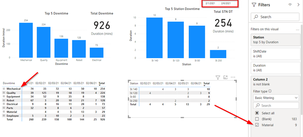
Thank you @v-xulin-mstf , but I think I better explain the situation more based on the image in your response. For the week of Feb 1 - Feb 5, the highest incidents of Downtime were due to Mechanical issues as the visuals on the right show. The visuals on the left should be filtering to show the stations with the highest Mechanical issues for the week of Feb 1 - 5. However, they are showing stations with Material downtime as that was the highest issue in previous weeks, in my demo file that was January 18 - 30. As I have multiple years worth of data in my live file, the calculated columns you provided are filtering for the highest downtime reason over a 4 year history and not for the specific week filtered with the slicer.
- Mark as New
- Bookmark
- Subscribe
- Mute
- Subscribe to RSS Feed
- Permalink
- Report Inappropriate Content
@v-xulin-mstf will you still be able to assist me with this or is what I am trying to do, not doable?
Thank you.
- Mark as New
- Bookmark
- Subscribe
- Mute
- Subscribe to RSS Feed
- Permalink
- Report Inappropriate Content
- Mark as New
- Bookmark
- Subscribe
- Mute
- Subscribe to RSS Feed
- Permalink
- Report Inappropriate Content
Thank you, @v-xulin-mstf but it is not working.... If you look at the measure on the left and expand on the stations below the downtime reason in the demo file, you do not see these same stations and downtime minutes for the stations on the right - these should match:
- Mark as New
- Bookmark
- Subscribe
- Mute
- Subscribe to RSS Feed
- Permalink
- Report Inappropriate Content
Hi @Opal55,
Sorry, i'm not clear why the measure only return correct total values.
Maybe you can apply the measure to more sample data and check if it works.
Best Regards,
Link
- Mark as New
- Bookmark
- Subscribe
- Mute
- Subscribe to RSS Feed
- Permalink
- Report Inappropriate Content
Hi @v-xulin-mstf !
I completely missed that the Measure 2 was the value field on the visual.... I didn't change that when I first tried this out. Now I have and it works a treat! Thank you so much for your patience with me!!!!!
- Mark as New
- Bookmark
- Subscribe
- Mute
- Subscribe to RSS Feed
- Permalink
- Report Inappropriate Content
I am fairly new to PowerBi and I am struggling to get this to work... I have been reading through all of the forums and have not been able to find the desired solution. I found this post that I thought might be the solution: https://community.powerbi.com/t5/Desktop/Top-N-products-sold-per-product-category/m-p/270082 but I kept getting a circular dependency error on the RANKX calculated column that I could not resolve. Does anyone else have any more advice for me? Basically, if the top Downtime reason in the two visuals on the left is "mechanical" (for example), then I want the two visuals on the right to filter for all the stations that had a "mechanical" Downtime reason.
- Mark as New
- Bookmark
- Subscribe
- Mute
- Subscribe to RSS Feed
- Permalink
- Report Inappropriate Content
@Opal55 , Not very clear to me. In case you need TOPN, Then you should create a TOPN Measure.
refer my video for that https://www.youtube.com/watch?v=QIVEFp-QiOk
Microsoft Power BI Learning Resources, 2023 !!
Learn Power BI - Full Course with Dec-2022, with Window, Index, Offset, 100+ Topics !!
Did I answer your question? Mark my post as a solution! Appreciate your Kudos !! Proud to be a Super User! !!
Helpful resources

Microsoft Fabric Learn Together
Covering the world! 9:00-10:30 AM Sydney, 4:00-5:30 PM CET (Paris/Berlin), 7:00-8:30 PM Mexico City

Power BI Monthly Update - April 2024
Check out the April 2024 Power BI update to learn about new features.

| User | Count |
|---|---|
| 114 | |
| 100 | |
| 83 | |
| 70 | |
| 61 |
| User | Count |
|---|---|
| 149 | |
| 114 | |
| 107 | |
| 89 | |
| 67 |


