- Power BI forums
- Updates
- News & Announcements
- Get Help with Power BI
- Desktop
- Service
- Report Server
- Power Query
- Mobile Apps
- Developer
- DAX Commands and Tips
- Custom Visuals Development Discussion
- Health and Life Sciences
- Power BI Spanish forums
- Translated Spanish Desktop
- Power Platform Integration - Better Together!
- Power Platform Integrations (Read-only)
- Power Platform and Dynamics 365 Integrations (Read-only)
- Training and Consulting
- Instructor Led Training
- Dashboard in a Day for Women, by Women
- Galleries
- Community Connections & How-To Videos
- COVID-19 Data Stories Gallery
- Themes Gallery
- Data Stories Gallery
- R Script Showcase
- Webinars and Video Gallery
- Quick Measures Gallery
- 2021 MSBizAppsSummit Gallery
- 2020 MSBizAppsSummit Gallery
- 2019 MSBizAppsSummit Gallery
- Events
- Ideas
- Custom Visuals Ideas
- Issues
- Issues
- Events
- Upcoming Events
- Community Blog
- Power BI Community Blog
- Custom Visuals Community Blog
- Community Support
- Community Accounts & Registration
- Using the Community
- Community Feedback
Register now to learn Fabric in free live sessions led by the best Microsoft experts. From Apr 16 to May 9, in English and Spanish.
- Power BI forums
- Forums
- Get Help with Power BI
- Desktop
- Re: Dynamic vertical line for scatter chart with 2...
- Subscribe to RSS Feed
- Mark Topic as New
- Mark Topic as Read
- Float this Topic for Current User
- Bookmark
- Subscribe
- Printer Friendly Page
- Mark as New
- Bookmark
- Subscribe
- Mute
- Subscribe to RSS Feed
- Permalink
- Report Inappropriate Content
Dynamic vertical line for scatter chart with 2 measures
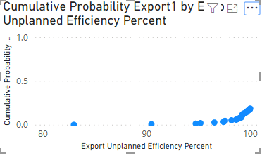
I have a chart like this:
In addition to dots shown I need to show vertical percentile line of Export Unplanned Efficiency Percent. I will try to explain what I did so far.
Because there is no way to have a vertical percentile line in scatter chart, I used Line and clustered column chart as a workaround.
Cumulative Probability Export1 measure:
Cumulative Probability Export1 = DIVIDE(RANKX(ALLSELECTED('Merge1'),CALCULATE(MIN([Export Unplanned Efficiency Percent])),,ASC),COUNTX(ALLSELECTED('Merge1'),CALCULATE(MIN([Export Unplanned Efficiency Percent]))))
Percentile line measure:
P10 Line =
var MaxCumulativeProbabilityExport = MAXX(ALLSELECTED('Merge1'),CALCULATE([Cumulative Probability Export1]))
var Result = IF
(
    HASONEVALUE(Merge1[Export Unplanned Efficiency Percent]),
    IF
    (
        VALUES('Merge1'[Export Unplanned Efficiency Percent]) = PERCENTILE.INC('Merge1'[Export Unplanned Efficiency Percent],0.1),
        MAXX(ALL('Merge1'[Export Unplanned Efficiency Percent]), MaxCumulativeProbabilityExport)
    )
)
return Result
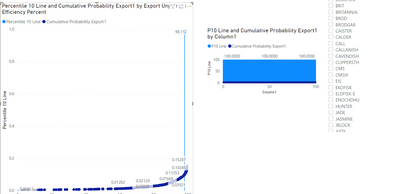
The problem I have is percentile line shows only when measure value is equal to one of the values from Export Unplanned Efficiency Percent column. To solve this, I created new table with numbers from 0 to 100 (Column1) and merged original table with this table using Export Unplanned Efficiency Percent column. When I replace Export Unplanned Efficiency Percent shared axis with this new column, I get the following chart:
I suspect this happened because Cumulative Probability Export1 measure which uses Export Unplanned Efficiency Percent in calculation couldn’t be associated with values from Column1. I thought merging data tables would enforce relationship between Column1 and Export Unplanned Efficiency Percent! Any ideas on how to solve this?
Solved! Go to Solution.
- Mark as New
- Bookmark
- Subscribe
- Mute
- Subscribe to RSS Feed
- Permalink
- Report Inappropriate Content
Hi @mariov ,
The issue here, has you refer, is the fact that some values aren't available in the X-axis so the line does not show.
What I did was to calculate the Percentile and then apply that and search the next closet value (smaller than the percentile).
I created the following measures (without using the merge table):
Percentile_Calculation =
PERCENTILE.INC (
    'Historical Unplanned DOE Analysis'[Export Unplanned Efficiency Percent],
    0.1
)

Percentile 10 Line =
VAR Percentile_value =
    CALCULATE (
        [Percentile_Calculation],
        ALLSELECTED ( 'Historical Unplanned DOE Analysis'[Export Unplanned Efficiency Percent] )
    )
VAR Historical_Percentile_Maximum =
    MAXX (
        FILTER (
            SUMMARIZE (
                ALLSELECTED (
                    'Historical Unplanned DOE Analysis'[Export Unplanned Efficiency Percent],
                    'Historical Unplanned DOE Analysis'[NAME]
                ),
                'Historical Unplanned DOE Analysis'[Export Unplanned Efficiency Percent]
            ),
            'Historical Unplanned DOE Analysis'[Export Unplanned Efficiency Percent] <= percentile_value
        ),
        'Historical Unplanned DOE Analysis'[Export Unplanned Efficiency Percent]
    )
RETURN
    IF (
        VALUES ( 'Historical Unplanned DOE Analysis'[Export Unplanned Efficiency Percent] ) = Historical_Percentile_Maximum,
        Percentile_value
    )
Check result below and in attach PBIX file.
Regards
Miguel Félix
Did I answer your question? Mark my post as a solution!
Proud to be a Super User!
Check out my blog: Power BI em Português- Mark as New
- Bookmark
- Subscribe
- Mute
- Subscribe to RSS Feed
- Permalink
- Report Inappropriate Content
Hi @mariov ,
The formula you are using is returning values only if your have a value selected that is the way you have written the measure HASONEVALUE() so when there are no value nothing is returned. Furthermore the rest of your calculation is based on an if statment that is also not filled out meaning that if the values don't match it will return a blank.
Have you tried using the percentile line base on your cumulative measure the one by default on the scatter chart?
Can you provide more insigths on what you need to achieve and if possible give some sample data?
Regards
Miguel Félix
Did I answer your question? Mark my post as a solution!
Proud to be a Super User!
Check out my blog: Power BI em Português- Mark as New
- Bookmark
- Subscribe
- Mute
- Subscribe to RSS Feed
- Permalink
- Report Inappropriate Content
Hi @MFelix,
Thanks for your response. I tried to replicate the formula I found on this thread: Solved: Reference Line on x-axis - Microsoft Power BI Community
My case requires decimal number instead of date type in x axis.
Chart shows the line only if following part of the measure is equal to one of the values from X axis (Export Unplanned Efficiency Percent column):
VALUES('Merge1'[Export Unplanned Efficiency Percent])
Here is the report: https://easyupload.io/ns2rhr
Cheers
- Mark as New
- Bookmark
- Subscribe
- Mute
- Subscribe to RSS Feed
- Permalink
- Report Inappropriate Content
Hi @mariov ,
The issue here, has you refer, is the fact that some values aren't available in the X-axis so the line does not show.
What I did was to calculate the Percentile and then apply that and search the next closet value (smaller than the percentile).
I created the following measures (without using the merge table):
Percentile_Calculation =
PERCENTILE.INC (
    'Historical Unplanned DOE Analysis'[Export Unplanned Efficiency Percent],
    0.1
)

Percentile 10 Line =
VAR Percentile_value =
    CALCULATE (
        [Percentile_Calculation],
        ALLSELECTED ( 'Historical Unplanned DOE Analysis'[Export Unplanned Efficiency Percent] )
    )
VAR Historical_Percentile_Maximum =
    MAXX (
        FILTER (
            SUMMARIZE (
                ALLSELECTED (
                    'Historical Unplanned DOE Analysis'[Export Unplanned Efficiency Percent],
                    'Historical Unplanned DOE Analysis'[NAME]
                ),
                'Historical Unplanned DOE Analysis'[Export Unplanned Efficiency Percent]
            ),
            'Historical Unplanned DOE Analysis'[Export Unplanned Efficiency Percent] <= percentile_value
        ),
        'Historical Unplanned DOE Analysis'[Export Unplanned Efficiency Percent]
    )
RETURN
    IF (
        VALUES ( 'Historical Unplanned DOE Analysis'[Export Unplanned Efficiency Percent] ) = Historical_Percentile_Maximum,
        Percentile_value
    )
Check result below and in attach PBIX file.
Regards
Miguel Félix
Did I answer your question? Mark my post as a solution!
Proud to be a Super User!
Check out my blog: Power BI em Português- Mark as New
- Bookmark
- Subscribe
- Mute
- Subscribe to RSS Feed
- Permalink
- Report Inappropriate Content
Thanks @MFelix this looks really good! I even extended solution so closest historical value is picked.
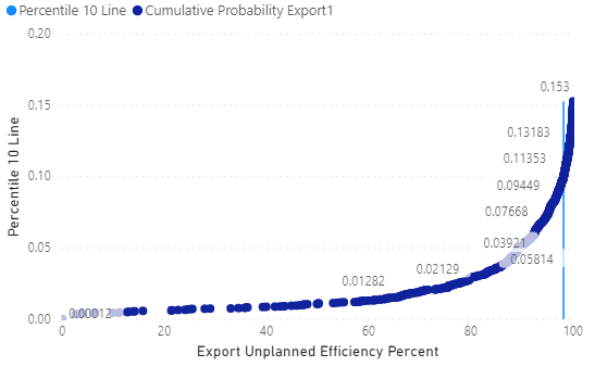
Is there a way to make Y axis scale dynamically based on maximum value of Cumulative Probability and preserve correct value shown in percentile line title (99.1, not 0.153)?
I used this code to calculate maximum value of Y:
MAXX(ALLSELECTED('Historical Unplanned DOE Analysis'),CALCULATE([Cumulative Probability Export1]))
- Mark as New
- Bookmark
- Subscribe
- Mute
- Subscribe to RSS Feed
- Permalink
- Report Inappropriate Content
HI @mariov
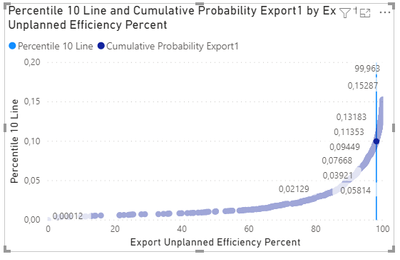
In the last switch you just need to replace the last value by the cumulative value (probably need to multiply by 1000 (this is because your value is a percentage of a percentile so 100*10 = 1000) in orde to show the 99,00
RETURN
    IF (
        VALUES ( 'Historical Unplanned DOE Analysis'[Export Unplanned Efficiency Percent] ) = Percentile_Closest_Value,
      [Cumulative Probability Export1]*1000
    )
Check image below:
Regards
Miguel Félix
Did I answer your question? Mark my post as a solution!
Proud to be a Super User!
Check out my blog: Power BI em Português- Mark as New
- Bookmark
- Subscribe
- Mute
- Subscribe to RSS Feed
- Permalink
- Report Inappropriate Content
Hi @MFelix,
What I meant was setting "End" property of Y axis to "Auto" instead of setting the value manually so axis would scale dynamically. Is it possible using this solution?
Thanks
- Mark as New
- Bookmark
- Subscribe
- Mute
- Subscribe to RSS Feed
- Permalink
- Report Inappropriate Content
Hi @mariov ,
When you have the Auto it's based on the value of the highest value so if you have the value to be the percentile value it will give you a very big Y-Axis, if you make in your measure any other value than the percentile then you aren't abble to have the label with the percentile value.
Regards
Miguel Félix
Did I answer your question? Mark my post as a solution!
Proud to be a Super User!
Check out my blog: Power BI em Português- Mark as New
- Bookmark
- Subscribe
- Mute
- Subscribe to RSS Feed
- Permalink
- Report Inappropriate Content
- Mark as New
- Bookmark
- Subscribe
- Mute
- Subscribe to RSS Feed
- Permalink
- Report Inappropriate Content
If you don't want to present the label values yes, if you only want to show the line value on the tooltips then you can use another value.
Regards
Miguel Félix
Did I answer your question? Mark my post as a solution!
Proud to be a Super User!
Check out my blog: Power BI em PortuguêsHelpful resources

Microsoft Fabric Learn Together
Covering the world! 9:00-10:30 AM Sydney, 4:00-5:30 PM CET (Paris/Berlin), 7:00-8:30 PM Mexico City

Power BI Monthly Update - April 2024
Check out the April 2024 Power BI update to learn about new features.

| User | Count |
|---|---|
| 106 | |
| 93 | |
| 75 | |
| 62 | |
| 50 |
| User | Count |
|---|---|
| 146 | |
| 109 | |
| 106 | |
| 88 | |
| 61 |


