- Power BI forums
- Updates
- News & Announcements
- Get Help with Power BI
- Desktop
- Service
- Report Server
- Power Query
- Mobile Apps
- Developer
- DAX Commands and Tips
- Custom Visuals Development Discussion
- Health and Life Sciences
- Power BI Spanish forums
- Translated Spanish Desktop
- Power Platform Integration - Better Together!
- Power Platform Integrations (Read-only)
- Power Platform and Dynamics 365 Integrations (Read-only)
- Training and Consulting
- Instructor Led Training
- Dashboard in a Day for Women, by Women
- Galleries
- Community Connections & How-To Videos
- COVID-19 Data Stories Gallery
- Themes Gallery
- Data Stories Gallery
- R Script Showcase
- Webinars and Video Gallery
- Quick Measures Gallery
- 2021 MSBizAppsSummit Gallery
- 2020 MSBizAppsSummit Gallery
- 2019 MSBizAppsSummit Gallery
- Events
- Ideas
- Custom Visuals Ideas
- Issues
- Issues
- Events
- Upcoming Events
- Community Blog
- Power BI Community Blog
- Custom Visuals Community Blog
- Community Support
- Community Accounts & Registration
- Using the Community
- Community Feedback
Register now to learn Fabric in free live sessions led by the best Microsoft experts. From Apr 16 to May 9, in English and Spanish.
- Power BI forums
- Forums
- Get Help with Power BI
- Desktop
- Dynamic table or on-fly table generation via DAX
- Subscribe to RSS Feed
- Mark Topic as New
- Mark Topic as Read
- Float this Topic for Current User
- Bookmark
- Subscribe
- Printer Friendly Page
- Mark as New
- Bookmark
- Subscribe
- Mute
- Subscribe to RSS Feed
- Permalink
- Report Inappropriate Content
Dynamic table or on-fly table generation via DAX
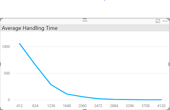
I am stuck with a problem which require me to generate a dynamic table in power bi. I have a fact table which consists of AHT values for different Teams (Supervisor_Name). We want to visualize AHT and number of calls such that we display 10 equal bins of AHT values in x-axis and the number of calls within the bins on y-axis. the chart should look like the following:

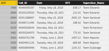
Below is the snapshot of data table that i have referred to:

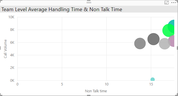
There is another graph that we have created to display Average NTT value by Supervisor name. The size of bubbles represent the call volume by team and position of bubble in the chart is located by Avg NTT value.
Please refer the below graph:

Now we know that both the chart are created from the same table so selection of a bubble in NTT chart would crosfilter the data in AHT line chart.
The logic used in DAX to create bins for selected team is:-
tbl_AHT_Bins =
var min_AHT = 1
var Max_AHT = MAX(AHT[AHT])
Var Interval = DIVIDE((Max_AHT - min_AHT),10)
var Result = CROSSJOIN(GENERATESERIES(Interval,Max_AHT,Interval),ROW("Team",SELECTEDVALUE(AHT[Supervisor_Name],"All Team")))
return
Result
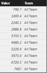
Below is table generated from above DAX:

According to me when i select a team in chart 2, the data table in the background should be filtered and the maximum value in DAX will become maximum for team (supervisor_name) selected. Therefore, team in the table generated from DAX now contains the selected team name in the Column 'Team' and selected team values in column 'Value'.
But the table generated using the above DAX remain static.
Can anyone look into the issue and provide its solution?
Solved! Go to Solution.
- Mark as New
- Bookmark
- Subscribe
- Mute
- Subscribe to RSS Feed
- Permalink
- Report Inappropriate Content
Hi satinmalik,
Based on your diagram, you want to create a dynamic calculate table based on the value selected in slicer, right? Unfortunately, dynamic calculate table or dynamic calculate column are not supported by DAX, you should create a chart(e.g.: table chart) and use a measure instead. For specific steps:
Firstly, create a calculate table with modified DAX like below:
tbl_AHT_Bins =
var min_AHT = 1
var Max_AHT = MAX(AHT[AHT])
Var Interval = DIVIDE((Max_AHT - min_AHT),10)
var Result = CROSSJOIN(GENERATESERIES(Interval,Max_AHT,Interval),Selectcolumns(Data, "Team",[Supervisor_Name]))
return
Result
Then, create a measure on Result table using DAX like this:
Result Measure = Calculate(sum('Result'[Value]), 'Result'[Team] = selectedvalue('Result'[Team]))
Hope it's helpful.
Jimmy Tao
Helpful resources

Microsoft Fabric Learn Together
Covering the world! 9:00-10:30 AM Sydney, 4:00-5:30 PM CET (Paris/Berlin), 7:00-8:30 PM Mexico City

Power BI Monthly Update - April 2024
Check out the April 2024 Power BI update to learn about new features.

| User | Count |
|---|---|
| 112 | |
| 99 | |
| 73 | |
| 72 | |
| 49 |
| User | Count |
|---|---|
| 145 | |
| 109 | |
| 109 | |
| 90 | |
| 64 |
