- Power BI forums
- Updates
- News & Announcements
- Get Help with Power BI
- Desktop
- Service
- Report Server
- Power Query
- Mobile Apps
- Developer
- DAX Commands and Tips
- Custom Visuals Development Discussion
- Health and Life Sciences
- Power BI Spanish forums
- Translated Spanish Desktop
- Power Platform Integration - Better Together!
- Power Platform Integrations (Read-only)
- Power Platform and Dynamics 365 Integrations (Read-only)
- Training and Consulting
- Instructor Led Training
- Dashboard in a Day for Women, by Women
- Galleries
- Community Connections & How-To Videos
- COVID-19 Data Stories Gallery
- Themes Gallery
- Data Stories Gallery
- R Script Showcase
- Webinars and Video Gallery
- Quick Measures Gallery
- 2021 MSBizAppsSummit Gallery
- 2020 MSBizAppsSummit Gallery
- 2019 MSBizAppsSummit Gallery
- Events
- Ideas
- Custom Visuals Ideas
- Issues
- Issues
- Events
- Upcoming Events
- Community Blog
- Power BI Community Blog
- Custom Visuals Community Blog
- Community Support
- Community Accounts & Registration
- Using the Community
- Community Feedback
Register now to learn Fabric in free live sessions led by the best Microsoft experts. From Apr 16 to May 9, in English and Spanish.
- Power BI forums
- Forums
- Get Help with Power BI
- Desktop
- Re: Dynamic grouping Power BI
- Subscribe to RSS Feed
- Mark Topic as New
- Mark Topic as Read
- Float this Topic for Current User
- Bookmark
- Subscribe
- Printer Friendly Page
- Mark as New
- Bookmark
- Subscribe
- Mute
- Subscribe to RSS Feed
- Permalink
- Report Inappropriate Content
Dynamic grouping Power BI
Hi
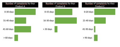
I need to create a Clustered bar chart, that displays the total number of complaints received grouped by the difference between the production date of an item and the date in which I received the complain, so for example I have Item A and I need the number of complaints received based on the following groups 0-30 days, 31- 60 days, 61- 90 days and > 90 days, where the days represent the difference between the two dates mentioned before.
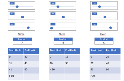
However I need this groups to be dynamic according to the item I select on a slicer, so for example Item A has the groups mentioned before, while Item B has groups as 0-15 days, 16-25 days, > 26 days, Item C 0 - 20 days, 21-30 days, 31-90 days > 90 days, and so on; therefore I also need that the final user is able to select the different ranges of days to create the different groups. Is there any way I can achieve this result.
Thank you so much
Solved! Go to Solution.
- Mark as New
- Bookmark
- Subscribe
- Mute
- Subscribe to RSS Feed
- Permalink
- Report Inappropriate Content
Hi @Anonymous
Thanks for reaching out to us.
For the visual axis, it only supports columns, but columns cannot be generated dynamically by slicer. So there are two workarounds.
(1) Create an auxiliary visual
(2) use tooltip
Here are all the measures used (just take product A as an example):
A Range =
var _v1= [Slicer1 Value]
var _v2=[Slicer2 Value]
var _v3=[Slicer3 Value]
var _cur= MIN(Stage[Column1])
return
SWITCH(TRUE(),
_cur="Stage 1","0-"&_v1&" days",
_cur="Stage 2",_v1&"-"&_v2&" days",
_cur="Stage 3",_v2&"-"&_v3&" days",
_cur="Stage 4",">"&_v3&" days")
A DaysPerComplain =
var _Pd= CALCULATE(MAX('production date list'[production date]),'production date list'[Product]= MIN('Table'[Product]))
return DATEDIFF(_Pd,MIN('Table'[complain date]),DAY)A Count =
var _cur= MIN(Stage[Column1])
var _PName= "Product A"
return
SWITCH(TRUE(),
_cur="Stage 1",CALCULATE(COUNTROWS('Table'),FILTER(ALL('Table'),'Table'[Product]=_PName&& [A DaysPerComplain]<= [Slicer1 Value])),
_cur="Stage 2",CALCULATE(COUNTROWS('Table'),FILTER(ALL('Table'),'Table'[Product]=_PName&& [A DaysPerComplain]> [Slicer1 Value] && [A DaysPerComplain]<= [Slicer2 Value])),
_cur="Stage 3",CALCULATE(COUNTROWS('Table'),FILTER(ALL('Table'),'Table'[Product]=_PName&& [A DaysPerComplain]> [Slicer2 Value] && [A DaysPerComplain]<= [Slicer3 Value])),
_cur="Stage 4",CALCULATE(COUNTROWS('Table'),FILTER(ALL('Table'),'Table'[Product]=_PName&& [A DaysPerComplain]> [Slicer3 Value])))For more please see my sample file attached below.
Best Regards,
Community Support Team _Tang
If this post helps, please consider Accept it as the solution to help the other members find it more quickly.
- Mark as New
- Bookmark
- Subscribe
- Mute
- Subscribe to RSS Feed
- Permalink
- Report Inappropriate Content
Hi v-xiotang, thank you so much for your reply, I solved this before using also the parameters as you but your solution helped me to improve what I had done before. Thanks a lot for your answer I really appreciate it.
- Mark as New
- Bookmark
- Subscribe
- Mute
- Subscribe to RSS Feed
- Permalink
- Report Inappropriate Content
@Anonymous , You to create a measure that displays these values. say at the customer, complaints level .
Have a table with all these values and join it back in measure using customer complaints in summarize in a measure
Please check the code below, you need equal to and you need to summarize as you two columns not one.
if only complaints level can suffice you can use the values.
Dynamic Segmentation Bucketing Binning
https://community.powerbi.com/t5/Quick-Measures-Gallery/Dynamic-Segmentation-Bucketing-Binning/m-p/1387187#M626
Dynamic Segmentation, Bucketing or Binning: https://youtu.be/CuczXPj0N-k
Microsoft Power BI Learning Resources, 2023 !!
Learn Power BI - Full Course with Dec-2022, with Window, Index, Offset, 100+ Topics !!
Did I answer your question? Mark my post as a solution! Appreciate your Kudos !! Proud to be a Super User! !!
- Mark as New
- Bookmark
- Subscribe
- Mute
- Subscribe to RSS Feed
- Permalink
- Report Inappropriate Content
Hi Amit
Thank you for your answer, however I would like to know if it's possibile to make the measure that you named "Margin Type" dynamic, in the sense that I need the limits of each group to change according to what the user selects in a slicer for the limits, this groups also change according to the product I filter. I attach an imagen to show you how it must work
Then this will be visualized in a clustered br chart
Thanks a lot
Helpful resources

Microsoft Fabric Learn Together
Covering the world! 9:00-10:30 AM Sydney, 4:00-5:30 PM CET (Paris/Berlin), 7:00-8:30 PM Mexico City

Power BI Monthly Update - April 2024
Check out the April 2024 Power BI update to learn about new features.

| User | Count |
|---|---|
| 110 | |
| 94 | |
| 82 | |
| 66 | |
| 58 |
| User | Count |
|---|---|
| 151 | |
| 121 | |
| 104 | |
| 87 | |
| 67 |


