- Power BI forums
- Updates
- News & Announcements
- Get Help with Power BI
- Desktop
- Service
- Report Server
- Power Query
- Mobile Apps
- Developer
- DAX Commands and Tips
- Custom Visuals Development Discussion
- Health and Life Sciences
- Power BI Spanish forums
- Translated Spanish Desktop
- Power Platform Integration - Better Together!
- Power Platform Integrations (Read-only)
- Power Platform and Dynamics 365 Integrations (Read-only)
- Training and Consulting
- Instructor Led Training
- Dashboard in a Day for Women, by Women
- Galleries
- Community Connections & How-To Videos
- COVID-19 Data Stories Gallery
- Themes Gallery
- Data Stories Gallery
- R Script Showcase
- Webinars and Video Gallery
- Quick Measures Gallery
- 2021 MSBizAppsSummit Gallery
- 2020 MSBizAppsSummit Gallery
- 2019 MSBizAppsSummit Gallery
- Events
- Ideas
- Custom Visuals Ideas
- Issues
- Issues
- Events
- Upcoming Events
- Community Blog
- Power BI Community Blog
- Custom Visuals Community Blog
- Community Support
- Community Accounts & Registration
- Using the Community
- Community Feedback
Register now to learn Fabric in free live sessions led by the best Microsoft experts. From Apr 16 to May 9, in English and Spanish.
- Power BI forums
- Forums
- Get Help with Power BI
- Desktop
- Dynamic change in X Axis
- Subscribe to RSS Feed
- Mark Topic as New
- Mark Topic as Read
- Float this Topic for Current User
- Bookmark
- Subscribe
- Printer Friendly Page
- Mark as New
- Bookmark
- Subscribe
- Mute
- Subscribe to RSS Feed
- Permalink
- Report Inappropriate Content
Dynamic change in X Axis
Hello Everyone,
I am trying a scenario where I need one chart, and it should shows two visuals like sales(YOY) by year and sales(YOY) by area.
The x-axis should be change by using Slicer which have two values Year and Area.
Is there any way to achieve this. I don't need any alternatives for that like drill down etc. I need that exact thing to be done.
If it is possible by dax please suggest something. (I am trying different dax functions to solve this problem but don't know what exact function should be used to do this.)
Thanks,
Akash Singhal
Solved! Go to Solution.
- Mark as New
- Bookmark
- Subscribe
- Mute
- Subscribe to RSS Feed
- Permalink
- Report Inappropriate Content
Hi @singhal14
Here's one idea of how it can be done using a bridging table.
Could well be other ways of handling this 🙂
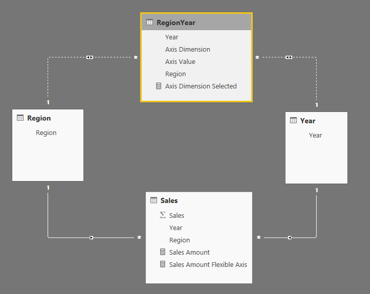
- Assuming you have Region and Year lookup tables, create a RegionYear table which is the cross product of Region & Year tables.
- Duplicate each row of RegionYear and add an Axis Dimension column which is "Region" for half the rows and "Year" for the other half, and an Axis Value column which is the Region or Year value for each row (depending on the Axis Dimension value).
- Relate Year and Region to RegionYear using inactive bidirectional relationships:
- Create an Axis Dimension Selected measure to harvest the value of Axis Dimension. Something equivalent to this (this guards against multiple selection):
Axis Dimension Selected = IF ( ISFILTERED ( RegionYear[Axis Dimension] ), IF ( CALCULATE ( HASONEVALUE ( RegionYear[Axis Dimension] ), ALLSELECTED () ), VALUES ( RegionYear[Axis Dimension] ) ) ) - Create a Sales Amount Flexible Axis measure like this (assuming Sales Amount is the normal measure):
Sales Amount Flexible Axis =
IF (
    NOT ( ISBLANK ( [Axis Dimension Selected] ) ),
    SWITCH (
        [Axis Dimension Selected],
        "Region",
        CALCULATE (
            [Sales Amount],
            USERELATIONSHIP ( RegionYear[Region], Region[Region] )
        ),
        "Year",
        CALCULATE (
            [Sales Amount],
            USERELATIONSHIP ( RegionYear[Year], 'Year'[Year] )
        )
    )
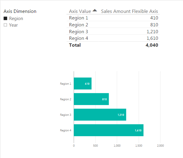
) - Then you can create visualizations using RegionYear[Axis Value] and [Sales Amount Flexible Axis]
Helpful resources

Microsoft Fabric Learn Together
Covering the world! 9:00-10:30 AM Sydney, 4:00-5:30 PM CET (Paris/Berlin), 7:00-8:30 PM Mexico City

Power BI Monthly Update - April 2024
Check out the April 2024 Power BI update to learn about new features.

| User | Count |
|---|---|
| 110 | |
| 97 | |
| 77 | |
| 63 | |
| 55 |
| User | Count |
|---|---|
| 143 | |
| 109 | |
| 89 | |
| 84 | |
| 66 |


