- Power BI forums
- Updates
- News & Announcements
- Get Help with Power BI
- Desktop
- Service
- Report Server
- Power Query
- Mobile Apps
- Developer
- DAX Commands and Tips
- Custom Visuals Development Discussion
- Health and Life Sciences
- Power BI Spanish forums
- Translated Spanish Desktop
- Power Platform Integration - Better Together!
- Power Platform Integrations (Read-only)
- Power Platform and Dynamics 365 Integrations (Read-only)
- Training and Consulting
- Instructor Led Training
- Dashboard in a Day for Women, by Women
- Galleries
- Community Connections & How-To Videos
- COVID-19 Data Stories Gallery
- Themes Gallery
- Data Stories Gallery
- R Script Showcase
- Webinars and Video Gallery
- Quick Measures Gallery
- 2021 MSBizAppsSummit Gallery
- 2020 MSBizAppsSummit Gallery
- 2019 MSBizAppsSummit Gallery
- Events
- Ideas
- Custom Visuals Ideas
- Issues
- Issues
- Events
- Upcoming Events
- Community Blog
- Power BI Community Blog
- Custom Visuals Community Blog
- Community Support
- Community Accounts & Registration
- Using the Community
- Community Feedback
Register now to learn Fabric in free live sessions led by the best Microsoft experts. From Apr 16 to May 9, in English and Spanish.
- Power BI forums
- Forums
- Get Help with Power BI
- Desktop
- Re: Dynamic change Axis AND Legend with Slicers
- Subscribe to RSS Feed
- Mark Topic as New
- Mark Topic as Read
- Float this Topic for Current User
- Bookmark
- Subscribe
- Printer Friendly Page
- Mark as New
- Bookmark
- Subscribe
- Mute
- Subscribe to RSS Feed
- Permalink
- Report Inappropriate Content
Dynamic change Axis AND Legend with Slicers
Hi guys, I am new to the community and excited to learn a lot! WIll be attending MS Data summit so let me know if you want to meet up.
I am trying to provide users of my reports with a powerful analytical experience and a self-service feeling.
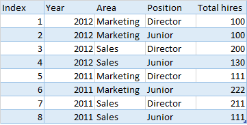
The data I am working with looks like this (simplified):
I would like users to be able to use slicers to change both the axis AND the legend of the different graphs in the report.
So far I have managed to change EITHER the axis or the legend using the following technique:
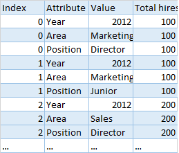
Duplicate the table (shown above) then unpivoted it based on Year, Area, and Position columns.
The remaining table looks like this:
I link both tables using the index column. Then create a Stacked Column Chart, with year on the Axis, Value on the Legend, and Total Hires on The Value fields:
Is there any way I can create a new slicer that lets me change the Axis by the different attributes? Would be interesting to see all hiring by Area vs Position, or Area vs Year, etc.
Thanks in advance,
Dirk
- Mark as New
- Bookmark
- Subscribe
- Mute
- Subscribe to RSS Feed
- Permalink
- Report Inappropriate Content
You could create a hierarchy of Area, Position, and Year. The first level would show Area totals, if you drill down without selecting a specific area, it will then show you position, and then by year.
Its not perfect but it does "change" the axis, and also gives you the ability to drill into an area and see position data for just that Area.
- Mark as New
- Bookmark
- Subscribe
- Mute
- Subscribe to RSS Feed
- Permalink
- Report Inappropriate Content
Hi @mdannemiller, Your solution some how helped me to dril down my chart while keeping only single chart and having multiple attribute at the same time. Now i want to show only top 5 value in each drill down state for each hirarchy i set. Is this possible in hirarchy drill down method? I am using donut chart. Please see my example screenshot attached here:
- Mark as New
- Bookmark
- Subscribe
- Mute
- Subscribe to RSS Feed
- Permalink
- Report Inappropriate Content
No, slicer/filter can only filter data on row level, not column level. So it's not possible to dynamically populate data fields into visual.
Regards,
- Mark as New
- Bookmark
- Subscribe
- Mute
- Subscribe to RSS Feed
- Permalink
- Report Inappropriate Content
Too bad... thanks for the answer tho.
Helpful resources

Microsoft Fabric Learn Together
Covering the world! 9:00-10:30 AM Sydney, 4:00-5:30 PM CET (Paris/Berlin), 7:00-8:30 PM Mexico City

Power BI Monthly Update - April 2024
Check out the April 2024 Power BI update to learn about new features.

| User | Count |
|---|---|
| 115 | |
| 100 | |
| 88 | |
| 68 | |
| 61 |
| User | Count |
|---|---|
| 152 | |
| 120 | |
| 102 | |
| 87 | |
| 68 |


