- Power BI forums
- Updates
- News & Announcements
- Get Help with Power BI
- Desktop
- Service
- Report Server
- Power Query
- Mobile Apps
- Developer
- DAX Commands and Tips
- Custom Visuals Development Discussion
- Health and Life Sciences
- Power BI Spanish forums
- Translated Spanish Desktop
- Power Platform Integration - Better Together!
- Power Platform Integrations (Read-only)
- Power Platform and Dynamics 365 Integrations (Read-only)
- Training and Consulting
- Instructor Led Training
- Dashboard in a Day for Women, by Women
- Galleries
- Community Connections & How-To Videos
- COVID-19 Data Stories Gallery
- Themes Gallery
- Data Stories Gallery
- R Script Showcase
- Webinars and Video Gallery
- Quick Measures Gallery
- 2021 MSBizAppsSummit Gallery
- 2020 MSBizAppsSummit Gallery
- 2019 MSBizAppsSummit Gallery
- Events
- Ideas
- Custom Visuals Ideas
- Issues
- Issues
- Events
- Upcoming Events
- Community Blog
- Power BI Community Blog
- Custom Visuals Community Blog
- Community Support
- Community Accounts & Registration
- Using the Community
- Community Feedback
Register now to learn Fabric in free live sessions led by the best Microsoft experts. From Apr 16 to May 9, in English and Spanish.
- Power BI forums
- Forums
- Get Help with Power BI
- Desktop
- Dynamic binning (ranges change) based on value of ...
- Subscribe to RSS Feed
- Mark Topic as New
- Mark Topic as Read
- Float this Topic for Current User
- Bookmark
- Subscribe
- Printer Friendly Page
- Mark as New
- Bookmark
- Subscribe
- Mute
- Subscribe to RSS Feed
- Permalink
- Report Inappropriate Content
Dynamic binning (ranges change) based on value of measures
I’m trying to represent some continuous data via bining. Continuous weighting data of an area should be binned as: VeryHigh, High, Low, VeryLow. The weighting values are based on an interaction between certain Types of event grouped by an Area and so can change depending on the Type selected by the report user.
I have included some sample data below and an outline of what’s been done so far.
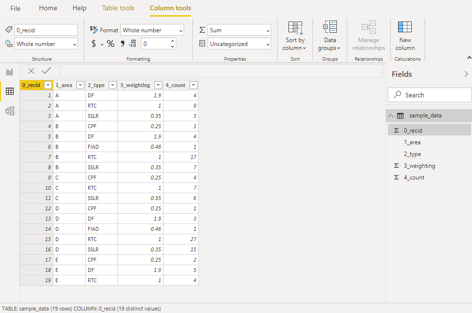
Start with five sets of area data (A-E). Within each are one or more incident Types. Each incident has a Weighting and the number of times (Count) it occurs within the Area.
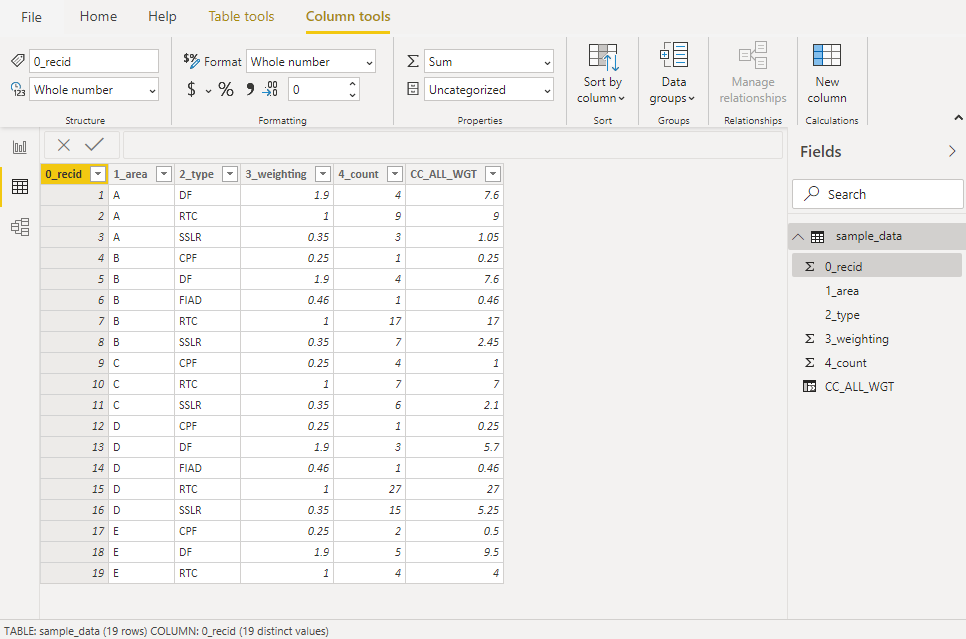
Add a calculated column CC_ALL_WGT (weighting * count)
Create a measure:
M_WGT = DIVIDE(SUM(sample_data[CC_ALL_WGT]), SUM(sample_data[4_count]))
This makes sense once grouped by Area and we can see that the Area gets an overall Weighting Score
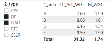
This can be altered by slicing the data based on which Type of incident we wish to inspect:
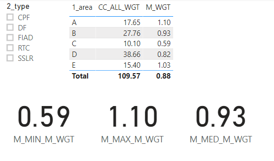
We can also set up additional measures to get the Min; Max; Median from the Measure based on the Type selection:
M_MIN_M_WGT = IF(
    countrows(values(sample_data[1_area])) = 1,
    sample_data[M_WGT],
    MINX(
        values(sample_data[1_area]),
        sample_data[M_WGT]
    )
)
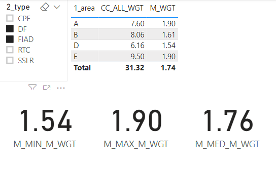
Which change as expected when a Slicer selection is made
Also set up a measure to determine the Mid-Point between the Minimum and the Median and Mid-Point between the Maximum and the Median
M_MidMinMed =
sample_data[M_MED_M_WGT] - ((sample_data[M_MED_M_WGT] - sample_data[M_MIN_M_WGT]) / 2)
What I would like to do with these values is create a banding based on the following:
- VeryLow: (Minimum to MinMed mid-point)
- Low: (MinMed to Median)
- High: (Median to MedMax mid-point)
- VeryHigh: (MedMax to Maximum)
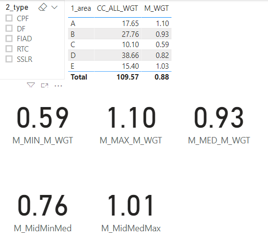
So based on the following selection
The bins would be set up as follows
- VeryLow (59 to 0.76)
- Low (76 to 0.93)
- High (93 to 1.01)
- VeryHigh (01 to 1.1)
Area A would be in Bin 4 (VeryHigh); Area B in Bin 2 (Low); Area C in Bin 1 (VeryLow); Area D in Bin 2 (Low); Area E in Bin 4 (VeryHigh)
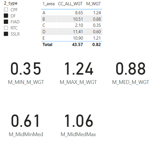
If select specific Types to review (via the slicer) the bins would be set up as follows:
- VeryLow (35 to 0.61)
- Low (61 to 0.88)
- High (88 to 1.06)
- VeryHigh (06 to 1.24)
So checking M_WGT (with types specified in the slicer):
Area A would be in Bin 4 (VeryHigh); Area B in Bin 2 (Low); Area C in Bin 1 (VeryLow); Area D in Bin 1 (VeryLow); Area E in Bin 4 (High)
NOTE - The change in bin classification for Area D from Low to VeryLow
This is where I get stuck. This posts specifies how to apply a static bin range: https://community.powerbi.com/t5/Desktop/Histogram-User-defined-bin-size/m-p/69854#M28961 but I’ve not been able to do this using dynamic or changing values (the Min; Max; Media; Midpoint) depending on selection.
The closest I’ve managed to apply is as follows:
Range =
var temp= CALCULATE(sample_data[M_WGT]) return
if(temp<0.76,"1_VeryLow",
    if(AND(temp>0.76,temp<=0.93), "2_Low",
        if(AND(temp>0.93,temp<=1.01), "3_High",
            "4_VeryHigh")))
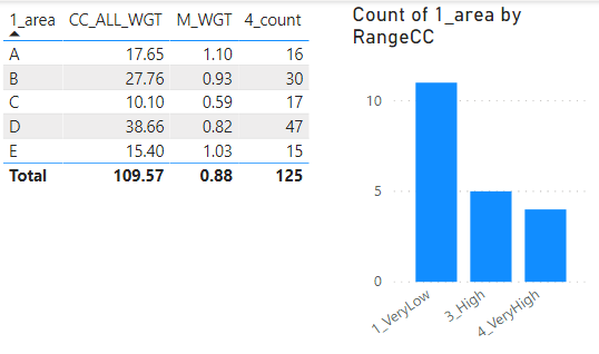
Which permitted the following:
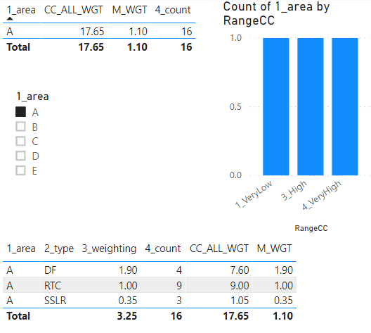
While I can then associate the Bins with a visual there are a number of things wrong with it. Firstly binning is occurring at the TYPE level not the AREA level. Secondly I’m manually setting the range values.
When I say Type levels what I mean is that they’re being binned at this level:
Whereas what I would like the histogram to be representing are the M_WGT values at the Area level.
If I slice by Area A only the problem is easier to see:
What would I like is for there to be one representation of Area A in the histogram (the bin for 1.10), not the three currently being shown (for each Type 1.9; 1; 0.35)
Hopefully I’ve managed to convey the problem and requirement.
Thank you in advance for any help!
- Mark as New
- Bookmark
- Subscribe
- Mute
- Subscribe to RSS Feed
- Permalink
- Report Inappropriate Content
Hi @juu ,
You may create measure like DAX below, then put it into Value box of histogram
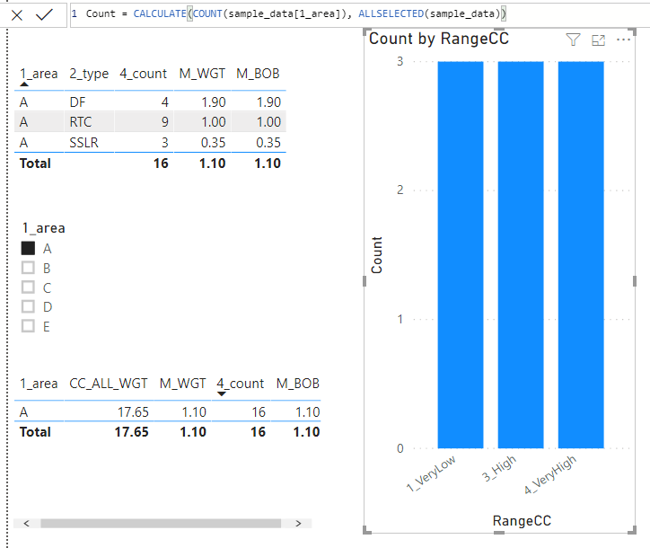
Count = CALCULATE(COUNT(sample_data[1_area]), ALLSELECTED(sample_data))
Best Regards,
Amy
Community Support Team _ Amy
If this post helps, then please consider Accept it as the solution to help the other members find it more quickly.
- Mark as New
- Bookmark
- Subscribe
- Mute
- Subscribe to RSS Feed
- Permalink
- Report Inappropriate Content
Hi @v-xicai,
I added the suggested measure to the value of the histogram but it didn't seem to change it as required. Please see the attached image.
Kind Regards, juu
- Mark as New
- Bookmark
- Subscribe
- Mute
- Subscribe to RSS Feed
- Permalink
- Report Inappropriate Content
Hi @juu ,
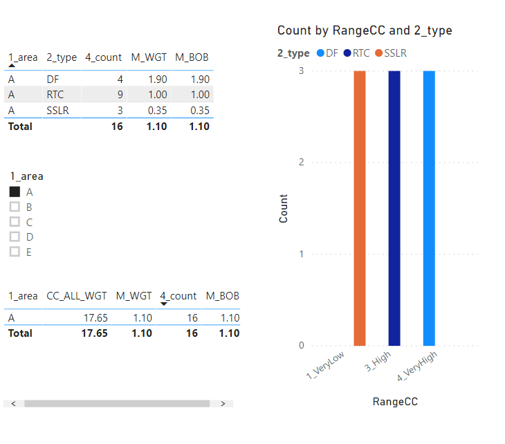
You may try to drag the [2_type] into Legend box of chart visual .
Best Regards,
Amy
Community Support Team _ Amy
If this post helps, then please consider Accept it as the solution to help the other members find it more quickly.
- Mark as New
- Bookmark
- Subscribe
- Mute
- Subscribe to RSS Feed
- Permalink
- Report Inappropriate Content
Hi @v-xicai,
OK but all this seems to do is symbolise the different types.
I don't wish to have representation of the types (2_Types) at all.
What I would like is just the value of M_WGT at the area (1_Area) level.
So there should be a single bar only in the histogram with a Count of 1 showing the value of 4_VeryHigh (as the underlying M_WGT at the 1_Area level is 1.10).
Kind regards
Helpful resources

Microsoft Fabric Learn Together
Covering the world! 9:00-10:30 AM Sydney, 4:00-5:30 PM CET (Paris/Berlin), 7:00-8:30 PM Mexico City

Power BI Monthly Update - April 2024
Check out the April 2024 Power BI update to learn about new features.

| User | Count |
|---|---|
| 113 | |
| 100 | |
| 78 | |
| 76 | |
| 52 |
| User | Count |
|---|---|
| 144 | |
| 109 | |
| 108 | |
| 88 | |
| 61 |
