- Power BI forums
- Updates
- News & Announcements
- Get Help with Power BI
- Desktop
- Service
- Report Server
- Power Query
- Mobile Apps
- Developer
- DAX Commands and Tips
- Custom Visuals Development Discussion
- Health and Life Sciences
- Power BI Spanish forums
- Translated Spanish Desktop
- Power Platform Integration - Better Together!
- Power Platform Integrations (Read-only)
- Power Platform and Dynamics 365 Integrations (Read-only)
- Training and Consulting
- Instructor Led Training
- Dashboard in a Day for Women, by Women
- Galleries
- Community Connections & How-To Videos
- COVID-19 Data Stories Gallery
- Themes Gallery
- Data Stories Gallery
- R Script Showcase
- Webinars and Video Gallery
- Quick Measures Gallery
- 2021 MSBizAppsSummit Gallery
- 2020 MSBizAppsSummit Gallery
- 2019 MSBizAppsSummit Gallery
- Events
- Ideas
- Custom Visuals Ideas
- Issues
- Issues
- Events
- Upcoming Events
- Community Blog
- Power BI Community Blog
- Custom Visuals Community Blog
- Community Support
- Community Accounts & Registration
- Using the Community
- Community Feedback
Register now to learn Fabric in free live sessions led by the best Microsoft experts. From Apr 16 to May 9, in English and Spanish.
- Power BI forums
- Forums
- Get Help with Power BI
- Desktop
- Re: Dynamic Y-axis range
- Subscribe to RSS Feed
- Mark Topic as New
- Mark Topic as Read
- Float this Topic for Current User
- Bookmark
- Subscribe
- Printer Friendly Page
- Mark as New
- Bookmark
- Subscribe
- Mute
- Subscribe to RSS Feed
- Permalink
- Report Inappropriate Content
Dynamic Y-axis range
Hello everyone,
I'm using line and clustered column chart in Power BI Desktop with a live connection to data source and some slicers.
The annoying thing is that the lines are shown on the columns which makes it difficult to read the data labels, I'm searching for a way to show the lines above columns so that they don't overlap. One solution is to change the Y axis range manually and say e.g. show only the range o to 100, BUT that doesn't solve it completely because once I change one filter via slicer 100 is smaller than maximum value and the chart gets messed up.
Does any one have a smart solution to adjust the start and end values of Y-axis dynamically?
Thanks in advance 🙂
- Mark as New
- Bookmark
- Subscribe
- Mute
- Subscribe to RSS Feed
- Permalink
- Report Inappropriate Content
@Saghar - Perhaps you could create a measure for your line that takes the maximum value in the columns and adds that to each of your line values and then turn off the secondary axis. What do you think of that?
@ me in replies or I'll lose your thread!!!
Instead of a Kudo, please vote for this idea
Become an expert!: Enterprise DNA
External Tools: MSHGQM
YouTube Channel!: Microsoft Hates Greg
Latest book!: The Definitive Guide to Power Query (M)
DAX is easy, CALCULATE makes DAX hard...
- Mark as New
- Bookmark
- Subscribe
- Mute
- Subscribe to RSS Feed
- Permalink
- Report Inappropriate Content
@Greg_Deckler thanks for the suggestion, the problem is that line and column measures have different formats (€ and %) and I can't think of a smart way to compare those two (to add the maximum of columns to the lines).
Do you have a solution to that as well? 🙂
- Mark as New
- Bookmark
- Subscribe
- Mute
- Subscribe to RSS Feed
- Permalink
- Report Inappropriate Content
Hi @Saghar ,
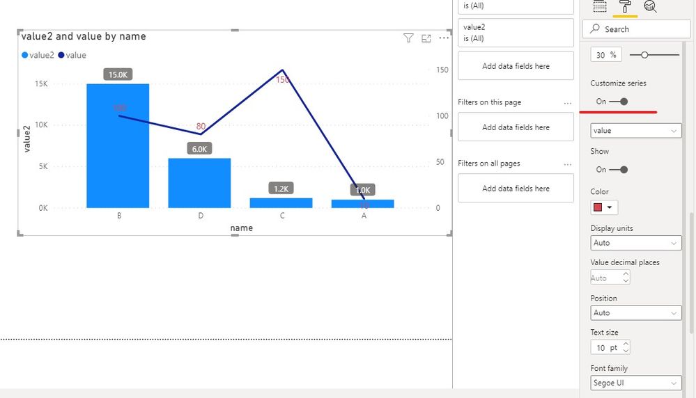
Maybe you can open the second Y axis for column chart and line chart.
And you can customize Data label to distinguish them.
Perhaps you can add a background to the Data label of the Column, the result like this,
If you have any question, please kindly ask here and we will try to resolve it.
Best regards,
Community Support Team _ zhenbw
If this post helps, then please consider Accept it as the solution to help the other members find it more quickly.
- Mark as New
- Bookmark
- Subscribe
- Mute
- Subscribe to RSS Feed
- Permalink
- Report Inappropriate Content
@Saghar , I doubt there is a solution for that. Auto is one which not working for.
There a few solutions. multi-axis visual - idea for that
Line and Bar chart with Multiple Axis
https://ideas.powerbi.com/ideas/idea/?ideaid=cc9b1531-8ca4-48be-8035-b6dfc17af84f
https://ideas.powerbi.com/ideas/idea/?ideaid=aec20fda-edc4-466c-a9c0-2772011f6193
You can vote or create a new idea.
https://appsource.microsoft.com/en-us/marketplace/apps?product=power-bi-visuals
You can explore some custom visual -
Microsoft Power BI Learning Resources, 2023 !!
Learn Power BI - Full Course with Dec-2022, with Window, Index, Offset, 100+ Topics !!
Did I answer your question? Mark my post as a solution! Appreciate your Kudos !! Proud to be a Super User! !!
Helpful resources

Microsoft Fabric Learn Together
Covering the world! 9:00-10:30 AM Sydney, 4:00-5:30 PM CET (Paris/Berlin), 7:00-8:30 PM Mexico City

Power BI Monthly Update - April 2024
Check out the April 2024 Power BI update to learn about new features.

| User | Count |
|---|---|
| 113 | |
| 100 | |
| 78 | |
| 76 | |
| 52 |
| User | Count |
|---|---|
| 144 | |
| 109 | |
| 108 | |
| 88 | |
| 61 |

