- Power BI forums
- Updates
- News & Announcements
- Get Help with Power BI
- Desktop
- Service
- Report Server
- Power Query
- Mobile Apps
- Developer
- DAX Commands and Tips
- Custom Visuals Development Discussion
- Health and Life Sciences
- Power BI Spanish forums
- Translated Spanish Desktop
- Power Platform Integration - Better Together!
- Power Platform Integrations (Read-only)
- Power Platform and Dynamics 365 Integrations (Read-only)
- Training and Consulting
- Instructor Led Training
- Dashboard in a Day for Women, by Women
- Galleries
- Community Connections & How-To Videos
- COVID-19 Data Stories Gallery
- Themes Gallery
- Data Stories Gallery
- R Script Showcase
- Webinars and Video Gallery
- Quick Measures Gallery
- 2021 MSBizAppsSummit Gallery
- 2020 MSBizAppsSummit Gallery
- 2019 MSBizAppsSummit Gallery
- Events
- Ideas
- Custom Visuals Ideas
- Issues
- Issues
- Events
- Upcoming Events
- Community Blog
- Power BI Community Blog
- Custom Visuals Community Blog
- Community Support
- Community Accounts & Registration
- Using the Community
- Community Feedback
Register now to learn Fabric in free live sessions led by the best Microsoft experts. From Apr 16 to May 9, in English and Spanish.
- Power BI forums
- Forums
- Get Help with Power BI
- Desktop
- Dynamic X and Y Scatter Plot Axis
- Subscribe to RSS Feed
- Mark Topic as New
- Mark Topic as Read
- Float this Topic for Current User
- Bookmark
- Subscribe
- Printer Friendly Page
- Mark as New
- Bookmark
- Subscribe
- Mute
- Subscribe to RSS Feed
- Permalink
- Report Inappropriate Content
Dynamic X and Y Scatter Plot Axis
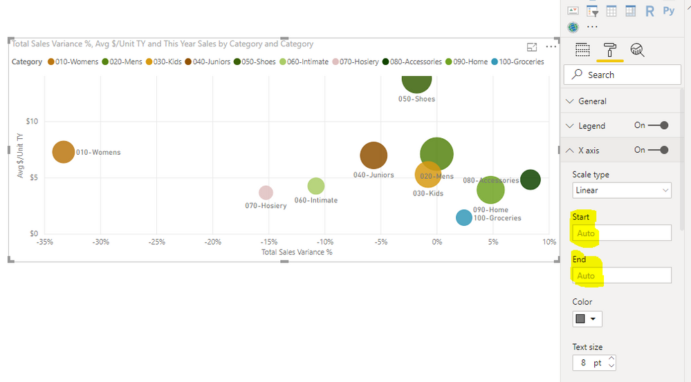
Is there a way to add a bit more to the x and/or y axis of a scatter plot so the maximum bubbles don't get cut off on the plot, without manually setting the "End" value?
Not manually setting the "End" value is important because I have a year filter tied to the plot. In 2015 the maximum y value is 23,000 but in 2016 the maximum y value is 210,000. I don't want to set the "End" value to be 220,000 because then the data would look really "squished" in 2015. So I was wondering if I could somehow dynamically make the "End" value Max(Y) * 1.1?
Thanks
- Mark as New
- Bookmark
- Subscribe
- Mute
- Subscribe to RSS Feed
- Permalink
- Report Inappropriate Content
Hi @handwepg,
Do you mean that you want to dynamically set the Start and End Value of X axis and Y axis for bubble chart?
Actually, the Start and End Value of X axis and Y axis is Auto by default.
So there is no other way for us to set it dynamically, we only could enter the value manually.
You could post your idea in Power BI ideas Forum and add your comments there to improve Power BI and make this feature coming sooner.
If you still need help, feel free to ask.
Best Regards,
Cherry
If this post helps, then please consider Accept it as the solution to help the other members find it more quickly.
- Mark as New
- Bookmark
- Subscribe
- Mute
- Subscribe to RSS Feed
- Permalink
- Report Inappropriate Content
Sorry I was unclear. I know there is a dynamic "Auto" Start and End. My issue with the "Auto" is that it cuts off part of the bubble the reaches the maximum (see 050 - Shoes in your pasted example).
What I would like is an option that would be something like "Auto + 10% of Max" so the entire bubble would appear on the plot.
Any ideas?
- Mark as New
- Bookmark
- Subscribe
- Mute
- Subscribe to RSS Feed
- Permalink
- Report Inappropriate Content
Hi @handwepg ,
By my tests and research, I'm afraid that there is no such option like "Auto + 10% of Max" in Power BI currently.
If you want to show the entire bubble, you could set the X or Y axis manually under formatting.
Best Regards,
Cherry
If this post helps, then please consider Accept it as the solution to help the other members find it more quickly.
Helpful resources

Microsoft Fabric Learn Together
Covering the world! 9:00-10:30 AM Sydney, 4:00-5:30 PM CET (Paris/Berlin), 7:00-8:30 PM Mexico City

Power BI Monthly Update - April 2024
Check out the April 2024 Power BI update to learn about new features.

| User | Count |
|---|---|
| 111 | |
| 96 | |
| 80 | |
| 68 | |
| 59 |
| User | Count |
|---|---|
| 150 | |
| 119 | |
| 104 | |
| 87 | |
| 67 |

