- Power BI forums
- Updates
- News & Announcements
- Get Help with Power BI
- Desktop
- Service
- Report Server
- Power Query
- Mobile Apps
- Developer
- DAX Commands and Tips
- Custom Visuals Development Discussion
- Health and Life Sciences
- Power BI Spanish forums
- Translated Spanish Desktop
- Power Platform Integration - Better Together!
- Power Platform Integrations (Read-only)
- Power Platform and Dynamics 365 Integrations (Read-only)
- Training and Consulting
- Instructor Led Training
- Dashboard in a Day for Women, by Women
- Galleries
- Community Connections & How-To Videos
- COVID-19 Data Stories Gallery
- Themes Gallery
- Data Stories Gallery
- R Script Showcase
- Webinars and Video Gallery
- Quick Measures Gallery
- 2021 MSBizAppsSummit Gallery
- 2020 MSBizAppsSummit Gallery
- 2019 MSBizAppsSummit Gallery
- Events
- Ideas
- Custom Visuals Ideas
- Issues
- Issues
- Events
- Upcoming Events
- Community Blog
- Power BI Community Blog
- Custom Visuals Community Blog
- Community Support
- Community Accounts & Registration
- Using the Community
- Community Feedback
Register now to learn Fabric in free live sessions led by the best Microsoft experts. From Apr 16 to May 9, in English and Spanish.
- Power BI forums
- Forums
- Get Help with Power BI
- Desktop
- Re: Dynamic Treemap - How do I change the view?
- Subscribe to RSS Feed
- Mark Topic as New
- Mark Topic as Read
- Float this Topic for Current User
- Bookmark
- Subscribe
- Printer Friendly Page
- Mark as New
- Bookmark
- Subscribe
- Mute
- Subscribe to RSS Feed
- Permalink
- Report Inappropriate Content
Dynamic Treemap - How do I change the view?
Hi
This si the first time I have posted and I am looking to find a solution for a treemap I am working on. I have a treemap made up of 3 sales regions and when I click one of the regions the treemap changes show shaded and non shaded parts withing the total treemap relating to that region. I dont want it to do this. I want it to create a new tremap only for that sales region, with no shaded/non shaded aspects at all. See images below:
Before I click on one region:
After I click on one region:
Any help gratefully received
- Mark as New
- Bookmark
- Subscribe
- Mute
- Subscribe to RSS Feed
- Permalink
- Report Inappropriate Content
firstly where are you clicking on the treemap or on another visual?
i think what you might be referring to is the edit interactions behaviour.
https://powerbi.microsoft.com/en-us/documentation/powerbi-service-visual-interactions/
If I took the time to answer your question and I came up with a solution, please mark my post as a solution and /or give kudos freely for the effort 🙂 Thank you!
Proud to be a Super User!
- Mark as New
- Bookmark
- Subscribe
- Mute
- Subscribe to RSS Feed
- Permalink
- Report Inappropriate Content
This is exactly what I was loking for, great tip! Thanks!!!
- Mark as New
- Bookmark
- Subscribe
- Mute
- Subscribe to RSS Feed
- Permalink
- Report Inappropriate Content
HI thanks for the reply.


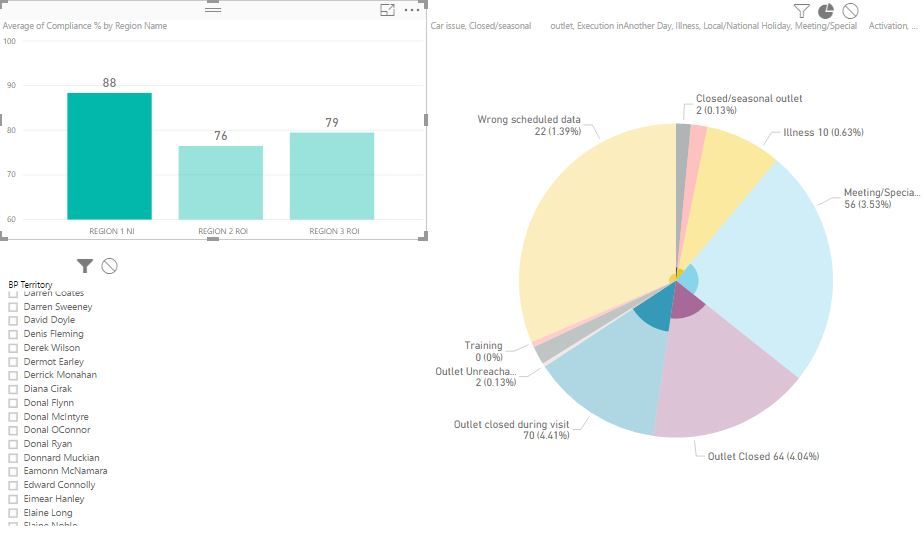
See above the visuals I have before and after lciking on one of the 3 bar chart bars. I dont want to pie segments to shrink smaller within the same segment sizes, rather I want to pie segments to change in size (get bigger smaller) to represent the isolated region i have picked.
Hope this makes sense.
- Mark as New
- Bookmark
- Subscribe
- Mute
- Subscribe to RSS Feed
- Permalink
- Report Inappropriate Content
Hi @johnnyscottni,
>>I dont want to pie segments to shrink smaller within the same segment sizes,
The pie segment is not be sharinked, it just shows the corresponding rows filtered by the cluster bar chart. For your pie report, the different show different categories(Wrong Scheduled data, Closed/seasonal letout, illness and so on). For same color area, there is different regions, when you click the bar chart, it shows different sub-parts for same region.
>>rather I want to pie segments to change in size (get bigger smaller) to represent the isolated region i have picked.
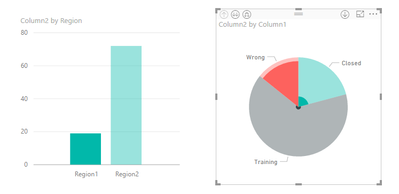
After my test, it hard to represent the isolated region for pie feature. It just highlighted the filtered part as the picture below.
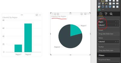
If I change the filed order of column2 and Region, it will show whole sub-sector when you click the cluster bar chart.
Do you mind share your resource table for further analysis if you still have other problems.
Besr Regards,
Angelia
- Mark as New
- Bookmark
- Subscribe
- Mute
- Subscribe to RSS Feed
- Permalink
- Report Inappropriate Content
Ok so my images didnt load, but hopefully you get the idea....cheers
Helpful resources

Microsoft Fabric Learn Together
Covering the world! 9:00-10:30 AM Sydney, 4:00-5:30 PM CET (Paris/Berlin), 7:00-8:30 PM Mexico City

Power BI Monthly Update - April 2024
Check out the April 2024 Power BI update to learn about new features.

| User | Count |
|---|---|
| 109 | |
| 99 | |
| 77 | |
| 66 | |
| 54 |
| User | Count |
|---|---|
| 144 | |
| 104 | |
| 102 | |
| 87 | |
| 64 |


