- Power BI forums
- Updates
- News & Announcements
- Get Help with Power BI
- Desktop
- Service
- Report Server
- Power Query
- Mobile Apps
- Developer
- DAX Commands and Tips
- Custom Visuals Development Discussion
- Health and Life Sciences
- Power BI Spanish forums
- Translated Spanish Desktop
- Power Platform Integration - Better Together!
- Power Platform Integrations (Read-only)
- Power Platform and Dynamics 365 Integrations (Read-only)
- Training and Consulting
- Instructor Led Training
- Dashboard in a Day for Women, by Women
- Galleries
- Community Connections & How-To Videos
- COVID-19 Data Stories Gallery
- Themes Gallery
- Data Stories Gallery
- R Script Showcase
- Webinars and Video Gallery
- Quick Measures Gallery
- 2021 MSBizAppsSummit Gallery
- 2020 MSBizAppsSummit Gallery
- 2019 MSBizAppsSummit Gallery
- Events
- Ideas
- Custom Visuals Ideas
- Issues
- Issues
- Events
- Upcoming Events
- Community Blog
- Power BI Community Blog
- Custom Visuals Community Blog
- Community Support
- Community Accounts & Registration
- Using the Community
- Community Feedback
Register now to learn Fabric in free live sessions led by the best Microsoft experts. From Apr 16 to May 9, in English and Spanish.
- Power BI forums
- Forums
- Get Help with Power BI
- Desktop
- Dynamic Reference Line in Scatter Chart by Filter
- Subscribe to RSS Feed
- Mark Topic as New
- Mark Topic as Read
- Float this Topic for Current User
- Bookmark
- Subscribe
- Printer Friendly Page
- Mark as New
- Bookmark
- Subscribe
- Mute
- Subscribe to RSS Feed
- Permalink
- Report Inappropriate Content
Dynamic Reference Line in Scatter Chart by Filter
Hello,
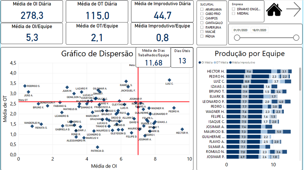
I have this dashboard below, and I would like the "reference line" in the scatter chart to be dynamical. For exemple, I have a filter on the screen called "Sucursal", and for each "Sucursal", I have a different value for the reference lines (in x-axis and y-axis), and It's not a calculated value, the values are pre-defined numbers (but different for each Sucursal), I just want to plot them on the chart when I filter it.
Is there a way to "move" the reference line when I select a different "Sucursal"?
Obs: the reference line is kind a "goal", dots "after" the line means they are good. But as said before, goals are different depending on the Sucursal selected.
Thanks!
- Mark as New
- Bookmark
- Subscribe
- Mute
- Subscribe to RSS Feed
- Permalink
- Report Inappropriate Content
Hi @Anonymous ,
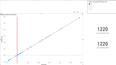
Although an old post, but since it has no accepted solution and I see the possible solution is available as standard feature in Power BI Desktop, I tested it and it is working fine.
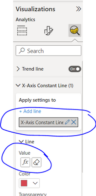
Now we can add dynamic reference lines for X and Y axis (as well as many other type of lines).
In the analytics pane, you can see above options. Select a reference table column value to use as a dynamic number for user to change values.
I also attach a sample file.
https://drive.google.com/file/d/18Vqo648GcsorF066vrw7yAQe9MIYjnvX/view?usp=sharing
- Mark as New
- Bookmark
- Subscribe
- Mute
- Subscribe to RSS Feed
- Permalink
- Report Inappropriate Content
Hi @Anonymous ,
You could find Quadrant Chart custom visual in Power BI.
The default Scatter chart doesn't support to add such feature. If the custom visual doesn't meet your requirement completely, you could vote the similar idea here.
If this post helps, then please consider Accept it as the solution to help the other members find it.
- Mark as New
- Bookmark
- Subscribe
- Mute
- Subscribe to RSS Feed
- Permalink
- Report Inappropriate Content
Quadrant chart doesn't have that functionality.Any other option?
- Mark as New
- Bookmark
- Subscribe
- Mute
- Subscribe to RSS Feed
- Permalink
- Report Inappropriate Content
For Cabo Frio for example: I have x-axis (7) and y-axis (2,6). [7; 2,6]
But for Araruama, it is I have x-axis (5) and y-axis (3). [5; 3]
Helpful resources

Microsoft Fabric Learn Together
Covering the world! 9:00-10:30 AM Sydney, 4:00-5:30 PM CET (Paris/Berlin), 7:00-8:30 PM Mexico City

Power BI Monthly Update - April 2024
Check out the April 2024 Power BI update to learn about new features.

| User | Count |
|---|---|
| 109 | |
| 99 | |
| 77 | |
| 66 | |
| 54 |
| User | Count |
|---|---|
| 144 | |
| 104 | |
| 101 | |
| 86 | |
| 64 |


