- Power BI forums
- Updates
- News & Announcements
- Get Help with Power BI
- Desktop
- Service
- Report Server
- Power Query
- Mobile Apps
- Developer
- DAX Commands and Tips
- Custom Visuals Development Discussion
- Health and Life Sciences
- Power BI Spanish forums
- Translated Spanish Desktop
- Power Platform Integration - Better Together!
- Power Platform Integrations (Read-only)
- Power Platform and Dynamics 365 Integrations (Read-only)
- Training and Consulting
- Instructor Led Training
- Dashboard in a Day for Women, by Women
- Galleries
- Community Connections & How-To Videos
- COVID-19 Data Stories Gallery
- Themes Gallery
- Data Stories Gallery
- R Script Showcase
- Webinars and Video Gallery
- Quick Measures Gallery
- 2021 MSBizAppsSummit Gallery
- 2020 MSBizAppsSummit Gallery
- 2019 MSBizAppsSummit Gallery
- Events
- Ideas
- Custom Visuals Ideas
- Issues
- Issues
- Events
- Upcoming Events
- Community Blog
- Power BI Community Blog
- Custom Visuals Community Blog
- Community Support
- Community Accounts & Registration
- Using the Community
- Community Feedback
Register now to learn Fabric in free live sessions led by the best Microsoft experts. From Apr 16 to May 9, in English and Spanish.
- Power BI forums
- Forums
- Get Help with Power BI
- Desktop
- Re: Dynamic Increase
- Subscribe to RSS Feed
- Mark Topic as New
- Mark Topic as Read
- Float this Topic for Current User
- Bookmark
- Subscribe
- Printer Friendly Page
- Mark as New
- Bookmark
- Subscribe
- Mute
- Subscribe to RSS Feed
- Permalink
- Report Inappropriate Content
Dynamic Increase
Hello,
I am trying to create a model where users (executive team) can visualise the effect of a targeted salary increase for which they (users) can modify the %. In essence, the Power BI end user (the management team) can select a random value for the salary increase and the Power BI model will show the appropriate results (additional cost, employees affected, etc.) without going behind the scene. The salary increase could be any randon number between zero and 10%. I hope my question makes sense. ![]()
Any ideas?
- Mark as New
- Bookmark
- Subscribe
- Mute
- Subscribe to RSS Feed
- Permalink
- Report Inappropriate Content
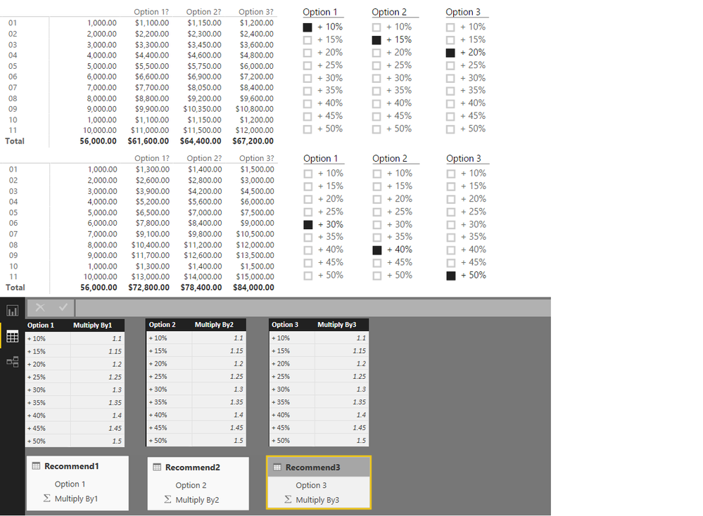
@EZgrafton Have you considered parameter tables? You will have to use pre-set numbers (in your case between 0% and 10%)
Here's what the basic Measure would look like for each slicer...
Option 1? =
IF (
    HASONEVALUE ( Recommend1[Option 1] ),
    ( [Measure] * VALUES ( Recommend1[Multiply By1] ) ),
    [Measure]
)
And here's the result with 3 slicers and 3 such measures...
Read more about how to create here...
- Mark as New
- Bookmark
- Subscribe
- Mute
- Subscribe to RSS Feed
- Permalink
- Report Inappropriate Content
Thank you for your suggestion, Sean.
I will try to replicate it. However, I was thinking of something more flexible like any value from 0 to 10, so for example 3.77%, Using your idea, I will have to develop a table that contains all possible values between 0 and 10 and on the slicer they would not look visually appealing. Would it be possible to have a sliding slicer? I think I've seen the concept of sliding data on a time table type of visual. Does anybody know how to make it happen?
Any creative idea is welcomed! 🙂
- Mark as New
- Bookmark
- Subscribe
- Mute
- Subscribe to RSS Feed
- Permalink
- Report Inappropriate Content
Unfortunately, I don't believe that there are any options that you are going to like. Parameters are now supported in queries, so that might be one route, but you probably do not want your users having to run the query and enter the % increase just to get the answer. If I understand your question correctly, you would like the user from the dashboard or report level to be able to enter a number and have the visuals reflect that. There is no "user input" at the report/dashboard level of which I am aware. Would make a nice "Idea" if it does not already exist.
@ me in replies or I'll lose your thread!!!
Instead of a Kudo, please vote for this idea
Become an expert!: Enterprise DNA
External Tools: MSHGQM
YouTube Channel!: Microsoft Hates Greg
Latest book!: The Definitive Guide to Power Query (M)
DAX is easy, CALCULATE makes DAX hard...
Helpful resources

Microsoft Fabric Learn Together
Covering the world! 9:00-10:30 AM Sydney, 4:00-5:30 PM CET (Paris/Berlin), 7:00-8:30 PM Mexico City

Power BI Monthly Update - April 2024
Check out the April 2024 Power BI update to learn about new features.

| User | Count |
|---|---|
| 117 | |
| 105 | |
| 69 | |
| 67 | |
| 43 |
| User | Count |
|---|---|
| 148 | |
| 103 | |
| 103 | |
| 88 | |
| 66 |

