- Power BI forums
- Updates
- News & Announcements
- Get Help with Power BI
- Desktop
- Service
- Report Server
- Power Query
- Mobile Apps
- Developer
- DAX Commands and Tips
- Custom Visuals Development Discussion
- Health and Life Sciences
- Power BI Spanish forums
- Translated Spanish Desktop
- Power Platform Integration - Better Together!
- Power Platform Integrations (Read-only)
- Power Platform and Dynamics 365 Integrations (Read-only)
- Training and Consulting
- Instructor Led Training
- Dashboard in a Day for Women, by Women
- Galleries
- Community Connections & How-To Videos
- COVID-19 Data Stories Gallery
- Themes Gallery
- Data Stories Gallery
- R Script Showcase
- Webinars and Video Gallery
- Quick Measures Gallery
- 2021 MSBizAppsSummit Gallery
- 2020 MSBizAppsSummit Gallery
- 2019 MSBizAppsSummit Gallery
- Events
- Ideas
- Custom Visuals Ideas
- Issues
- Issues
- Events
- Upcoming Events
- Community Blog
- Power BI Community Blog
- Custom Visuals Community Blog
- Community Support
- Community Accounts & Registration
- Using the Community
- Community Feedback
Register now to learn Fabric in free live sessions led by the best Microsoft experts. From Apr 16 to May 9, in English and Spanish.
- Power BI forums
- Forums
- Get Help with Power BI
- Desktop
- Dynamic Graph month
- Subscribe to RSS Feed
- Mark Topic as New
- Mark Topic as Read
- Float this Topic for Current User
- Bookmark
- Subscribe
- Printer Friendly Page
- Mark as New
- Bookmark
- Subscribe
- Mute
- Subscribe to RSS Feed
- Permalink
- Report Inappropriate Content
Dynamic Graph month
I have a calendar filter to choose a month.
I have a bar Graph with quantity tickets x System Name X Month.
I need show in this graph the last 12 months considering the month selected in filter.
Examples:
If I choose February 2016. The graphic should show from February 2015 to February 2016.
If I choose June 2014, the graph should show from June 2013 to June 2014.
- Mark as New
- Bookmark
- Subscribe
- Mute
- Subscribe to RSS Feed
- Permalink
- Report Inappropriate Content
https://msdn.microsoft.com/en-us/library/ee634539.aspx
=CALCULATE( [whatever_measure_you're_using],
     DATESINPERIOD(Calendar(Date], MAX(Calendard[Date]), -12, MONTH)
)
- Mark as New
- Bookmark
- Subscribe
- Mute
- Subscribe to RSS Feed
- Permalink
- Report Inappropriate Content
@austinsense, Good Morning.
It did not work out as I expected.
This is the Example.
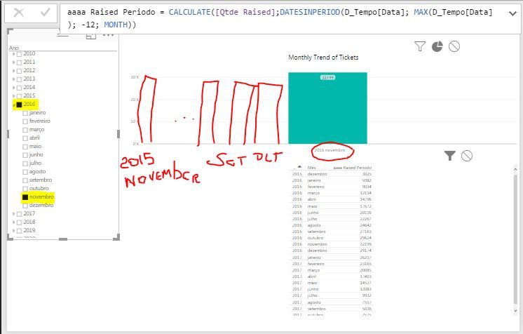
I Have a Filter Data to choose one month. When I choose the month, my Graph needs show me only last 12 month, including the month selected.
Once again, thank you.
- Mark as New
- Bookmark
- Subscribe
- Mute
- Subscribe to RSS Feed
- Permalink
- Report Inappropriate Content
Sorry this is my fault - I answered the wrong question 😕
You're looking for a dynamic filter on the date axis - I have to get to a meeting but I can take a look at this later.
- Mark as New
- Bookmark
- Subscribe
- Mute
- Subscribe to RSS Feed
- Permalink
- Report Inappropriate Content
- Mark as New
- Bookmark
- Subscribe
- Mute
- Subscribe to RSS Feed
- Permalink
- Report Inappropriate Content
Hi @thliberato,
I Have a Filter Data to choose one month. When I choose the month, my Graph needs show me only last 12 month, including the month selected.
According to your description, you should be able to follow steps below get the expected result.
1. You need to add a new date table to your model, and make sure there is no any relationships between the new date table and other tables.
2. Use the formula similar like below to add calculate column to both the new date table and your calendar table.
DateInt = YEAR ( NewDateTable[Date] ) * 12 + MONTH ( NewDateTable[Date] )
3. Use the formula similar like below to create the measure that you want to show in the visual.
Last12MontnSales =
IF (
    MAX(DimDate[DateInt])<=MAX(NewDateTable[DateInt]) && MAX(DimDate[DateInt])>MAX(NewDateTable[DateInt])-12,
    SUM ( FactInternetSales[SalesAmount] ),
    BLANK()
)
4. Use the date column of the new date table as the Slicer, and show the measure with the date column of your calendar table on the report.
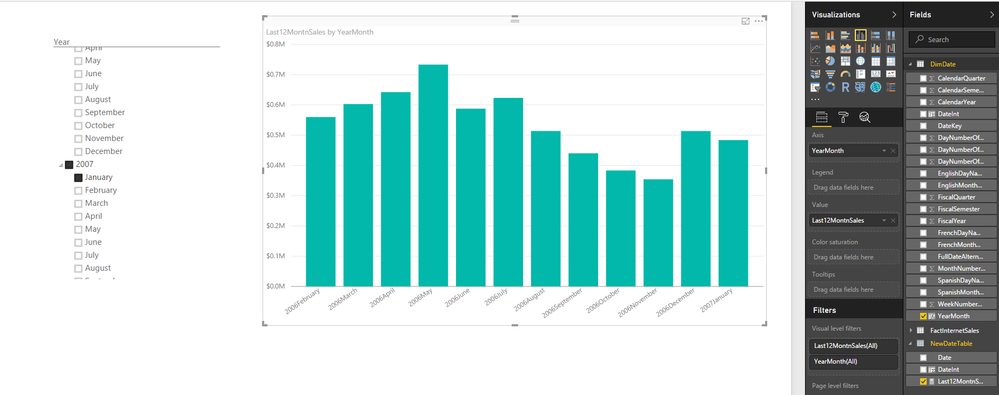
Here is the sample pbix file for your reference.![]()
Regards
- Mark as New
- Bookmark
- Subscribe
- Mute
- Subscribe to RSS Feed
- Permalink
- Report Inappropriate Content
@v-ljerr-msft, @austinsense, @Framet,
It did not work as expected.
If I select month May, the chart only shows me 5 columns (May, Apr, Mar, Feb and Jan).
If I select month Apr, the chart only shows me 4 columns (Apr, Mar, Feb and Jan).
If I select month Apr, the chart only shows me 3 columns (Mar, Feb and Jan).
If I select month Apr, the chart only shows me 2 columns (Feb and Jan).
If I select month Apr, the chart only shows me 1 column (Jan).
I need the graph that always display 12 months, always ending in the selected month in the filter.
- Mark as New
- Bookmark
- Subscribe
- Mute
- Subscribe to RSS Feed
- Permalink
- Report Inappropriate Content
Hi @thliberato,
Have you checked my sample shared above? It should work as expected.![]()
According to your description, it seems that you are using drill down on the chart, right? That's why the chart only shows data for a specific year from Jan to your selected month. So please recheck my sample and use a YearMonth column as I used in the sample, and don't use drill down to show year with month, then it should work.
Regards
- Mark as New
- Bookmark
- Subscribe
- Mute
- Subscribe to RSS Feed
- Permalink
- Report Inappropriate Content
@v-ljerr-msft, good morning.
I check you example, but I have a problem.
In the same page, I have a lot of graphs using my D_Tempo (time dimension).
Following your instructions, I need to create another time dimension to work.
I need to use the same time dimension in all graphics.
How can I do this and work ?
If you can, follow my skype (thliberato). If you stay online I can share my desktop with you.
Thanks.
- Mark as New
- Bookmark
- Subscribe
- Mute
- Subscribe to RSS Feed
- Permalink
- Report Inappropriate Content
Hi @thliberato,
Could you share a sample pbix file with me? You can upload it to OneDrive or Dropbox and post the link here, or just sent the link to me in private message. Do mask sensitive data before uploading.![]()
Regards
- Mark as New
- Bookmark
- Subscribe
- Mute
- Subscribe to RSS Feed
- Permalink
- Report Inappropriate Content
@v-ljerr-msft, good afternoon, Thanks for helping me.
I can not access the dropbox and onedrive in my office. Could you give me your e-mail address so I can send you the requested file?
- Mark as New
- Bookmark
- Subscribe
- Mute
- Subscribe to RSS Feed
- Permalink
- Report Inappropriate Content
Hi,
The last time I needed to do this I had to create a measure that returned values during the month range I wanted else blank() and therefore PowerBI would only show the axis where values existed. I don't think you can have dynamic ranges set on axis yet or do this within PowerBI withouth writing measures.
Assuming your existing measure is something like:
MyMeasure=SUM(Tickets)
Then you can create a new measure for the last 12 months only:
My12MonthMeasure =
CALCULATE (
    [MyMeasure],
    FILTER (
        ALL ( DateTable[DateColumn] ),
        [DateColumn] > EOMONTH ( MAX ( [DateColumn] ), -12 )
            && [DateColumn] <= EOMONTH ( MAX ( [DateColumn] ), 0 )
    )
)
This hopefully returns a count of tickets provided the date is less than or equal to the current date selected and greater than 12 months prior to the current date selected. (In whole months).
Hope this helps at least a little.
Thanks
Thomas
Helpful resources

Microsoft Fabric Learn Together
Covering the world! 9:00-10:30 AM Sydney, 4:00-5:30 PM CET (Paris/Berlin), 7:00-8:30 PM Mexico City

Power BI Monthly Update - April 2024
Check out the April 2024 Power BI update to learn about new features.

| User | Count |
|---|---|
| 111 | |
| 100 | |
| 80 | |
| 64 | |
| 58 |
| User | Count |
|---|---|
| 146 | |
| 110 | |
| 93 | |
| 84 | |
| 67 |


