- Power BI forums
- Updates
- News & Announcements
- Get Help with Power BI
- Desktop
- Service
- Report Server
- Power Query
- Mobile Apps
- Developer
- DAX Commands and Tips
- Custom Visuals Development Discussion
- Health and Life Sciences
- Power BI Spanish forums
- Translated Spanish Desktop
- Power Platform Integration - Better Together!
- Power Platform Integrations (Read-only)
- Power Platform and Dynamics 365 Integrations (Read-only)
- Training and Consulting
- Instructor Led Training
- Dashboard in a Day for Women, by Women
- Galleries
- Community Connections & How-To Videos
- COVID-19 Data Stories Gallery
- Themes Gallery
- Data Stories Gallery
- R Script Showcase
- Webinars and Video Gallery
- Quick Measures Gallery
- 2021 MSBizAppsSummit Gallery
- 2020 MSBizAppsSummit Gallery
- 2019 MSBizAppsSummit Gallery
- Events
- Ideas
- Custom Visuals Ideas
- Issues
- Issues
- Events
- Upcoming Events
- Community Blog
- Power BI Community Blog
- Custom Visuals Community Blog
- Community Support
- Community Accounts & Registration
- Using the Community
- Community Feedback
Register now to learn Fabric in free live sessions led by the best Microsoft experts. From Apr 16 to May 9, in English and Spanish.
- Power BI forums
- Forums
- Get Help with Power BI
- Desktop
- Re: Double grouping X axis - Year/month - visualiz...
- Subscribe to RSS Feed
- Mark Topic as New
- Mark Topic as Read
- Float this Topic for Current User
- Bookmark
- Subscribe
- Printer Friendly Page
- Mark as New
- Bookmark
- Subscribe
- Mute
- Subscribe to RSS Feed
- Permalink
- Report Inappropriate Content
Double grouping X axis - Year/month - visualization
Dear Community,
I would like to make a 100% stacked column chart with a double X axis Year/month as you can see below on the pic. By using the same method than in excel it doesnt work and put only year and/or only months.
Do you have any idea on how to solve this issue ?
Thanks 🙂
Solved! Go to Solution.
- Mark as New
- Bookmark
- Subscribe
- Mute
- Subscribe to RSS Feed
- Permalink
- Report Inappropriate Content
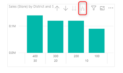
You need to change the Concatenate label setting on the X-Axis.
Then ensure you have expanded the hierarchy on the visual
Some times you will also need to correct the sort order
- Mark as New
- Bookmark
- Subscribe
- Mute
- Subscribe to RSS Feed
- Permalink
- Report Inappropriate Content
Its a good modeling practice to have a seperate date dimension in your data model. This table should include a rich set of date fields that you can use in your reporting. One of the features would be to add an additional column that define the sort order of your months e.g. 1 = Jan etc... You then need to assign this sort order field to the month label to ensure they are sorted in the correct way.
Hope this makes sense.
- Mark as New
- Bookmark
- Subscribe
- Mute
- Subscribe to RSS Feed
- Permalink
- Report Inappropriate Content
You need to change the Concatenate label setting on the X-Axis.
Then ensure you have expanded the hierarchy on the visual
Some times you will also need to correct the sort order
- Mark as New
- Bookmark
- Subscribe
- Mute
- Subscribe to RSS Feed
- Permalink
- Report Inappropriate Content
Hello @Anonymous ,
Thanks ! your answer was very helpful. Just a question, I have now an issue of sorting on X axis. I would like 2018 on the left hand side and the months increasing from left to the right. Can you help on this ?
Thanks 🙂
- Mark as New
- Bookmark
- Subscribe
- Mute
- Subscribe to RSS Feed
- Permalink
- Report Inappropriate Content
I am able by clicking "sort ascending" to have 2018 on the left and 2019 on the right but the months are not sorted as you can see below :
- Mark as New
- Bookmark
- Subscribe
- Mute
- Subscribe to RSS Feed
- Permalink
- Report Inappropriate Content
Its a good modeling practice to have a seperate date dimension in your data model. This table should include a rich set of date fields that you can use in your reporting. One of the features would be to add an additional column that define the sort order of your months e.g. 1 = Jan etc... You then need to assign this sort order field to the month label to ensure they are sorted in the correct way.
Hope this makes sense.
- Mark as New
- Bookmark
- Subscribe
- Mute
- Subscribe to RSS Feed
- Permalink
- Report Inappropriate Content
Thanks @Anonymous ,
Well I understood that it is easier for PBi to sort by numbers. It didn't work by creating a column with the month number but I made it directly in my excel file. It works now.
Thank you
- Mark as New
- Bookmark
- Subscribe
- Mute
- Subscribe to RSS Feed
- Permalink
- Report Inappropriate Content
Well okay I understand that maybe it is easier to sort with numbers than with letters for PBi. I created a column from example with the following formula :
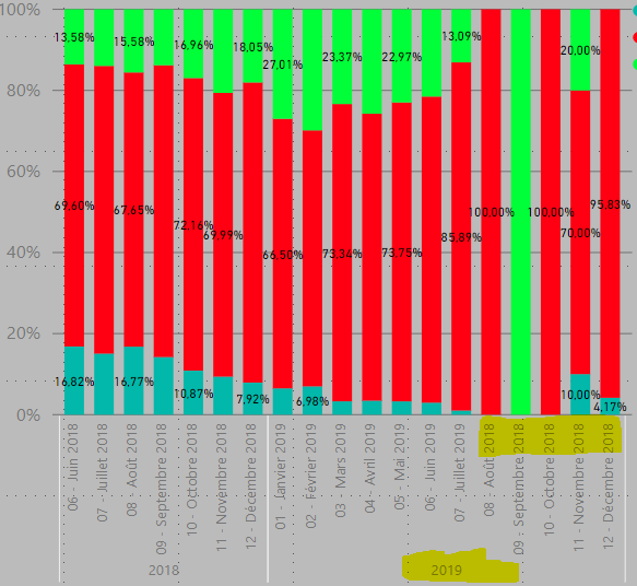
= Table.AddColumn(#"Removed Blank Rows", "Colonne date pour graph", each Text.Combine({Date.ToText([Quote Date], "MM"), " - ", Text.Proper(Date.ToText([Quote Date], "MMMM"))}), type text)And it works but it creates in the graph months which shouldn't be here such as from August to December 2019 as you can see below. I tried to filter it but it doesnt work as I don't have the options August to December 2019. How can I solve his ?
Thanks in advance
Helpful resources

Microsoft Fabric Learn Together
Covering the world! 9:00-10:30 AM Sydney, 4:00-5:30 PM CET (Paris/Berlin), 7:00-8:30 PM Mexico City

Power BI Monthly Update - April 2024
Check out the April 2024 Power BI update to learn about new features.

| User | Count |
|---|---|
| 107 | |
| 93 | |
| 77 | |
| 65 | |
| 53 |
| User | Count |
|---|---|
| 147 | |
| 106 | |
| 104 | |
| 87 | |
| 61 |


