- Power BI forums
- Updates
- News & Announcements
- Get Help with Power BI
- Desktop
- Service
- Report Server
- Power Query
- Mobile Apps
- Developer
- DAX Commands and Tips
- Custom Visuals Development Discussion
- Health and Life Sciences
- Power BI Spanish forums
- Translated Spanish Desktop
- Power Platform Integration - Better Together!
- Power Platform Integrations (Read-only)
- Power Platform and Dynamics 365 Integrations (Read-only)
- Training and Consulting
- Instructor Led Training
- Dashboard in a Day for Women, by Women
- Galleries
- Community Connections & How-To Videos
- COVID-19 Data Stories Gallery
- Themes Gallery
- Data Stories Gallery
- R Script Showcase
- Webinars and Video Gallery
- Quick Measures Gallery
- 2021 MSBizAppsSummit Gallery
- 2020 MSBizAppsSummit Gallery
- 2019 MSBizAppsSummit Gallery
- Events
- Ideas
- Custom Visuals Ideas
- Issues
- Issues
- Events
- Upcoming Events
- Community Blog
- Power BI Community Blog
- Custom Visuals Community Blog
- Community Support
- Community Accounts & Registration
- Using the Community
- Community Feedback
Register now to learn Fabric in free live sessions led by the best Microsoft experts. From Apr 16 to May 9, in English and Spanish.
- Power BI forums
- Forums
- Get Help with Power BI
- Desktop
- Don't show the line when no data or zero for Conti...
- Subscribe to RSS Feed
- Mark Topic as New
- Mark Topic as Read
- Float this Topic for Current User
- Bookmark
- Subscribe
- Printer Friendly Page
- Mark as New
- Bookmark
- Subscribe
- Mute
- Subscribe to RSS Feed
- Permalink
- Report Inappropriate Content
Don't show the line when no data or zero for Continuos line chart
Hello,
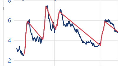
I have one measure that then put in the line chart it draws the Blue line like below. Then I have another measure that has just some datapoints of the original measure, which when I place in the chart it appears in red color. Now if for the missing values I choose blank, it draws this straight lines from the last datapoint of a period, to the first datapoint of the next period:
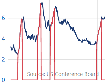
If instead of Blank, I choose to have Zeros in the missing values, I get this other version, which is also not what I want:
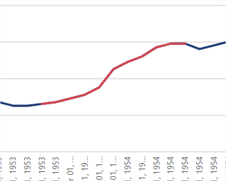
So, I want something like below, BUT not to have the x-axis as Categorical, because there are a lot of data points and then the scrollbar appears, which ruins the purpose of the chart 😞
Any help please?
Solved! Go to Solution.
- Mark as New
- Bookmark
- Subscribe
- Mute
- Subscribe to RSS Feed
- Permalink
- Report Inappropriate Content
Hi @Sab ,
According to your statement, I know that you want to combine two category line charts as one and use continuos X axis. I think Power BI doesn't support us to do this. As far as I know when we choose continuos in X axis, Power BI will let your line chart show as continuos automaticlly. According to your statement, I think there are two lines in your visual, so you may use legend or add two values in value field. So two lines will show as continuos. If you choose the x-axis as Categorical, the line may show as you want, however X axis will expand and then the scrollbar appears.
In other charts like column chart, there may be a function named as conditional formatting which still is not supported in line chart. By this function we can change the color of the visual by some conditions or by measure.
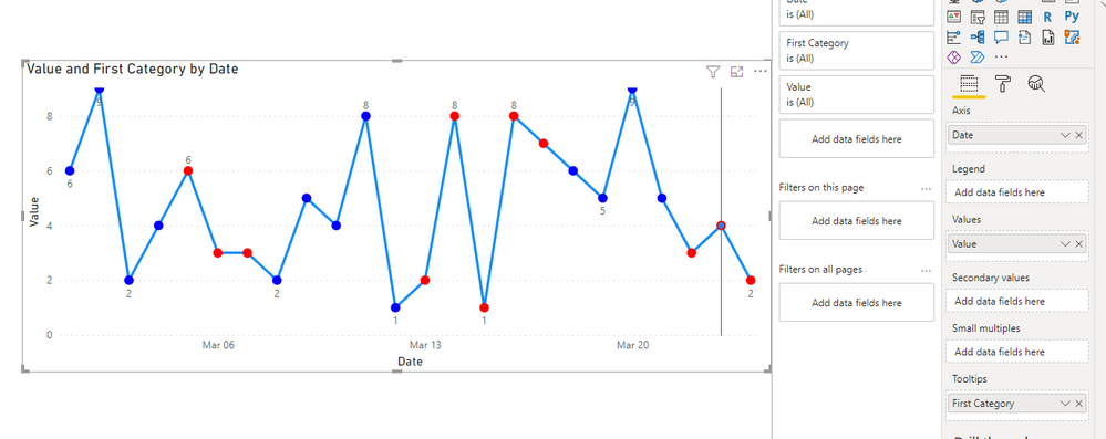
Currently we could only use it in column chart then change the column chart as line chart then the dot will show colors as we want.
Though we couldn't use conditional format to change the line color, but it may be the best workaround currently.
You can vote up this idea for this function:Conditional Formatting Line Chart
Or you can submit a new idea to improve the Power BI.
It is a place for customers provide feedback about Microsoft Office products . What’s more, if a feedback is high voted there by other customers, it will be promising that Microsoft Product Team will take it into consideration when designing the next version in the future.
Best Regards,
Rico Zhou
If this post helps, then please consider Accept it as the solution to help the other members find it more quickly.
- Mark as New
- Bookmark
- Subscribe
- Mute
- Subscribe to RSS Feed
- Permalink
- Report Inappropriate Content
I guess there is no solution to this 😞
- Mark as New
- Bookmark
- Subscribe
- Mute
- Subscribe to RSS Feed
- Permalink
- Report Inappropriate Content
Hi @Sab ,
According to your statement, I know that you want to combine two category line charts as one and use continuos X axis. I think Power BI doesn't support us to do this. As far as I know when we choose continuos in X axis, Power BI will let your line chart show as continuos automaticlly. According to your statement, I think there are two lines in your visual, so you may use legend or add two values in value field. So two lines will show as continuos. If you choose the x-axis as Categorical, the line may show as you want, however X axis will expand and then the scrollbar appears.
In other charts like column chart, there may be a function named as conditional formatting which still is not supported in line chart. By this function we can change the color of the visual by some conditions or by measure.
Currently we could only use it in column chart then change the column chart as line chart then the dot will show colors as we want.
Though we couldn't use conditional format to change the line color, but it may be the best workaround currently.
You can vote up this idea for this function:Conditional Formatting Line Chart
Or you can submit a new idea to improve the Power BI.
It is a place for customers provide feedback about Microsoft Office products . What’s more, if a feedback is high voted there by other customers, it will be promising that Microsoft Product Team will take it into consideration when designing the next version in the future.
Best Regards,
Rico Zhou
If this post helps, then please consider Accept it as the solution to help the other members find it more quickly.
Helpful resources

Microsoft Fabric Learn Together
Covering the world! 9:00-10:30 AM Sydney, 4:00-5:30 PM CET (Paris/Berlin), 7:00-8:30 PM Mexico City

Power BI Monthly Update - April 2024
Check out the April 2024 Power BI update to learn about new features.

| User | Count |
|---|---|
| 107 | |
| 100 | |
| 78 | |
| 64 | |
| 58 |
| User | Count |
|---|---|
| 148 | |
| 113 | |
| 97 | |
| 84 | |
| 67 |


