- Power BI forums
- Updates
- News & Announcements
- Get Help with Power BI
- Desktop
- Service
- Report Server
- Power Query
- Mobile Apps
- Developer
- DAX Commands and Tips
- Custom Visuals Development Discussion
- Health and Life Sciences
- Power BI Spanish forums
- Translated Spanish Desktop
- Power Platform Integration - Better Together!
- Power Platform Integrations (Read-only)
- Power Platform and Dynamics 365 Integrations (Read-only)
- Training and Consulting
- Instructor Led Training
- Dashboard in a Day for Women, by Women
- Galleries
- Community Connections & How-To Videos
- COVID-19 Data Stories Gallery
- Themes Gallery
- Data Stories Gallery
- R Script Showcase
- Webinars and Video Gallery
- Quick Measures Gallery
- 2021 MSBizAppsSummit Gallery
- 2020 MSBizAppsSummit Gallery
- 2019 MSBizAppsSummit Gallery
- Events
- Ideas
- Custom Visuals Ideas
- Issues
- Issues
- Events
- Upcoming Events
- Community Blog
- Power BI Community Blog
- Custom Visuals Community Blog
- Community Support
- Community Accounts & Registration
- Using the Community
- Community Feedback
Register now to learn Fabric in free live sessions led by the best Microsoft experts. From Apr 16 to May 9, in English and Spanish.
- Power BI forums
- Forums
- Get Help with Power BI
- Desktop
- Re: Don't Summarize question
- Subscribe to RSS Feed
- Mark Topic as New
- Mark Topic as Read
- Float this Topic for Current User
- Bookmark
- Subscribe
- Printer Friendly Page
- Mark as New
- Bookmark
- Subscribe
- Mute
- Subscribe to RSS Feed
- Permalink
- Report Inappropriate Content
Don't Summarize question
Hello:
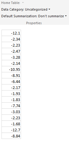
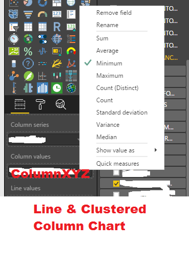
As you can see form below screenshot that my column is uncategorized & Don't summarize. In "Line & Clustered Column Chart" when i drop this column in Column values. i get options of SUM, Min, MAX etc.....
Even though it is "Don't summarize" i shouldn't see options SUM, Min, MAX etc.....
The solution that i am looking for is to display exactly same values as shown below on chart.
Please help me how to do that. Any help is greatly appreciated.
Thanks
- Mark as New
- Bookmark
- Subscribe
- Mute
- Subscribe to RSS Feed
- Permalink
- Report Inappropriate Content
You really need to provide more details here.
A chart has two dimensions...
The values need to be aggregated by whatever you are using as your X-Axys.
What are you using as the X-Axys?
what are you trying to achieve?
Can you draw an example?
- Mark as New
- Bookmark
- Subscribe
- Mute
- Subscribe to RSS Feed
- Permalink
- Report Inappropriate Content
This is because you are throwing it into a chart. It has to be a calculation then. An aggregation or a min or max. But be aware though. When you plot it a sum in a chart the calculation is dependent on what you have on the x-axis (unless you use ALL() in your calculation).
Maybe you can provide some more context, so I can help you out.
Best,
Martin
- Mark as New
- Bookmark
- Subscribe
- Mute
- Subscribe to RSS Feed
- Permalink
- Report Inappropriate Content
Martin,
I'm having the same problem. Why does displaying it in a chart require a calculation? Is there no simple way to visually display things in a chart without this calculation? We are simply trying to plot x and y, it should be that simple.
Alex
- Mark as New
- Bookmark
- Subscribe
- Mute
- Subscribe to RSS Feed
- Permalink
- Report Inappropriate Content
Hello:
Thank you for your all reply.
I agree with Alex.
I have already shown data in my screenshot. i just wantto display that data as it is without calculation. there has to be way out or workaround?
Please help.
Thank you.
Thanks
- Mark as New
- Bookmark
- Subscribe
- Mute
- Subscribe to RSS Feed
- Permalink
- Report Inappropriate Content
You may add an index column in Query Editor and drag that to shared axis field.
If this post helps, then please consider Accept it as the solution to help the other members find it more quickly.
- Mark as New
- Bookmark
- Subscribe
- Mute
- Subscribe to RSS Feed
- Permalink
- Report Inappropriate Content
Index column didn't helped. it might have some purpose but not helping me what i want.
Its very simple. i want to display value without calculations, is there work around?
Thanks
- Mark as New
- Bookmark
- Subscribe
- Mute
- Subscribe to RSS Feed
- Permalink
- Report Inappropriate Content
As far as I know, an index column is necessary. If you know custom visual, "Grouping", "Measure" and "GroupingOrMeasure" are the only three options available. See "dataRole.kind" in this link.
If this post helps, then please consider Accept it as the solution to help the other members find it more quickly.
- Mark as New
- Bookmark
- Subscribe
- Mute
- Subscribe to RSS Feed
- Permalink
- Report Inappropriate Content
Thanks for all replies but not seeing solution how to resolve not summarization of value.
Please see the data screenshot in my question and please help me to understand that how hard it is to represent data as it is without summarization.
Thanks
Helpful resources

Microsoft Fabric Learn Together
Covering the world! 9:00-10:30 AM Sydney, 4:00-5:30 PM CET (Paris/Berlin), 7:00-8:30 PM Mexico City

Power BI Monthly Update - April 2024
Check out the April 2024 Power BI update to learn about new features.

| User | Count |
|---|---|
| 117 | |
| 105 | |
| 69 | |
| 67 | |
| 43 |
| User | Count |
|---|---|
| 148 | |
| 103 | |
| 103 | |
| 88 | |
| 66 |


