- Power BI forums
- Updates
- News & Announcements
- Get Help with Power BI
- Desktop
- Service
- Report Server
- Power Query
- Mobile Apps
- Developer
- DAX Commands and Tips
- Custom Visuals Development Discussion
- Health and Life Sciences
- Power BI Spanish forums
- Translated Spanish Desktop
- Power Platform Integration - Better Together!
- Power Platform Integrations (Read-only)
- Power Platform and Dynamics 365 Integrations (Read-only)
- Training and Consulting
- Instructor Led Training
- Dashboard in a Day for Women, by Women
- Galleries
- Community Connections & How-To Videos
- COVID-19 Data Stories Gallery
- Themes Gallery
- Data Stories Gallery
- R Script Showcase
- Webinars and Video Gallery
- Quick Measures Gallery
- 2021 MSBizAppsSummit Gallery
- 2020 MSBizAppsSummit Gallery
- 2019 MSBizAppsSummit Gallery
- Events
- Ideas
- Custom Visuals Ideas
- Issues
- Issues
- Events
- Upcoming Events
- Community Blog
- Power BI Community Blog
- Custom Visuals Community Blog
- Community Support
- Community Accounts & Registration
- Using the Community
- Community Feedback
Register now to learn Fabric in free live sessions led by the best Microsoft experts. From Apr 16 to May 9, in English and Spanish.
- Power BI forums
- Forums
- Get Help with Power BI
- Desktop
- Re: Do you know of a combined visual to highlight ...
- Subscribe to RSS Feed
- Mark Topic as New
- Mark Topic as Read
- Float this Topic for Current User
- Bookmark
- Subscribe
- Printer Friendly Page
- Mark as New
- Bookmark
- Subscribe
- Mute
- Subscribe to RSS Feed
- Permalink
- Report Inappropriate Content
Do you know of a combined visual to highlight Promotions?
Hi Team,
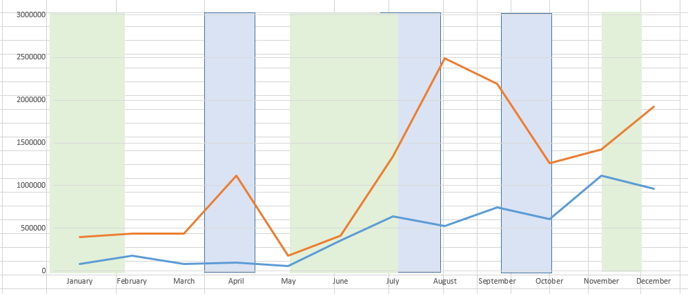
I have a serious brain picker here. I've been looking for ways to have combined visual that shows multiple line chart with Sales (split by category like "Customer") or with multiple Measures (no split by category CY vs LY) and at the same time show higlighted (maybe with bars) when in the selected period there was a promotion. The challenge here is that the Promotions are not happening only 1 day, should not be splitted by category and I need to show the length of the promotion period (the only visual showing period length I've fount so far are Line chart and Gantt). Promotions could be 2 types max. In some cases CY vs LY promos and in other cases 2 types split by other business caracteristic. Tried several approaches that are shown in videos and blogs out there, but nothing gives the desired visual. I managed to achieve the CY vs PY promo case with markers (adding dummy Promo measures and showing only their markers, removing lines), but this approch splits the markers by the Axis granularity and doesn't work when Sales measure is split by Category. I'm attaching some screenshots of what I currently have and my desired result in case someone has an idea how such visual or something similar could be achieved. Having two visuals one behind another is not an option either because I'm changing the Axis granularity by drilling and I need both visuals to change together.Besides, it still doesn't show the length per promotion.
Thanks in advance for any idea you might have!
Solved! Go to Solution.
- Mark as New
- Bookmark
- Subscribe
- Mute
- Subscribe to RSS Feed
- Permalink
- Report Inappropriate Content
hi, @pdacheva
Based on my research, for your requirement, I'm afraid it couldn't achieve in Power BI for now.
If you could try to use two visuals but when changing the Axis granularity by drilling, do it two times.
Best Regards,
Lin
If this post helps, then please consider Accept it as the solution to help the other members find it more quickly.
- Mark as New
- Bookmark
- Subscribe
- Mute
- Subscribe to RSS Feed
- Permalink
- Report Inappropriate Content
Hi Lin,
Thanks a lot for your prompt feedback! Yes, I asumed this is the case, but I had to do one last try :). I meant to do it in R, but the performance was really bad, therefore I was looking for alternatives.
Thanks again!
Best,
Helpful resources

Microsoft Fabric Learn Together
Covering the world! 9:00-10:30 AM Sydney, 4:00-5:30 PM CET (Paris/Berlin), 7:00-8:30 PM Mexico City

Power BI Monthly Update - April 2024
Check out the April 2024 Power BI update to learn about new features.

| User | Count |
|---|---|
| 114 | |
| 99 | |
| 82 | |
| 70 | |
| 60 |
| User | Count |
|---|---|
| 149 | |
| 114 | |
| 107 | |
| 89 | |
| 67 |


