- Power BI forums
- Updates
- News & Announcements
- Get Help with Power BI
- Desktop
- Service
- Report Server
- Power Query
- Mobile Apps
- Developer
- DAX Commands and Tips
- Custom Visuals Development Discussion
- Health and Life Sciences
- Power BI Spanish forums
- Translated Spanish Desktop
- Power Platform Integration - Better Together!
- Power Platform Integrations (Read-only)
- Power Platform and Dynamics 365 Integrations (Read-only)
- Training and Consulting
- Instructor Led Training
- Dashboard in a Day for Women, by Women
- Galleries
- Community Connections & How-To Videos
- COVID-19 Data Stories Gallery
- Themes Gallery
- Data Stories Gallery
- R Script Showcase
- Webinars and Video Gallery
- Quick Measures Gallery
- 2021 MSBizAppsSummit Gallery
- 2020 MSBizAppsSummit Gallery
- 2019 MSBizAppsSummit Gallery
- Events
- Ideas
- Custom Visuals Ideas
- Issues
- Issues
- Events
- Upcoming Events
- Community Blog
- Power BI Community Blog
- Custom Visuals Community Blog
- Community Support
- Community Accounts & Registration
- Using the Community
- Community Feedback
Register now to learn Fabric in free live sessions led by the best Microsoft experts. From Apr 16 to May 9, in English and Spanish.
- Power BI forums
- Forums
- Get Help with Power BI
- Desktop
- Re: Displaying customer population over time
- Subscribe to RSS Feed
- Mark Topic as New
- Mark Topic as Read
- Float this Topic for Current User
- Bookmark
- Subscribe
- Printer Friendly Page
- Mark as New
- Bookmark
- Subscribe
- Mute
- Subscribe to RSS Feed
- Permalink
- Report Inappropriate Content
Displaying customer population over time
Hi,
I am new to Power BI and the forums, so apologies if this has been answered but I wasn't sure how to frame the question, and couldn't find anything in search.
Say I have a table:
CustomerID | In | Out
xxxxxx | 2018-04-06 11:02:00 | 2018-04-06 11:16:00
Where In and Out are the time they entered and left the store.
With this, how can I create a line chart for a period of time where it displays the number of customers in the store across, say, 15 minute intervals (that is, the X axis would be 2018-04-06 09:00:00, 2018-04-06 09:15:00 ...., and the Y value would be the number of customers in the store at that interval)
Thanks for any advice.
- Mark as New
- Bookmark
- Subscribe
- Mute
- Subscribe to RSS Feed
- Permalink
- Report Inappropriate Content
Hi @lee_,
Based on my test, you can refer to below steps:
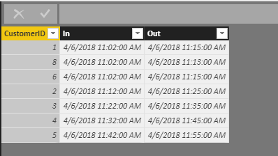
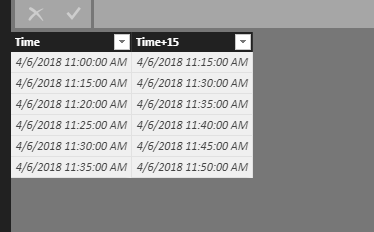
1.I have entered some sample data to test for your problem in below picture and I have created a new table to record the time period.
2.
Create a new measure to calculate your customer amount in different period.
Amount of customer = CALCULATE(COUNT(Sheet1[CustomerID]),FILTER('Sheet1','Sheet1'[In]>=MAX('Sheet2'[Time]) && 'Sheet1'[Out]<=MAX('Sheet2'[Time+15])))
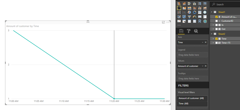
3.Create a Line chart visual and add the [Amount of customer] and [Time] field. Now you can see the result.
You can also download the PBIX file to have a view.
https://www.dropbox.com/s/pmxbwhjihin9m40/Displaying%20customer%20population%20over%20time.pbix?dl=0
Regards,
Daniel He
If this post helps, then please consider Accept it as the solution to help the other members find it more quickly.
- Mark as New
- Bookmark
- Subscribe
- Mute
- Subscribe to RSS Feed
- Permalink
- Report Inappropriate Content
Thanks for the response Daniel,
Unfortunately I don't think this is going to work for my instance where there are 100K+ visits over the course of the year. The chart takes an exceedingly long time to generate.
I tried a different way, creating a table, Times, with a column of 15-minute intervals using:
Time = GENERATESERIES(Date(2017,7,11), DATE(2018,7,1), (1/1440)*15)
and then on that table adding a column
In Store = SUMX(Customers, IF(AND(Customers[In]<=Times[Time], Customers[Out]>Times[Time]),1,0))
Although the extra column took a long time to calculate, the chart was a bit more fluid. Unfortunately, this solution means that I am unable to drill down/slice against other Customer parameters (gender, age, etc).
I suspect I am going to have to re-evaluate my underlying model. But is there a more efficient/dynamic way of doing this in Power BI?
Thanks again.
Helpful resources

Microsoft Fabric Learn Together
Covering the world! 9:00-10:30 AM Sydney, 4:00-5:30 PM CET (Paris/Berlin), 7:00-8:30 PM Mexico City

Power BI Monthly Update - April 2024
Check out the April 2024 Power BI update to learn about new features.

| User | Count |
|---|---|
| 110 | |
| 94 | |
| 80 | |
| 66 | |
| 58 |
| User | Count |
|---|---|
| 150 | |
| 119 | |
| 104 | |
| 87 | |
| 67 |


