- Power BI forums
- Updates
- News & Announcements
- Get Help with Power BI
- Desktop
- Service
- Report Server
- Power Query
- Mobile Apps
- Developer
- DAX Commands and Tips
- Custom Visuals Development Discussion
- Health and Life Sciences
- Power BI Spanish forums
- Translated Spanish Desktop
- Power Platform Integration - Better Together!
- Power Platform Integrations (Read-only)
- Power Platform and Dynamics 365 Integrations (Read-only)
- Training and Consulting
- Instructor Led Training
- Dashboard in a Day for Women, by Women
- Galleries
- Community Connections & How-To Videos
- COVID-19 Data Stories Gallery
- Themes Gallery
- Data Stories Gallery
- R Script Showcase
- Webinars and Video Gallery
- Quick Measures Gallery
- 2021 MSBizAppsSummit Gallery
- 2020 MSBizAppsSummit Gallery
- 2019 MSBizAppsSummit Gallery
- Events
- Ideas
- Custom Visuals Ideas
- Issues
- Issues
- Events
- Upcoming Events
- Community Blog
- Power BI Community Blog
- Custom Visuals Community Blog
- Community Support
- Community Accounts & Registration
- Using the Community
- Community Feedback
Register now to learn Fabric in free live sessions led by the best Microsoft experts. From Apr 16 to May 9, in English and Spanish.
- Power BI forums
- Forums
- Get Help with Power BI
- Desktop
- Re: Displaying Value as Percent of Month rather th...
- Subscribe to RSS Feed
- Mark Topic as New
- Mark Topic as Read
- Float this Topic for Current User
- Bookmark
- Subscribe
- Printer Friendly Page
- Mark as New
- Bookmark
- Subscribe
- Mute
- Subscribe to RSS Feed
- Permalink
- Report Inappropriate Content
Displaying Value as Percent of Month rather than Grand Total
This is a issue which creates a lot of topics but since every is using very different data sources the answer is always different, its something Excel does with ease so its frustrating that its simply not present in BI.
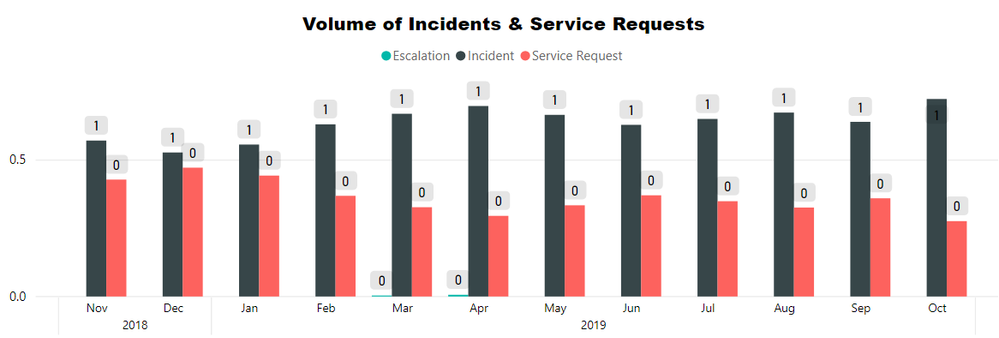
So I have a Graph that looks like so, what I want is instead of displaying the actual value I'd like it as a percentage for that month. Currently the only option is to show the values as percentage of grand total.
The value in this case is a measure which counts all the rows in a table. Each record has a date entry and a case type entry (among others).
Please let me know if you need anymore information to help me overcome this hurdle. My knowledge of how to create measures is very limited 😞 so any documentation that may help me get a better grasp of how to write them would be helpful too.
Thanks,
Sam
Solved! Go to Solution.
- Mark as New
- Bookmark
- Subscribe
- Mute
- Subscribe to RSS Feed
- Permalink
- Report Inappropriate Content
Hi @SamTrott ,
You can create the following measure:
Volume percentang =
DIVIDE (
    [Volume],
    CALCULATE ( [Volume], ALLSELECTED ( 'Table'[case type] ) )
)
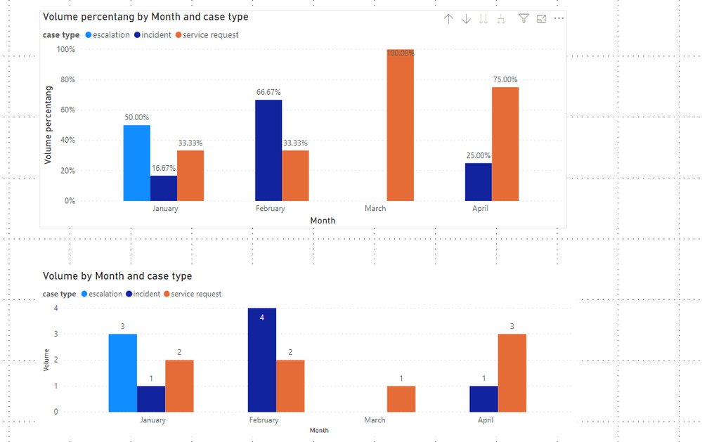
Results are as follows:
Here is a demo, please try it:
If this post helps, then please consider Accept it as the solution to help the other members find it more quickly.
- Mark as New
- Bookmark
- Subscribe
- Mute
- Subscribe to RSS Feed
- Permalink
- Report Inappropriate Content
Hi @SamTrott ,
You can create the following measure:
Volume percentang =
DIVIDE (
    [Volume],
    CALCULATE ( [Volume], ALLSELECTED ( 'Table'[case type] ) )
)
Results are as follows:
Here is a demo, please try it:
If this post helps, then please consider Accept it as the solution to help the other members find it more quickly.
- Mark as New
- Bookmark
- Subscribe
- Mute
- Subscribe to RSS Feed
- Permalink
- Report Inappropriate Content
Hi @v-joesh-msft ,
Thank you for your rseponse, unfortunately this does not seem to have worked. Using the fields and tables names for my data source I tried both
Volume percentage =
DIVIDE (
    'dAccount'[Count of Cases Created],
    CALCULATE ( 'dAccount'[Count of Cases Created], ALLSELECTED ( 'fIncident'[Case Type] ) )
)
and
Volume percentage =
DIVIDE (
    [Count of Cases Created],
    CALCULATE ( [Count of Cases Created], ALLSELECTED ( 'fIncident'[Case Type] ) )
)
but both display the graph like so
The proportions of the bars seems to be correct but the Data labels are obviously not.
Thanks in advance!
Sam
- Mark as New
- Bookmark
- Subscribe
- Mute
- Subscribe to RSS Feed
- Permalink
- Report Inappropriate Content
Hi @SamTrott ,
You can check if the measure format is set correctly, as shown in the figure below, select the measure “Volume percentage”—Formatting, and then you can adjust the format accordingly.
Best Regards,
Community Support Team _ Joey
If this post helps, then please consider Accept it as the solution to help the other members find it more quickly.
- Mark as New
- Bookmark
- Subscribe
- Mute
- Subscribe to RSS Feed
- Permalink
- Report Inappropriate Content
Hi @v-joesh-msft ,
Thanks that has indeed fixed labels. I've marked your first response as the solution since it contained the relevant measure I was missing.
Thank you for your help.
Regard,
Sam
Helpful resources

Microsoft Fabric Learn Together
Covering the world! 9:00-10:30 AM Sydney, 4:00-5:30 PM CET (Paris/Berlin), 7:00-8:30 PM Mexico City

Power BI Monthly Update - April 2024
Check out the April 2024 Power BI update to learn about new features.

| User | Count |
|---|---|
| 113 | |
| 97 | |
| 85 | |
| 70 | |
| 61 |
| User | Count |
|---|---|
| 151 | |
| 121 | |
| 104 | |
| 87 | |
| 67 |


