- Power BI forums
- Updates
- News & Announcements
- Get Help with Power BI
- Desktop
- Service
- Report Server
- Power Query
- Mobile Apps
- Developer
- DAX Commands and Tips
- Custom Visuals Development Discussion
- Health and Life Sciences
- Power BI Spanish forums
- Translated Spanish Desktop
- Power Platform Integration - Better Together!
- Power Platform Integrations (Read-only)
- Power Platform and Dynamics 365 Integrations (Read-only)
- Training and Consulting
- Instructor Led Training
- Dashboard in a Day for Women, by Women
- Galleries
- Community Connections & How-To Videos
- COVID-19 Data Stories Gallery
- Themes Gallery
- Data Stories Gallery
- R Script Showcase
- Webinars and Video Gallery
- Quick Measures Gallery
- 2021 MSBizAppsSummit Gallery
- 2020 MSBizAppsSummit Gallery
- 2019 MSBizAppsSummit Gallery
- Events
- Ideas
- Custom Visuals Ideas
- Issues
- Issues
- Events
- Upcoming Events
- Community Blog
- Power BI Community Blog
- Custom Visuals Community Blog
- Community Support
- Community Accounts & Registration
- Using the Community
- Community Feedback
Register now to learn Fabric in free live sessions led by the best Microsoft experts. From Apr 16 to May 9, in English and Spanish.
- Power BI forums
- Forums
- Get Help with Power BI
- Desktop
- Re: Display various data (different categories) on...
- Subscribe to RSS Feed
- Mark Topic as New
- Mark Topic as Read
- Float this Topic for Current User
- Bookmark
- Subscribe
- Printer Friendly Page
- Mark as New
- Bookmark
- Subscribe
- Mute
- Subscribe to RSS Feed
- Permalink
- Report Inappropriate Content
Display various data (different categories) on a single map + use of slicer
Dear all,
I'm building a report for the company X, which present on a map the company X workers(based on their home address) and locations of that company X (also based on their address).
The aim is to allow Company X management to quickly identify which worker could replace another one (if he's sick for example) on a given location, based on the proximity of the worker and that location.
For this I use three tables : Locations / Workers / Postcodes-cities. They are linked together by the postcode.
The way I I've built my report is to append my locations and workers tables, and display them on a map.
I use the legend (location or worker) to display the points in a different color (blue and yellow respectively). I then use my postcode-cities as a slicer . This works well, and you can see a sample below.
The question I have is the following though : I'd like not to use a postcode as a slicer, but rather the location.
The idea would be to see on the map which workers lives the closest from that location. On my map, I should then only see one blue point (=the selected location) and the closest workers (=yellow points).
I however does not know how to achieve this on a single map.
Would anyone of you have an idea ?
Thanks already for the help.
Benoît
Solved! Go to Solution.
- Mark as New
- Bookmark
- Subscribe
- Mute
- Subscribe to RSS Feed
- Permalink
- Report Inappropriate Content
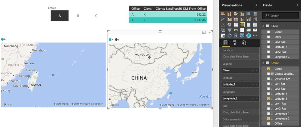
To show the closet workers, we need to know the distance between each worker and location. To calculate the distance between two points here, we need to know the latitude and longitude of each worker and location. You can refer to this thread for the calculation method. But I don’t think we can achieve the final goal only on a single map. Once we select a location in the slicer, the workers in the map will be filtered out. So we may need two maps, one map will show the selected location and one will show the nearest workers.
There is another thread which use power query to do the similar thing.
Best Regards,
Herbert
- Mark as New
- Bookmark
- Subscribe
- Mute
- Subscribe to RSS Feed
- Permalink
- Report Inappropriate Content
Thank you Herbert for your message.
That's indeed the only solution I'm afraid.
The related post are however very relevant and should help me build a more robust solution.
Helpful resources

Microsoft Fabric Learn Together
Covering the world! 9:00-10:30 AM Sydney, 4:00-5:30 PM CET (Paris/Berlin), 7:00-8:30 PM Mexico City

Power BI Monthly Update - April 2024
Check out the April 2024 Power BI update to learn about new features.

| User | Count |
|---|---|
| 117 | |
| 107 | |
| 69 | |
| 68 | |
| 43 |
| User | Count |
|---|---|
| 148 | |
| 103 | |
| 103 | |
| 88 | |
| 66 |


