- Power BI forums
- Updates
- News & Announcements
- Get Help with Power BI
- Desktop
- Service
- Report Server
- Power Query
- Mobile Apps
- Developer
- DAX Commands and Tips
- Custom Visuals Development Discussion
- Health and Life Sciences
- Power BI Spanish forums
- Translated Spanish Desktop
- Power Platform Integration - Better Together!
- Power Platform Integrations (Read-only)
- Power Platform and Dynamics 365 Integrations (Read-only)
- Training and Consulting
- Instructor Led Training
- Dashboard in a Day for Women, by Women
- Galleries
- Community Connections & How-To Videos
- COVID-19 Data Stories Gallery
- Themes Gallery
- Data Stories Gallery
- R Script Showcase
- Webinars and Video Gallery
- Quick Measures Gallery
- 2021 MSBizAppsSummit Gallery
- 2020 MSBizAppsSummit Gallery
- 2019 MSBizAppsSummit Gallery
- Events
- Ideas
- Custom Visuals Ideas
- Issues
- Issues
- Events
- Upcoming Events
- Community Blog
- Power BI Community Blog
- Custom Visuals Community Blog
- Community Support
- Community Accounts & Registration
- Using the Community
- Community Feedback
Register now to learn Fabric in free live sessions led by the best Microsoft experts. From Apr 16 to May 9, in English and Spanish.
- Power BI forums
- Forums
- Get Help with Power BI
- Desktop
- Display the Age range using Power BI (Standpoint O...
- Subscribe to RSS Feed
- Mark Topic as New
- Mark Topic as Read
- Float this Topic for Current User
- Bookmark
- Subscribe
- Printer Friendly Page
- Mark as New
- Bookmark
- Subscribe
- Mute
- Subscribe to RSS Feed
- Permalink
- Report Inappropriate Content
Display the Age range using Power BI (Standpoint Online)
H All,
I have a SharePoint list with different columns (age, region, balance etc.) for a sample bank and I wanted to display different charts/reports using Power BI.
These are the screenshot of the SharePoint List:
I need to display Geographical map, Gender, and Age etc.
I connect to SharePoint list on SharePoint Online via Power BI.
The map visualization works well.
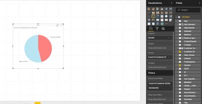
And gender using Pie chart works well as shown
However, what customer is looking for an age rage as follows:
- a) Average Age Years
- b) % below 30 years
- c) % 31-40 years
- d) % 41-50 years
- e) % 51-60 years
- f) % above 60 years
I came up with this:
- Visualization: Stacked Column Chart
- Dragged the Stacked Column Chart
- Created Age group
- Grouped the “20” and
- Clicked OK.
and the charts shows:
How could I leverage age range charts (% below 30 years, % 31-40 years, % 41-50 years etc.) using Power BI?
Any help would be highly appreciated.
Thanks!
Solved! Go to Solution.
- Mark as New
- Bookmark
- Subscribe
- Mute
- Subscribe to RSS Feed
- Permalink
- Report Inappropriate Content
HI @Anonymous,
For your scenario, I think you can add a calculated column to add custom category, then use it to calculate percent of each range.
Calculate column sample:
Age Range =
IF (
    [Age] >= 60,
    "Over 60",
    IF (
        [Age] >= 51
            && [Age] = 60,
        "51 ~60",
        IF (
            [Age] >= 41
                && [Age] <= 50,
            "41 ~50",
            IF ( [Age] >= 31 && [Age] <= 40, "31 ~ 40", "Below 30" )
        )
    )
)
Regards,
Xiaoxin Sheng
If this post helps, please consider accept as solution to help other members find it more quickly.
- Mark as New
- Bookmark
- Subscribe
- Mute
- Subscribe to RSS Feed
- Permalink
- Report Inappropriate Content
Helllo I am trying to calculte the age and tenure groups below. Does any one have a good suggestion for cretaing a calculated colum using a DAX expression for the below. any help would greatly be appreciated. Thanks in advance
Age:
Ranges
21-25
26-30
31-35
36-40
41-45
46-50
51-60
61-65
66-70
71-75
For tenure:
6 months -1 year
2-5 years
6-10
11-15
16-20
21-25
26-30
31-35
36-40
41-45
46-50
51-55
- Mark as New
- Bookmark
- Subscribe
- Mute
- Subscribe to RSS Feed
- Permalink
- Report Inappropriate Content
thanks! Worked for me. I used this to create a scorecard where a certain range would give a numeric score.
- Mark as New
- Bookmark
- Subscribe
- Mute
- Subscribe to RSS Feed
- Permalink
- Report Inappropriate Content
Helpful resources

Microsoft Fabric Learn Together
Covering the world! 9:00-10:30 AM Sydney, 4:00-5:30 PM CET (Paris/Berlin), 7:00-8:30 PM Mexico City

Power BI Monthly Update - April 2024
Check out the April 2024 Power BI update to learn about new features.

| User | Count |
|---|---|
| 114 | |
| 97 | |
| 86 | |
| 70 | |
| 62 |
| User | Count |
|---|---|
| 151 | |
| 120 | |
| 103 | |
| 87 | |
| 68 |


