- Power BI forums
- Updates
- News & Announcements
- Get Help with Power BI
- Desktop
- Service
- Report Server
- Power Query
- Mobile Apps
- Developer
- DAX Commands and Tips
- Custom Visuals Development Discussion
- Health and Life Sciences
- Power BI Spanish forums
- Translated Spanish Desktop
- Power Platform Integration - Better Together!
- Power Platform Integrations (Read-only)
- Power Platform and Dynamics 365 Integrations (Read-only)
- Training and Consulting
- Instructor Led Training
- Dashboard in a Day for Women, by Women
- Galleries
- Community Connections & How-To Videos
- COVID-19 Data Stories Gallery
- Themes Gallery
- Data Stories Gallery
- R Script Showcase
- Webinars and Video Gallery
- Quick Measures Gallery
- 2021 MSBizAppsSummit Gallery
- 2020 MSBizAppsSummit Gallery
- 2019 MSBizAppsSummit Gallery
- Events
- Ideas
- Custom Visuals Ideas
- Issues
- Issues
- Events
- Upcoming Events
- Community Blog
- Power BI Community Blog
- Custom Visuals Community Blog
- Community Support
- Community Accounts & Registration
- Using the Community
- Community Feedback
Register now to learn Fabric in free live sessions led by the best Microsoft experts. From Apr 16 to May 9, in English and Spanish.
- Power BI forums
- Forums
- Get Help with Power BI
- Desktop
- Re: Display multiple dates by event on a timeline
- Subscribe to RSS Feed
- Mark Topic as New
- Mark Topic as Read
- Float this Topic for Current User
- Bookmark
- Subscribe
- Printer Friendly Page
- Mark as New
- Bookmark
- Subscribe
- Mute
- Subscribe to RSS Feed
- Permalink
- Report Inappropriate Content
Display multiple dates by event on a timeline
Hey PowerBI community,
I have a problem concerning timeline visuals. I have numerous data that represent events. Each event is characterized by a dozen of dates : start date of the creation process, end date of the creation process, planned start date of event, actual start date of the event, planned end date of the event etc etc.
As you can see we can extract periods from this and I would want to display these periods on a timeline for each event I have !
Problem is that I've never found a timeline visuals that accepts more than 2 dates (start and end). So I cant find a solution to my issue. Do you have any ideas about it ?
I'm on the PowerBI Version: 2.52.4921.682 64-bit (novembre 2017) and I cannot change the version.
Big thanks community,
Lucas.
- Mark as New
- Bookmark
- Subscribe
- Mute
- Subscribe to RSS Feed
- Permalink
- Report Inappropriate Content
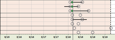
Hello, not sure if this is the same issue, but I am trying to have 4 project dates shown on a single timeline and represented as an image. The picture below is an example of what I am trying to achieve. Each line represents an active project that is either In-Progress (indicated with a black line) or Scheduled (indicated with two circles).
The circle to the left of each line represents the project EST. Start, and the circle to the right represents the EST. End dates. The black bar indicates the duration calculated by Actual start date and either Est. End or the Revised Est. End date. I have removed the project names as it is sensitive data to my previous company. My current organization does not use the previous tool that I was able to create the visual below, thus I am trying to do it in Power BI.
Basically, one can now see a pattern of those projects that either started early, on time, or late based on where the black bar indicator starts. The same holds true for the End date, if the bar stops short of the end date the project completed early. If it goes pat the Est End date, then it is late. Those projects with only circles represent Scheduled projects. Using this visual a patter will emerge quickly as to if projects are on time and what other projects are scheduled to begin in the future. It’s a good way to plan resource capacities.
Any help or pointing me in the right direction would be greatly appreciated. Thanks
- Mark as New
- Bookmark
- Subscribe
- Mute
- Subscribe to RSS Feed
- Permalink
- Report Inappropriate Content
I have the same issue too.. Still haven't found a solution
- Mark as New
- Bookmark
- Subscribe
- Mute
- Subscribe to RSS Feed
- Permalink
- Report Inappropriate Content
Hey Have you found any solution for this? I need similar solution where I can track multiple dates in a timeline.
Thanks
Helpful resources

Microsoft Fabric Learn Together
Covering the world! 9:00-10:30 AM Sydney, 4:00-5:30 PM CET (Paris/Berlin), 7:00-8:30 PM Mexico City

Power BI Monthly Update - April 2024
Check out the April 2024 Power BI update to learn about new features.

| User | Count |
|---|---|
| 111 | |
| 100 | |
| 80 | |
| 64 | |
| 58 |
| User | Count |
|---|---|
| 148 | |
| 111 | |
| 93 | |
| 84 | |
| 66 |

