- Power BI forums
- Updates
- News & Announcements
- Get Help with Power BI
- Desktop
- Service
- Report Server
- Power Query
- Mobile Apps
- Developer
- DAX Commands and Tips
- Custom Visuals Development Discussion
- Health and Life Sciences
- Power BI Spanish forums
- Translated Spanish Desktop
- Power Platform Integration - Better Together!
- Power Platform Integrations (Read-only)
- Power Platform and Dynamics 365 Integrations (Read-only)
- Training and Consulting
- Instructor Led Training
- Dashboard in a Day for Women, by Women
- Galleries
- Community Connections & How-To Videos
- COVID-19 Data Stories Gallery
- Themes Gallery
- Data Stories Gallery
- R Script Showcase
- Webinars and Video Gallery
- Quick Measures Gallery
- 2021 MSBizAppsSummit Gallery
- 2020 MSBizAppsSummit Gallery
- 2019 MSBizAppsSummit Gallery
- Events
- Ideas
- Custom Visuals Ideas
- Issues
- Issues
- Events
- Upcoming Events
- Community Blog
- Power BI Community Blog
- Custom Visuals Community Blog
- Community Support
- Community Accounts & Registration
- Using the Community
- Community Feedback
Register now to learn Fabric in free live sessions led by the best Microsoft experts. From Apr 16 to May 9, in English and Spanish.
- Power BI forums
- Forums
- Get Help with Power BI
- Desktop
- Re: Display line chart with one line showing stand...
- Subscribe to RSS Feed
- Mark Topic as New
- Mark Topic as Read
- Float this Topic for Current User
- Bookmark
- Subscribe
- Printer Friendly Page
- Mark as New
- Bookmark
- Subscribe
- Mute
- Subscribe to RSS Feed
- Permalink
- Report Inappropriate Content
Display line chart with one line showing standard timeline and actual timeline against quantity
Hi All,
I am fairly new to Power BI and having trouble in achieving below requirement. Can you please advise some pointers on how to achieve the requirement.
Requirement details:
I have two tables, one table has details about Product Confirmation data (Table 1) and one table has details about Standard time taken for each piece (Table 2).
Table 1:
| ORDER_NUM | OP_NUM | Quantity | Actual Time | Unit | Confirmation_Time |
| 4567890 | 0070 | 1 | 12 | MIN | 1/20/2021 7:39:00 AM |
| 4567890 | 0070 | 1 | 11 | MIN | 1/20/2021 7:50:00 AM |
| 4567890 | 0070 | 1 | 10 | MIN | 1/20/2021 8:00:00 AM |
| 4567891 | 0010 | 1 | 7 | MIN | 1/20/2021 8:07:00 AM |
| 4567891 | 0010 | 1 | 8 | MIN | 1/20/2021 8:15:00 AM |
| 4567891 | 0010 | 1 | 10 | MIN | 1/20/2021 8:25:00 AM |
Table 2:
| ORDER_NUM | OP_NUM | Standard_Mins_Per_Piece | Unit | Pieces |
| 4567890 | 0070 | 5.878 | MIN | 1 |
| 4567891 | 0010 | 7 | MIN | 1 |
I tried to combine the above two tables to get the output table as shown below.
| ORDER_NUM | OP_NUM | Qty_Running_Total | Actual Mins Per Piece | Actual Total Mins | Standard Mins per PieceTime |
| 4567890 | 0070 | 1 | 12 | 12 | 5.878 |
| 4567890 | 0070 | 2 | 11 | 23 | 11.756 |
| 4567890 | 0070 | 3 | 10 | 33 | 17.634 |
| 4567891 | 0010 | 1 | 7 | 7 | 7 |
| 4567891 | 0010 | 2 | 8 | 15 | 14 |
| 4567891 | 0010 | 3 | 10 | 25 | 21 |
Based on above table, i am planning to represent the data in line chart where one line shows based on actual time taken per piece against standard time taken per piece.
Thanks,
Subash
Solved! Go to Solution.
- Mark as New
- Bookmark
- Subscribe
- Mute
- Subscribe to RSS Feed
- Permalink
- Report Inappropriate Content
Hi @Subash_G ,
Create a table with the 1 to 500 quantities using the following syntax:
Quantity = GENERATESERIES(1,500, 1)
Now add the two following measures:
Actuals_Value =
VAR temp_table =
    SUMMARIZE (
        'Table 1',
        'Table 1'[  Confirmation_Time],
        'Table 1'[Actual Time],
        'Table 2'[OP_NUM],
        'Table 2'[ORDER_NUM],
        "QtyRun", [Qty runnning total],
        "Act_Min", [Actuals Total Minutes],
        "Std_Min", [Standard time]
    )
RETURN
    AVERAGEX (
        FILTER ( temp_table, [QtyRun] = SELECTEDVALUE ( Quantity[Value] ) ),
        [Act_Min]
    )

Standard_Value =
VAR temp_table =
    SUMMARIZE (
        'Table 1',
        'Table 1'[  Confirmation_Time],
        'Table 1'[Actual Time],
        'Table 2'[OP_NUM],
        'Table 2'[ORDER_NUM],
        "QtyRun", [Qty runnning total],
        "Act_Min", [Actuals Total Minutes],
        "Std_Min", [Standard time]
    )
RETURN
    AVERAGEX (
        FILTER ( temp_table, [QtyRun] = SELECTEDVALUE ( Quantity[Value] ) ),
        [Std_Min]
    )
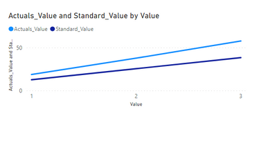
Now create your line chart:
Be aware that I'm using the AVERAGEX so if you have more than one product, order number or whatever other context it will give you the average of those values this can be change to SUMX, MINX or MAXX according to your needs.
Regards
Miguel Félix
Did I answer your question? Mark my post as a solution!
Proud to be a Super User!
Check out my blog: Power BI em Português- Mark as New
- Bookmark
- Subscribe
- Mute
- Subscribe to RSS Feed
- Permalink
- Report Inappropriate Content
Hi Miguel Felix,
Firstly, Thanks for the response.
The solution you provided is working as expected except for one small issue, basically i want to plot the X-axis by Quantity not by the order number. I checked the pbix file and found that for the Quantity Running total we are using a measure, as you know we cannot use that as X-axis. Is there any way to achieve this requirement please.
Thanks,
Subash G
- Mark as New
- Bookmark
- Subscribe
- Mute
- Subscribe to RSS Feed
- Permalink
- Report Inappropriate Content
Hi @Subash_G
When you say you want to plot by quantity and not order number what is the quantity you want to plot the cumulative quantity? And if you are using quantity on the x-axis what ar you considering in the values?
Regards
Miguel Félix
Did I answer your question? Mark my post as a solution!
Proud to be a Super User!
Check out my blog: Power BI em Português- Mark as New
- Bookmark
- Subscribe
- Mute
- Subscribe to RSS Feed
- Permalink
- Report Inappropriate Content
Basically X-axis will have values from 1 to max 500 quantity, that is 1,2,3,4,5,6....500. Basically for a given product for making one product what is the standard time against the actual time is what i am trying to plot here.. Like wise for 2 quantity, 3 quantity etc.,
so X-axis will have quantity number from 1,2,3,4,....500 and Y-axis will have the mins..
Thanks,
Subash
- Mark as New
- Bookmark
- Subscribe
- Mute
- Subscribe to RSS Feed
- Permalink
- Report Inappropriate Content
Hi @Subash_G ,
Create a table with the 1 to 500 quantities using the following syntax:
Quantity = GENERATESERIES(1,500, 1)
Now add the two following measures:
Actuals_Value =
VAR temp_table =
    SUMMARIZE (
        'Table 1',
        'Table 1'[  Confirmation_Time],
        'Table 1'[Actual Time],
        'Table 2'[OP_NUM],
        'Table 2'[ORDER_NUM],
        "QtyRun", [Qty runnning total],
        "Act_Min", [Actuals Total Minutes],
        "Std_Min", [Standard time]
    )
RETURN
    AVERAGEX (
        FILTER ( temp_table, [QtyRun] = SELECTEDVALUE ( Quantity[Value] ) ),
        [Act_Min]
    )

Standard_Value =
VAR temp_table =
    SUMMARIZE (
        'Table 1',
        'Table 1'[  Confirmation_Time],
        'Table 1'[Actual Time],
        'Table 2'[OP_NUM],
        'Table 2'[ORDER_NUM],
        "QtyRun", [Qty runnning total],
        "Act_Min", [Actuals Total Minutes],
        "Std_Min", [Standard time]
    )
RETURN
    AVERAGEX (
        FILTER ( temp_table, [QtyRun] = SELECTEDVALUE ( Quantity[Value] ) ),
        [Std_Min]
    )
Now create your line chart:
Be aware that I'm using the AVERAGEX so if you have more than one product, order number or whatever other context it will give you the average of those values this can be change to SUMX, MINX or MAXX according to your needs.
Regards
Miguel Félix
Did I answer your question? Mark my post as a solution!
Proud to be a Super User!
Check out my blog: Power BI em Português- Mark as New
- Bookmark
- Subscribe
- Mute
- Subscribe to RSS Feed
- Permalink
- Report Inappropriate Content
Thanks for your help, it worked perfectly !!!
Regards,
subash
- Mark as New
- Bookmark
- Subscribe
- Mute
- Subscribe to RSS Feed
- Permalink
- Report Inappropriate Content
Hi @Subash_G ,
I assume that the Table 2 has only one value per order if that is true you can do a relationship between both tables and then add the following measures:
Qty runnning total =
CALCULATE (
    SUM ( 'Table 1'[Quantity] ),
    FILTER (
        ALL (
            'Table 1'[  Confirmation_Time],
            'Table 1'[ORDER_NUM],
            'Table 1'[Actual Time]
        ),
        'Table 1'[ORDER_NUM] = SELECTEDVALUE ( 'Table 2'[ORDER_NUM] )
            && 'Table 1'[  Confirmation_Time] <= MAX ( 'Table 1'[  Confirmation_Time] )
    )
)

Actuals Total Minutes =
CALCULATE (
    SUM ( 'Table 1'[Actual Time] ),
    FILTER (
        ALL (
            'Table 1'[  Confirmation_Time],
            'Table 1'[ORDER_NUM],
            'Table 1'[Actual Time]
        ),
        'Table 1'[ORDER_NUM] = SELECTEDVALUE ( 'Table 2'[ORDER_NUM] )
            && 'Table 1'[  Confirmation_Time] <= MAX ( 'Table 1'[  Confirmation_Time] )
    )
)

Standard time = SUM('Table 2'[Standard_Mins_Per_Piece]) * [Qty runnning total]
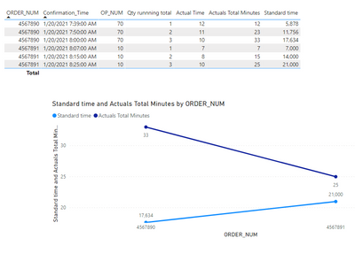
Now you can use this measures to create your tables and visualizations:
Check PBIX file attach.
Regards
Miguel Félix
Did I answer your question? Mark my post as a solution!
Proud to be a Super User!
Check out my blog: Power BI em PortuguêsHelpful resources

Microsoft Fabric Learn Together
Covering the world! 9:00-10:30 AM Sydney, 4:00-5:30 PM CET (Paris/Berlin), 7:00-8:30 PM Mexico City

Power BI Monthly Update - April 2024
Check out the April 2024 Power BI update to learn about new features.

| User | Count |
|---|---|
| 109 | |
| 99 | |
| 77 | |
| 66 | |
| 54 |
| User | Count |
|---|---|
| 144 | |
| 104 | |
| 102 | |
| 88 | |
| 63 |


