- Power BI forums
- Updates
- News & Announcements
- Get Help with Power BI
- Desktop
- Service
- Report Server
- Power Query
- Mobile Apps
- Developer
- DAX Commands and Tips
- Custom Visuals Development Discussion
- Health and Life Sciences
- Power BI Spanish forums
- Translated Spanish Desktop
- Power Platform Integration - Better Together!
- Power Platform Integrations (Read-only)
- Power Platform and Dynamics 365 Integrations (Read-only)
- Training and Consulting
- Instructor Led Training
- Dashboard in a Day for Women, by Women
- Galleries
- Community Connections & How-To Videos
- COVID-19 Data Stories Gallery
- Themes Gallery
- Data Stories Gallery
- R Script Showcase
- Webinars and Video Gallery
- Quick Measures Gallery
- 2021 MSBizAppsSummit Gallery
- 2020 MSBizAppsSummit Gallery
- 2019 MSBizAppsSummit Gallery
- Events
- Ideas
- Custom Visuals Ideas
- Issues
- Issues
- Events
- Upcoming Events
- Community Blog
- Power BI Community Blog
- Custom Visuals Community Blog
- Community Support
- Community Accounts & Registration
- Using the Community
- Community Feedback
Register now to learn Fabric in free live sessions led by the best Microsoft experts. From Apr 16 to May 9, in English and Spanish.
- Power BI forums
- Forums
- Get Help with Power BI
- Desktop
- Display individual lines
- Subscribe to RSS Feed
- Mark Topic as New
- Mark Topic as Read
- Float this Topic for Current User
- Bookmark
- Subscribe
- Printer Friendly Page
- Mark as New
- Bookmark
- Subscribe
- Mute
- Subscribe to RSS Feed
- Permalink
- Report Inappropriate Content
Display individual lines
Hi All,
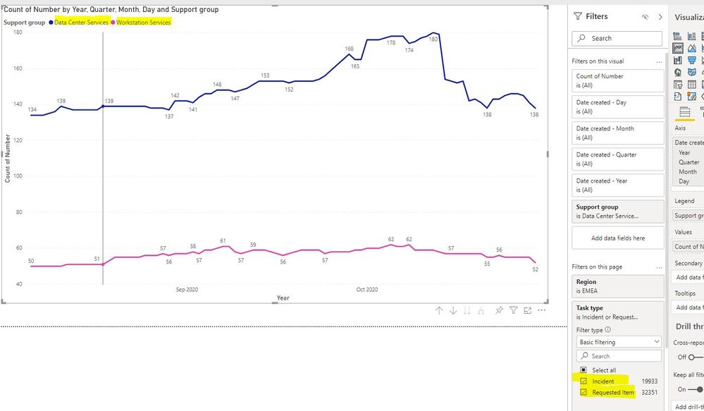
I've been using excel for analytics in the past, and witching now to Power Bi. How can I display individual lines simultaneously without combining them into a single one.
I have 2 support groups to compare. Each has Requests and Incidents. I need 4 lines on the graph:
Data Center Incidents
Data Center Requests
Workstation Services Incidents
Workstation Services Requests
Didn't find any functionality to do so. If anyone has an Idea, I would really appreciate anyhelp.
Solved! Go to Solution.
- Mark as New
- Bookmark
- Subscribe
- Mute
- Subscribe to RSS Feed
- Permalink
- Report Inappropriate Content
Hi, @Rav3n
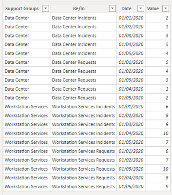
Based on your description, I created data to reproduce your scenario. The pbix file is attached in the end.
Table:
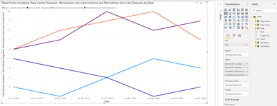
You may create a visual as below.
Or you can create a measure for each Re/In and put them in 'Values'.
Data Center Incidents =
CALCULATE(
    SUM('Table'[Value]),
    FILTER(
        'Table',
        [Re/In]="Data Center Incidents"
    )
)
Data Center Incidents =
CALCULATE(
SUM('Table'[Value]),
FILTER(
'Table',
[Re/In]="Data Center Incidents"
)
)Workstation Services Incidents =
CALCULATE(
SUM('Table'[Value]),
FILTER(
'Table',
[Re/In]="Workstation Services Incidents"
)
)Workstation Services Requests =
CALCULATE(
SUM('Table'[Value]),
FILTER(
'Table',
[Re/In]="Workstation Services Requests"
)
)
Best Regards
Allan
If this post helps, then please consider Accept it as the solution to help the other members find it more quickly.
- Mark as New
- Bookmark
- Subscribe
- Mute
- Subscribe to RSS Feed
- Permalink
- Report Inappropriate Content
@Rav3n , You can have multiple measures or you can use a legend, you can not have both. In this case, you might have create 4 measures
Microsoft Power BI Learning Resources, 2023 !!
Learn Power BI - Full Course with Dec-2022, with Window, Index, Offset, 100+ Topics !!
Did I answer your question? Mark my post as a solution! Appreciate your Kudos !! Proud to be a Super User! !!
Helpful resources

Microsoft Fabric Learn Together
Covering the world! 9:00-10:30 AM Sydney, 4:00-5:30 PM CET (Paris/Berlin), 7:00-8:30 PM Mexico City

Power BI Monthly Update - April 2024
Check out the April 2024 Power BI update to learn about new features.

| User | Count |
|---|---|
| 112 | |
| 100 | |
| 80 | |
| 64 | |
| 57 |
| User | Count |
|---|---|
| 146 | |
| 110 | |
| 93 | |
| 84 | |
| 67 |


