- Power BI forums
- Updates
- News & Announcements
- Get Help with Power BI
- Desktop
- Service
- Report Server
- Power Query
- Mobile Apps
- Developer
- DAX Commands and Tips
- Custom Visuals Development Discussion
- Health and Life Sciences
- Power BI Spanish forums
- Translated Spanish Desktop
- Power Platform Integration - Better Together!
- Power Platform Integrations (Read-only)
- Power Platform and Dynamics 365 Integrations (Read-only)
- Training and Consulting
- Instructor Led Training
- Dashboard in a Day for Women, by Women
- Galleries
- Community Connections & How-To Videos
- COVID-19 Data Stories Gallery
- Themes Gallery
- Data Stories Gallery
- R Script Showcase
- Webinars and Video Gallery
- Quick Measures Gallery
- 2021 MSBizAppsSummit Gallery
- 2020 MSBizAppsSummit Gallery
- 2019 MSBizAppsSummit Gallery
- Events
- Ideas
- Custom Visuals Ideas
- Issues
- Issues
- Events
- Upcoming Events
- Community Blog
- Power BI Community Blog
- Custom Visuals Community Blog
- Community Support
- Community Accounts & Registration
- Using the Community
- Community Feedback
Register now to learn Fabric in free live sessions led by the best Microsoft experts. From Apr 16 to May 9, in English and Spanish.
- Power BI forums
- Forums
- Get Help with Power BI
- Desktop
- Re: Display a donut chart based on 2x2 matrix
- Subscribe to RSS Feed
- Mark Topic as New
- Mark Topic as Read
- Float this Topic for Current User
- Bookmark
- Subscribe
- Printer Friendly Page
- Mark as New
- Bookmark
- Subscribe
- Mute
- Subscribe to RSS Feed
- Permalink
- Report Inappropriate Content
Display a donut chart based on 2x2 matrix
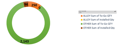
I have a matrix chart based on my data similar to the one below. I'm trying to display it as a donut chart where every value (installed alloy, to go alloy, installed other, to go other) is its own segment with its own label. However, the donut chart only allows me to label by material. The installed is a column in my data and the uninstalled is a measure based on (total - installed).
Sample Data:
| Material | Installed | To Go |
| Alloy | 4 | 241 |
| Other | 113 | 2140 |
| Total | 117 | 2380 |
What I get:
What I want:
Solved! Go to Solution.
- Mark as New
- Bookmark
- Subscribe
- Mute
- Subscribe to RSS Feed
- Permalink
- Report Inappropriate Content
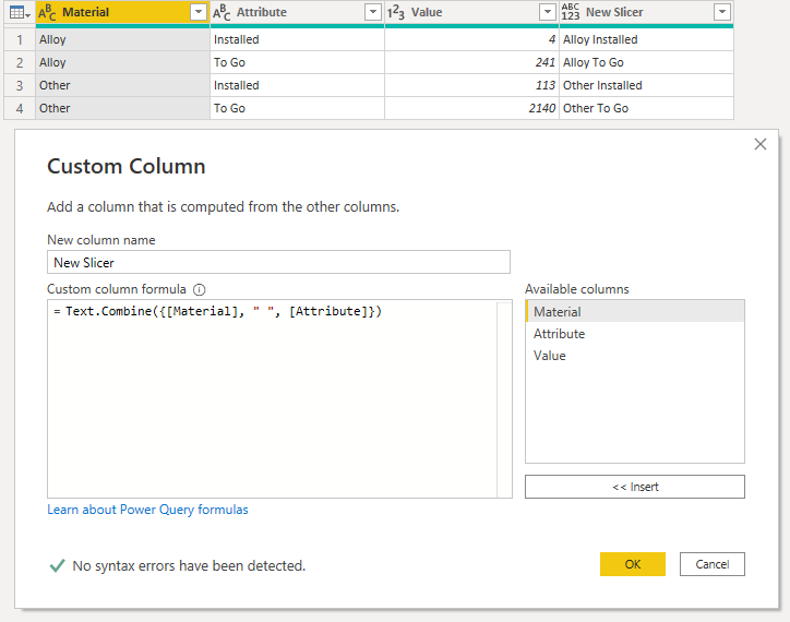
You need to unpivot the two columns as attributed and then concatenate those attributes with each material:
Step 1: Unpivot Column Values:
You can do this by right clicking on Material and selecting "Unpivot Other Columns". This transforms the field headers into row values.
Step 2: Text Combine in M Power Query:
This is just a simple concatenation function which joins the materials with the unpivoted values for a new field header and set of values to use in the data visual below.
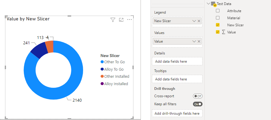
Step 3: Drop the Values into the Desired Chart:
However, since these data are so heavily skewed, certain slice results are quite obfuscated in this particular data visual; donut and pie charts are really only effective visuals when they have a small number of relatively unskewed data points. I'd probably consider a column or bar chart instead.
Hope this helps,
- Mark as New
- Bookmark
- Subscribe
- Mute
- Subscribe to RSS Feed
- Permalink
- Report Inappropriate Content
Good idea, unfortunately I can't unpivot the table because the material is in a separate table that is related by a code. The actual data is more like the following tables, but there are 38 codes and thousands of rows:
| Date | Class | Building | Code | Total | Installed |
| 6/29/22 | A | B1 | 1 | 500 | 50 |
| 6/29/22 | A | B2 | 2 | 200 | 20 |
| 6/29/22 | B | B3 | 3 | 1000 | 100 |
| 6/29/22 | B | B4 | 1 | 100 | 10 |
| Code | Material | Size |
| 1 | Alloy | Big |
| 2 | Other | Small |
| 3 | Alloy | Small |
- Mark as New
- Bookmark
- Subscribe
- Mute
- Subscribe to RSS Feed
- Permalink
- Report Inappropriate Content
Well, if you merge those datasets in PowerQuery based on the Code value, then you can unpivot them.
I think next step you post questions, be very detailed and thorough about your schema and data model when soliciting advice and solutions. Your initial question included a data table that looks entirely different than what you've posted above, which is two different tables.
If you post an example of the schema you're actually working with, then it's easier to determine what the best approach might be to help you solve your problem.
- Mark as New
- Bookmark
- Subscribe
- Mute
- Subscribe to RSS Feed
- Permalink
- Report Inappropriate Content
Hi @adthomas
Try
Hope it resolves your issue? Did I answer your question? Mark my post as a solution! Appreciate your Kudos, Press the thumbs up button!! Linkedin Profile |
- Mark as New
- Bookmark
- Subscribe
- Mute
- Subscribe to RSS Feed
- Permalink
- Report Inappropriate Content
I'm not trying to move the labels to overlap the donut. I'm trying to have 4 values with 4 colours instead of the colours only being decided by the material. It's the legend that needs to change.
- Mark as New
- Bookmark
- Subscribe
- Mute
- Subscribe to RSS Feed
- Permalink
- Report Inappropriate Content
Well, again, if you're trying to reference field headers as values in your data visual, you fundamentally need to unpivot your table's data columns: Installed and To Go so that they can be referenced as values in the data visual.
Once they're combined as new row values in an attribute column, you can drop them into the donut chart as multiple levels in the Legend. Only then will all four appear in the legend where you can apply the custom color palette for each data point. But you'll have to drill down first.
In my experience, I think your desired approach is generally bad practice, as donut charts don't render in published reports in Power BI very well (colors get mixed up, and the data values tend to be hard to read), and users often get confused or frustrated when having to drill up/down in a report to get the data they need.
Again, I'd with a column or bar chart instead.
Helpful resources

Microsoft Fabric Learn Together
Covering the world! 9:00-10:30 AM Sydney, 4:00-5:30 PM CET (Paris/Berlin), 7:00-8:30 PM Mexico City

Power BI Monthly Update - April 2024
Check out the April 2024 Power BI update to learn about new features.

| User | Count |
|---|---|
| 113 | |
| 97 | |
| 85 | |
| 70 | |
| 61 |
| User | Count |
|---|---|
| 151 | |
| 121 | |
| 104 | |
| 87 | |
| 67 |


