- Power BI forums
- Updates
- News & Announcements
- Get Help with Power BI
- Desktop
- Service
- Report Server
- Power Query
- Mobile Apps
- Developer
- DAX Commands and Tips
- Custom Visuals Development Discussion
- Health and Life Sciences
- Power BI Spanish forums
- Translated Spanish Desktop
- Power Platform Integration - Better Together!
- Power Platform Integrations (Read-only)
- Power Platform and Dynamics 365 Integrations (Read-only)
- Training and Consulting
- Instructor Led Training
- Dashboard in a Day for Women, by Women
- Galleries
- Community Connections & How-To Videos
- COVID-19 Data Stories Gallery
- Themes Gallery
- Data Stories Gallery
- R Script Showcase
- Webinars and Video Gallery
- Quick Measures Gallery
- 2021 MSBizAppsSummit Gallery
- 2020 MSBizAppsSummit Gallery
- 2019 MSBizAppsSummit Gallery
- Events
- Ideas
- Custom Visuals Ideas
- Issues
- Issues
- Events
- Upcoming Events
- Community Blog
- Power BI Community Blog
- Custom Visuals Community Blog
- Community Support
- Community Accounts & Registration
- Using the Community
- Community Feedback
Register now to learn Fabric in free live sessions led by the best Microsoft experts. From Apr 16 to May 9, in English and Spanish.
- Power BI forums
- Forums
- Get Help with Power BI
- Desktop
- Differentiate similar values from different id in ...
- Subscribe to RSS Feed
- Mark Topic as New
- Mark Topic as Read
- Float this Topic for Current User
- Bookmark
- Subscribe
- Printer Friendly Page
- Mark as New
- Bookmark
- Subscribe
- Mute
- Subscribe to RSS Feed
- Permalink
- Report Inappropriate Content
Differentiate similar values from different id in bar chart
Hello Folks,
I have a column where there are similar values for different ids. For Example, Please have a look at the table below:
Client | Client_Id | User_id | Name | Data |
Samsung | 100 | 01 | John Smith | 1000 |
Apple | 101 | 02 | John Smith | 1200 |
Nokia | 102 | 03 | Katie Bond | 800 |
Blackberry | 103 | 04 | Kattie Bond | 900 |
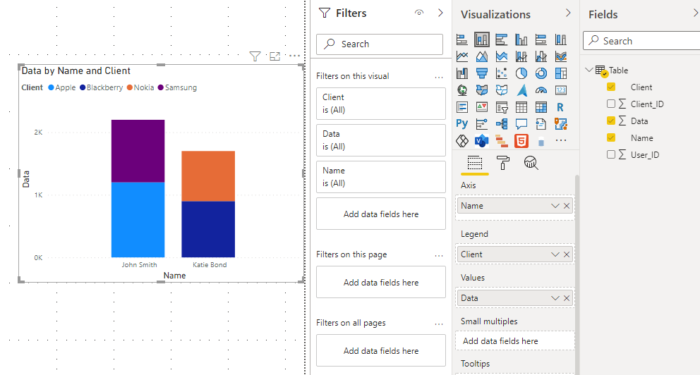
Now, when I want to visualise the count of data for each user on the bar chart, what happens is John Smith's & Kattie bond's data gets clustered in single bar chart with different colors, as I am using client Name as legend in the visualisation.
What I want to see is, separate bars for each individual user in the bar chart.
Please Help!
Solved! Go to Solution.
- Mark as New
- Bookmark
- Subscribe
- Mute
- Subscribe to RSS Feed
- Permalink
- Report Inappropriate Content
Hi @Anonymous
I think your visual is as below. When you add Client name into legend, Power BI will divide values with Client group by different colors.
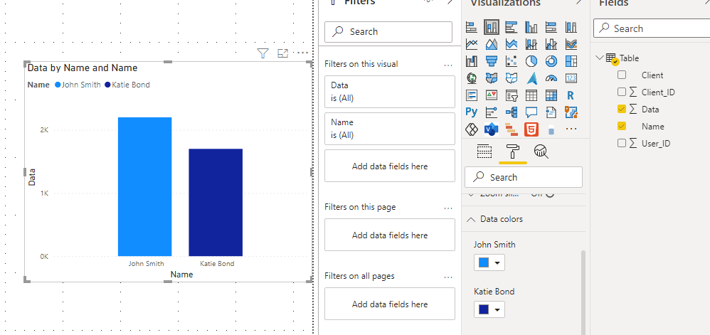
If you want the bar show same color for each user, you can change data colors in visual format. By this way, you need to make sure that there is no same clients in for differents users. For example: John has Apple and Samsung, so you can change them to blue. But if Katie has Apple or Samsung as well, it is not a good idea.
Or you can remove the client Name from legend in the visualisation and add user name into legend.
Power BI doesn't support you to use conditional formatting if you add columns in legend.
Best Regards,
Rico Zhou
If this post helps, then please consider Accept it as the solution to help the other members find it more quickly.
- Mark as New
- Bookmark
- Subscribe
- Mute
- Subscribe to RSS Feed
- Permalink
- Report Inappropriate Content
@Anonymous , If you have both of them in axis you can use color measure for the user.
Refer the power bi part, how to use conditional formatting in such a case -Bar/Clustered Bar: https://youtu.be/2P5BBRN853c
Microsoft Power BI Learning Resources, 2023 !!
Learn Power BI - Full Course with Dec-2022, with Window, Index, Offset, 100+ Topics !!
Did I answer your question? Mark my post as a solution! Appreciate your Kudos !! Proud to be a Super User! !!
Helpful resources

Microsoft Fabric Learn Together
Covering the world! 9:00-10:30 AM Sydney, 4:00-5:30 PM CET (Paris/Berlin), 7:00-8:30 PM Mexico City

Power BI Monthly Update - April 2024
Check out the April 2024 Power BI update to learn about new features.

| User | Count |
|---|---|
| 110 | |
| 94 | |
| 80 | |
| 66 | |
| 58 |
| User | Count |
|---|---|
| 150 | |
| 119 | |
| 104 | |
| 87 | |
| 67 |


