- Power BI forums
- Updates
- News & Announcements
- Get Help with Power BI
- Desktop
- Service
- Report Server
- Power Query
- Mobile Apps
- Developer
- DAX Commands and Tips
- Custom Visuals Development Discussion
- Health and Life Sciences
- Power BI Spanish forums
- Translated Spanish Desktop
- Power Platform Integration - Better Together!
- Power Platform Integrations (Read-only)
- Power Platform and Dynamics 365 Integrations (Read-only)
- Training and Consulting
- Instructor Led Training
- Dashboard in a Day for Women, by Women
- Galleries
- Community Connections & How-To Videos
- COVID-19 Data Stories Gallery
- Themes Gallery
- Data Stories Gallery
- R Script Showcase
- Webinars and Video Gallery
- Quick Measures Gallery
- 2021 MSBizAppsSummit Gallery
- 2020 MSBizAppsSummit Gallery
- 2019 MSBizAppsSummit Gallery
- Events
- Ideas
- Custom Visuals Ideas
- Issues
- Issues
- Events
- Upcoming Events
- Community Blog
- Power BI Community Blog
- Custom Visuals Community Blog
- Community Support
- Community Accounts & Registration
- Using the Community
- Community Feedback
Register now to learn Fabric in free live sessions led by the best Microsoft experts. From Apr 16 to May 9, in English and Spanish.
- Power BI forums
- Forums
- Get Help with Power BI
- Desktop
- Different time aggregation for different measures ...
- Subscribe to RSS Feed
- Mark Topic as New
- Mark Topic as Read
- Float this Topic for Current User
- Bookmark
- Subscribe
- Printer Friendly Page
- Mark as New
- Bookmark
- Subscribe
- Mute
- Subscribe to RSS Feed
- Permalink
- Report Inappropriate Content
Different time aggregation for different measures within the same table?
Hello,
I did achieve the result visually but am very uncomfortable with how I did it: it seems like I've hit a wall in searching for a solution to create the following table:
Current Month | LY same month | YTD | YTD / LYTD % change |
Sum (sales)
Count (clients)
measure 3
measure 4
...5
...6
...7
Challenges:
1. For 2 columns with months I created a Table with measures in rows and I am using my Date, then I have to filter on 2 months of interest. Ideally I would want the most recent month to show, as well as the same ``most recent month`` from last year - automatically, data is refreshed monthly
2. For YTD column I had to create a new table and place it next to the first table, because I can`t find a way to have 2 months AND YTD as table columns at the same time. Ideally - it should be just a column within Table 1, not a separate column
3. Finally, the last column are in fact KPI cards mimicking table cells as each of them is a measure itself. ( I am using time intelligence to create YTD/LYTD % change, for each of the measures in Column 1, for example: Appr Avg YoY = [Appr Avg YTD] / calculate([Appr Avg YTD], dateadd(Table[Date], -1, YEAR)) -1). Sorry I can't share the data it is sensitive.
So the big question is: can we show 2 separate months, YTD and YOY for MEASURES as rows?
Are there any other workarounds or more elegant ideas you might suggest? Would appreciate any comments.
Thank you,
Aleksandra
Solved! Go to Solution.
- Mark as New
- Bookmark
- Subscribe
- Mute
- Subscribe to RSS Feed
- Permalink
- Report Inappropriate Content
Hi Aleksandra,
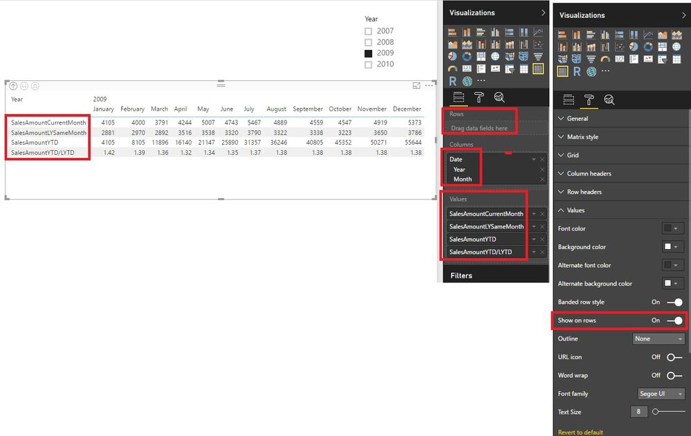
There are measures in the rows and columns in your example. Measures are dynamic. So you can't a visual that is exactly the same with your example. Maybe you can try it like this.
1. The column could be dates from a column of one table.
2. The visualization is a Matrix.
3. The Columns field is date.
4. The Value field is the results you want.
5. Enable "Show on rows" in the settings of Matrix.
Best Regards!
Dale
If this post helps, then please consider Accept it as the solution to help the other members find it more quickly.
Helpful resources

Microsoft Fabric Learn Together
Covering the world! 9:00-10:30 AM Sydney, 4:00-5:30 PM CET (Paris/Berlin), 7:00-8:30 PM Mexico City

Power BI Monthly Update - April 2024
Check out the April 2024 Power BI update to learn about new features.

| User | Count |
|---|---|
| 109 | |
| 98 | |
| 80 | |
| 64 | |
| 57 |
| User | Count |
|---|---|
| 145 | |
| 111 | |
| 92 | |
| 84 | |
| 66 |

